Fixing a failed bill pay experience with customer-focused redesign
PROBLEM OVERVIEW
Paying bills online is a core feature of any banking platform and a major driver of usage across Scotiabank’s desktop and mobile apps.
With a high volume of monthly bill payments, customers expect the experience to be fast and seamless. However, usability and accessibility gaps in the existing experience led to customer drop-off and consistent negative feedback, signalling a strong need for redesign.
MY ROLE
I was the primary product designer on this project and the SME for bill pay. I identified pain points, simplified key flows, restructured the information architecture for adding payees and editing payments, and designed new interaction patterns through wireframes and prototypes.
OUTCOME
+9.4 pts
NPS
+10.6%
Task completion
+0.8 pts
Task easiness
The redesigned bill pay experience reduced customer complaints, improved satisfaction, and increased task completion rates. All of this was driven by a simpler, more intuitive flow that aligned with existing user expectations.
Team
Product designer (me)
Design lead
Product manager
UX Researchers
Engineers
Timeline
Initial project:
Feb - Jul 2023
Project revamp:
Feb-Apr 2025
CONTEXT
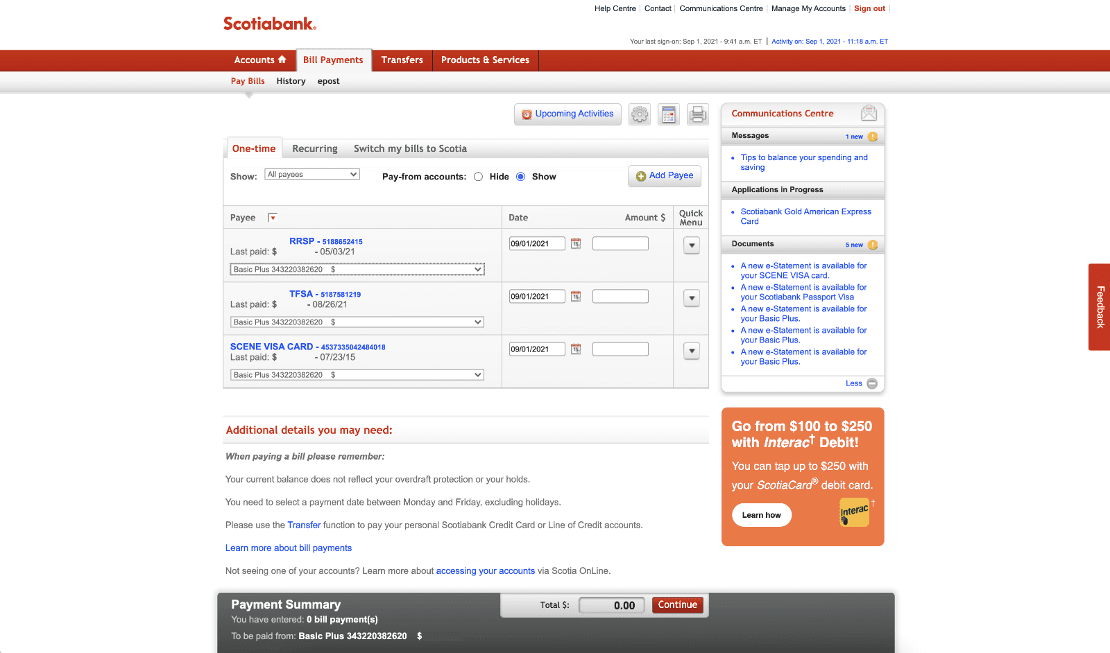
The bill pay experience was outdated, period.
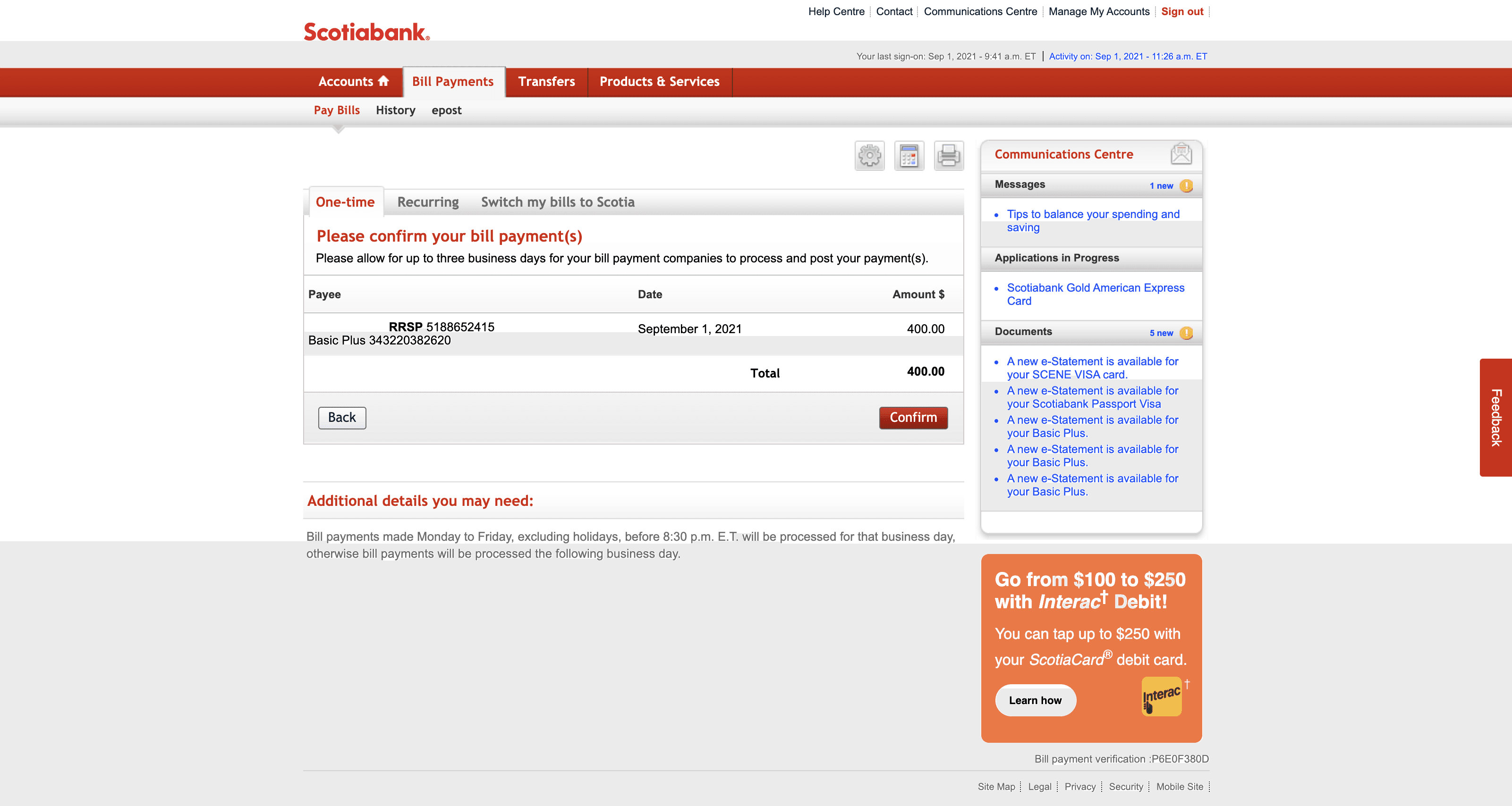
Let's paint the scene: It's the start of a new month in 2023 and you have bills to pay. This is your least favourite part of the month — not because you have to pay your bills (which does suck but everyone has to do this), but because you have to navigate an archaic experience that feels stuck in the 1990s just to get it done.
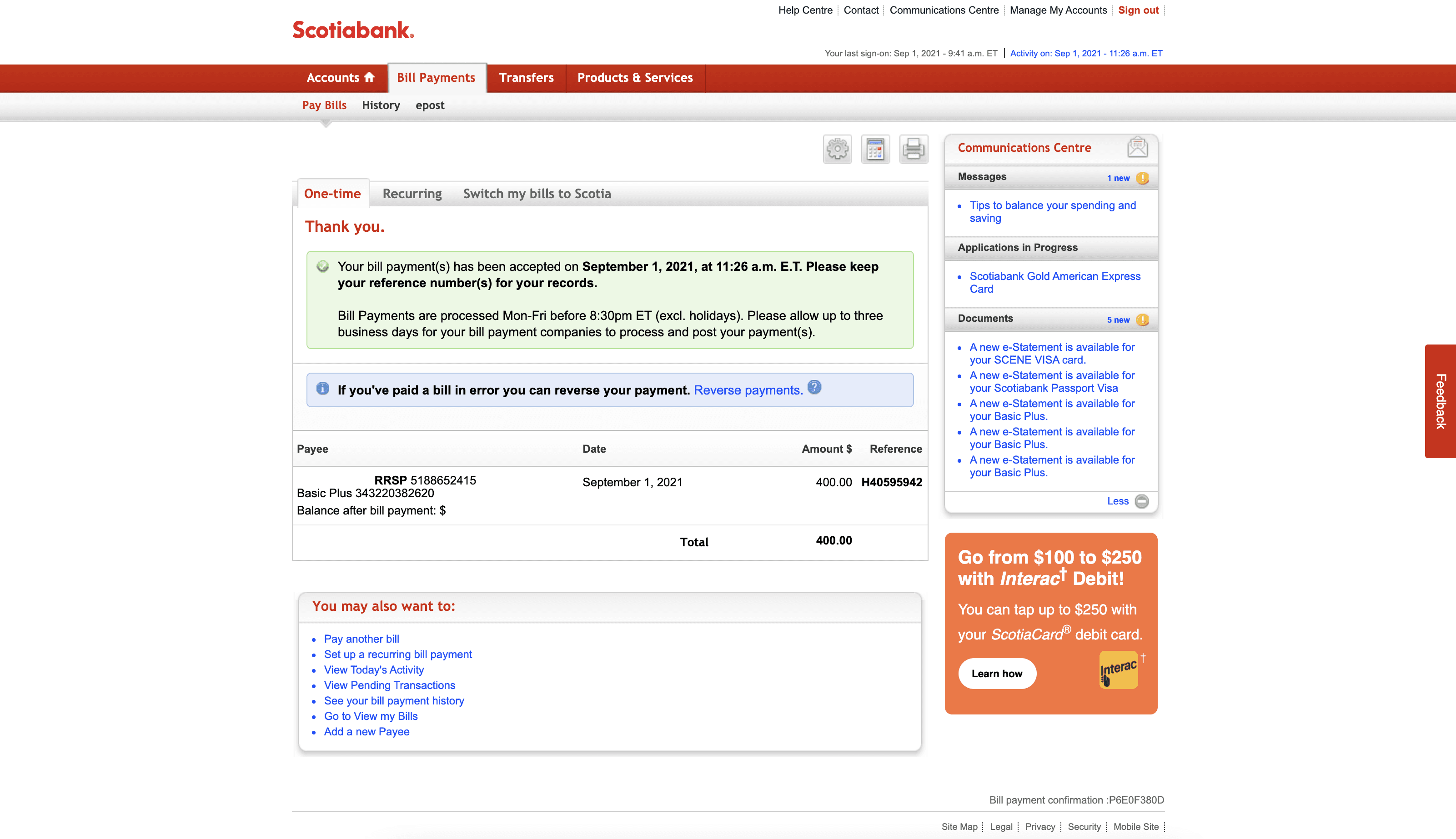
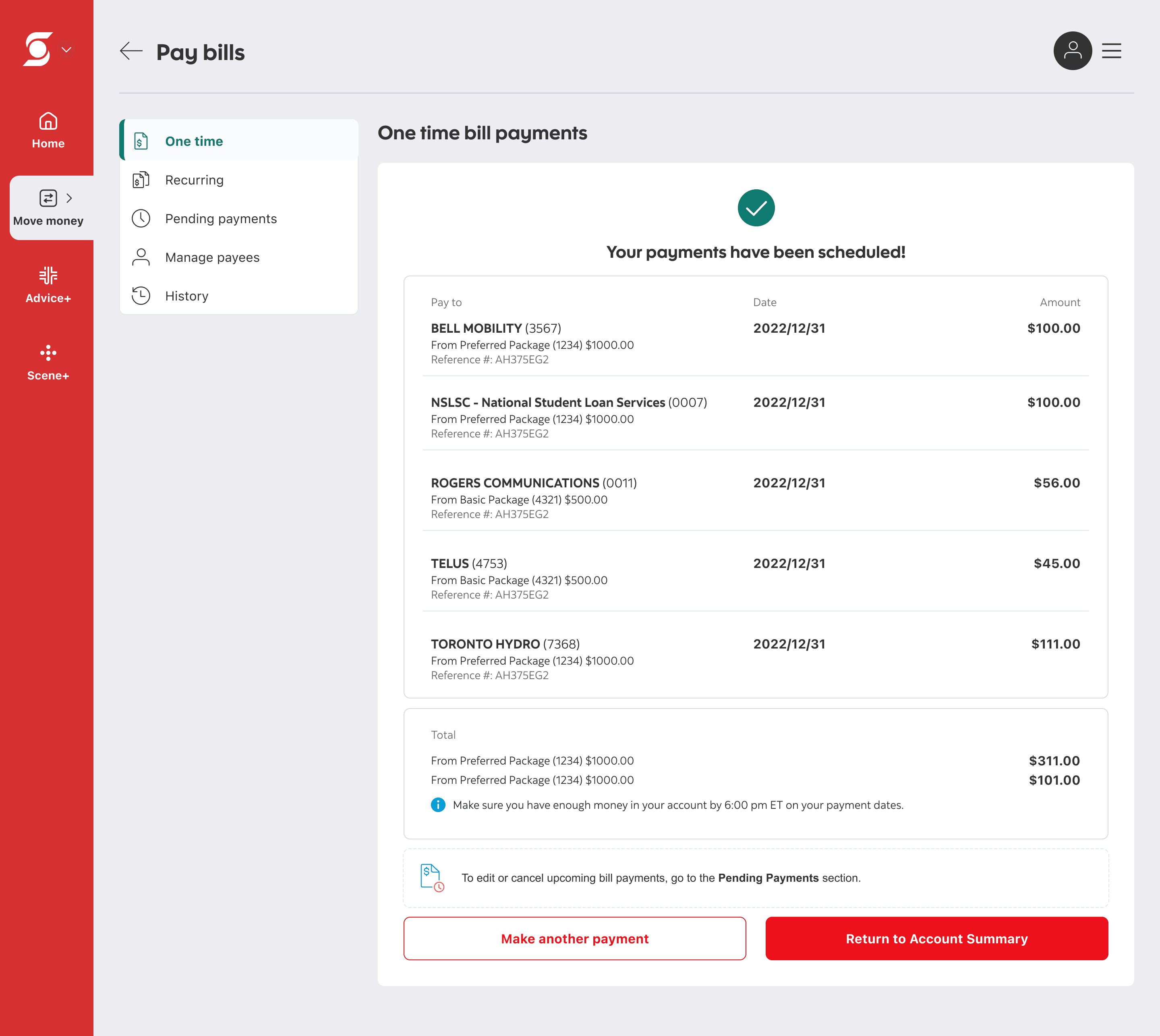
This was the experience many of our customers had for a long time. While the broader platform was undergoing a major modernization overhaul, key money movement flows like Bill pay, which handles 150,000-200,000 payments each month, were left untouched. The experience was cluttered with inconsistent text styles, small click targets, and irrelevant content. This resulted in an increase in negative feedback, 20% of customers dropping off early because they thought the review page was the confirmation page, and worst of all — risk of platform abandonment.
The first redesign
Identifying the wrong problem
The project initially kicked off as a parity effort where we weren’t creating anything new, just modernizing the interface while keeping the existing functionality intact. At the same time, we looked outward. We analyzed how competitors handled single and multiple bills, as well as scheduled and recurring payments, using both their approaches and our existing flow as a foundation for ideation.
This mindset of "modernize and simplify" is ultimately what led us down the wrong path and caused us to tackle the project the wrong way.
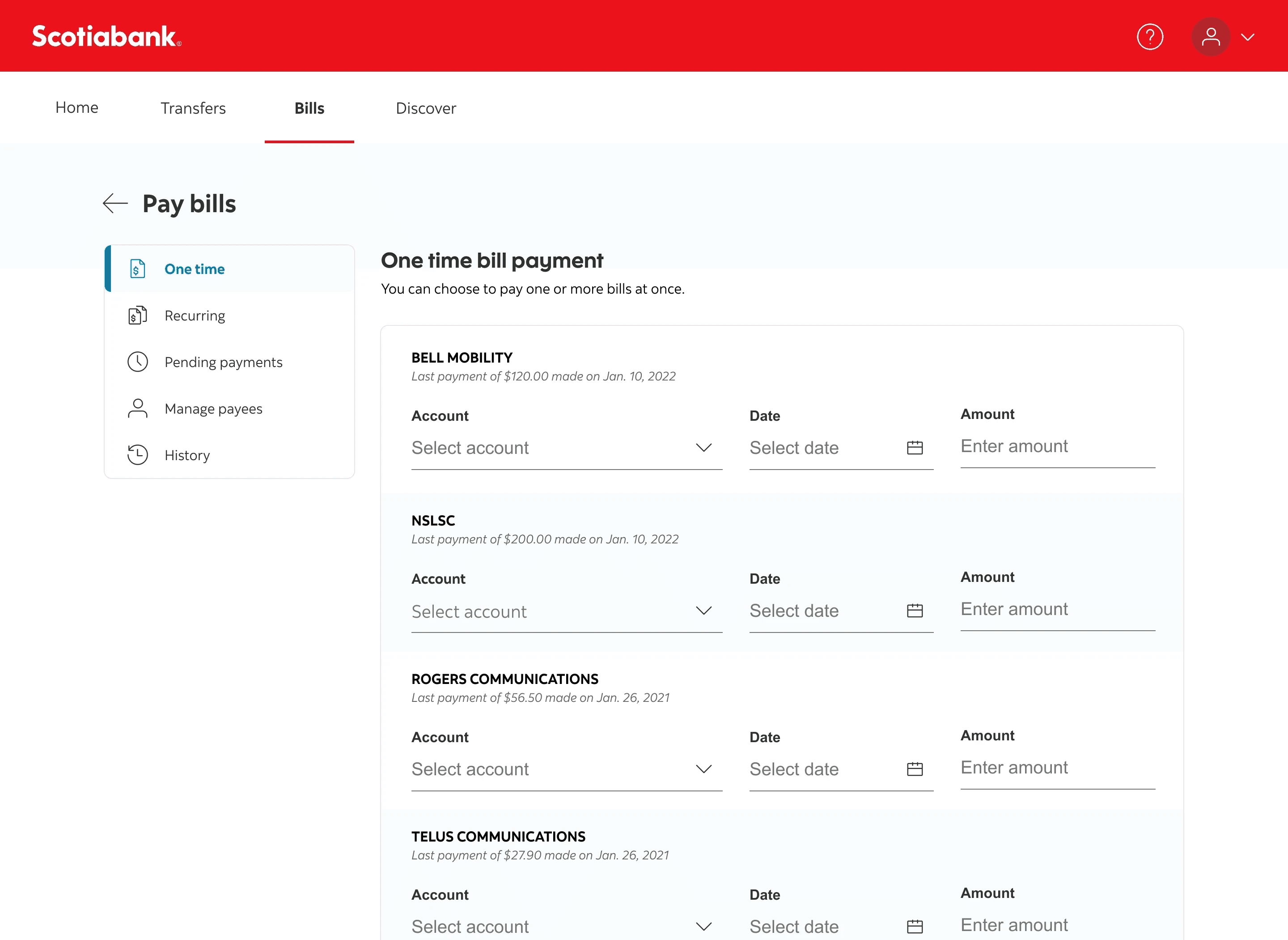
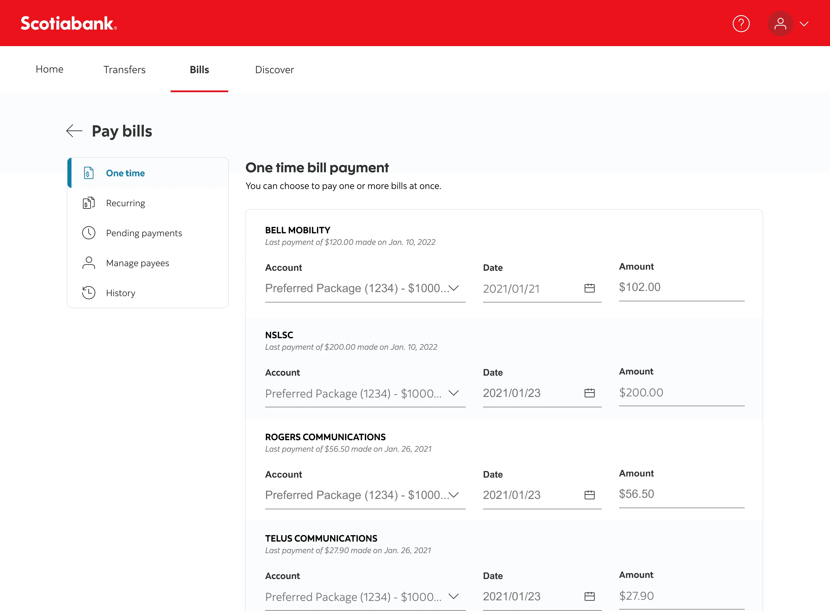
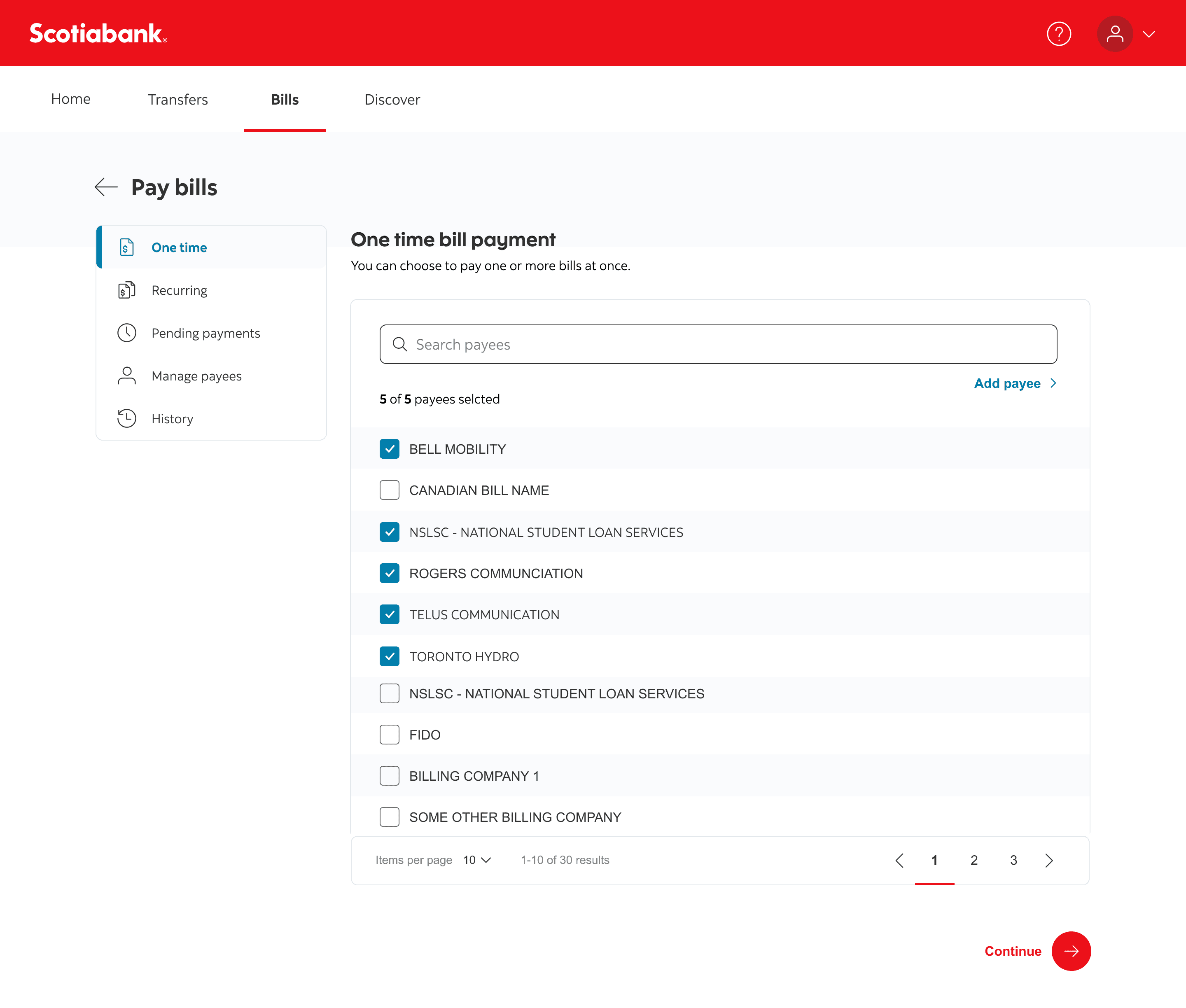
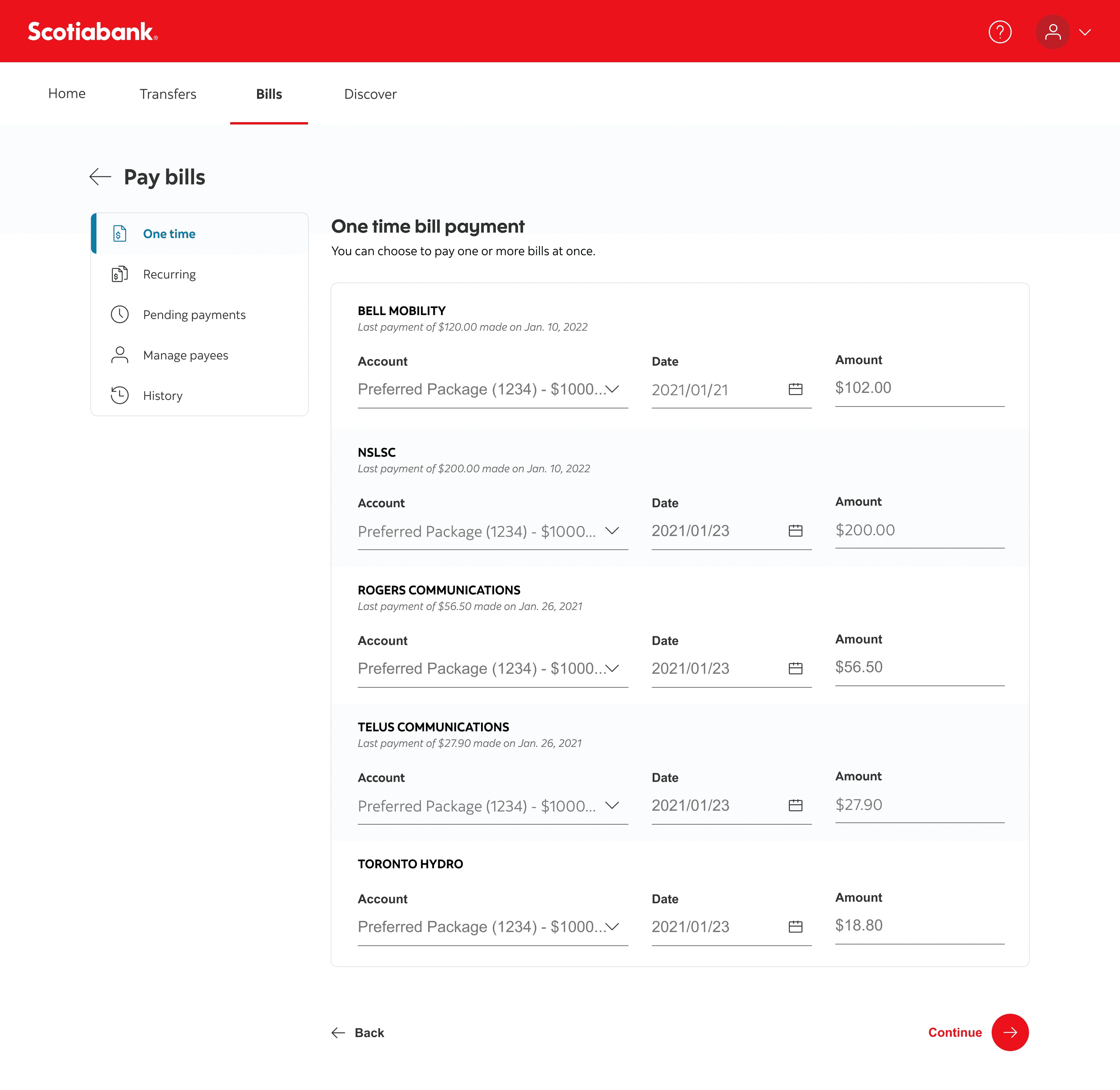
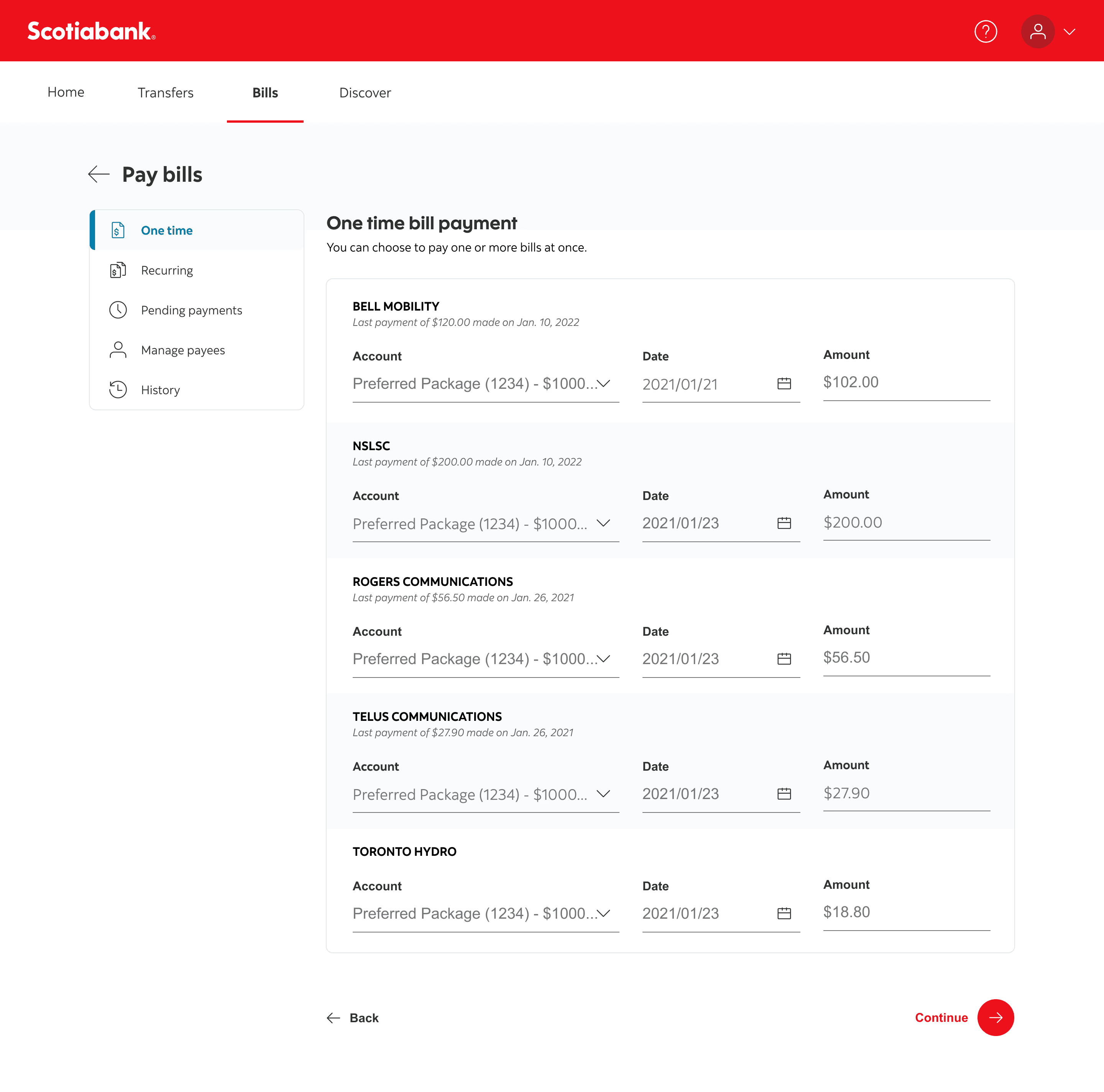
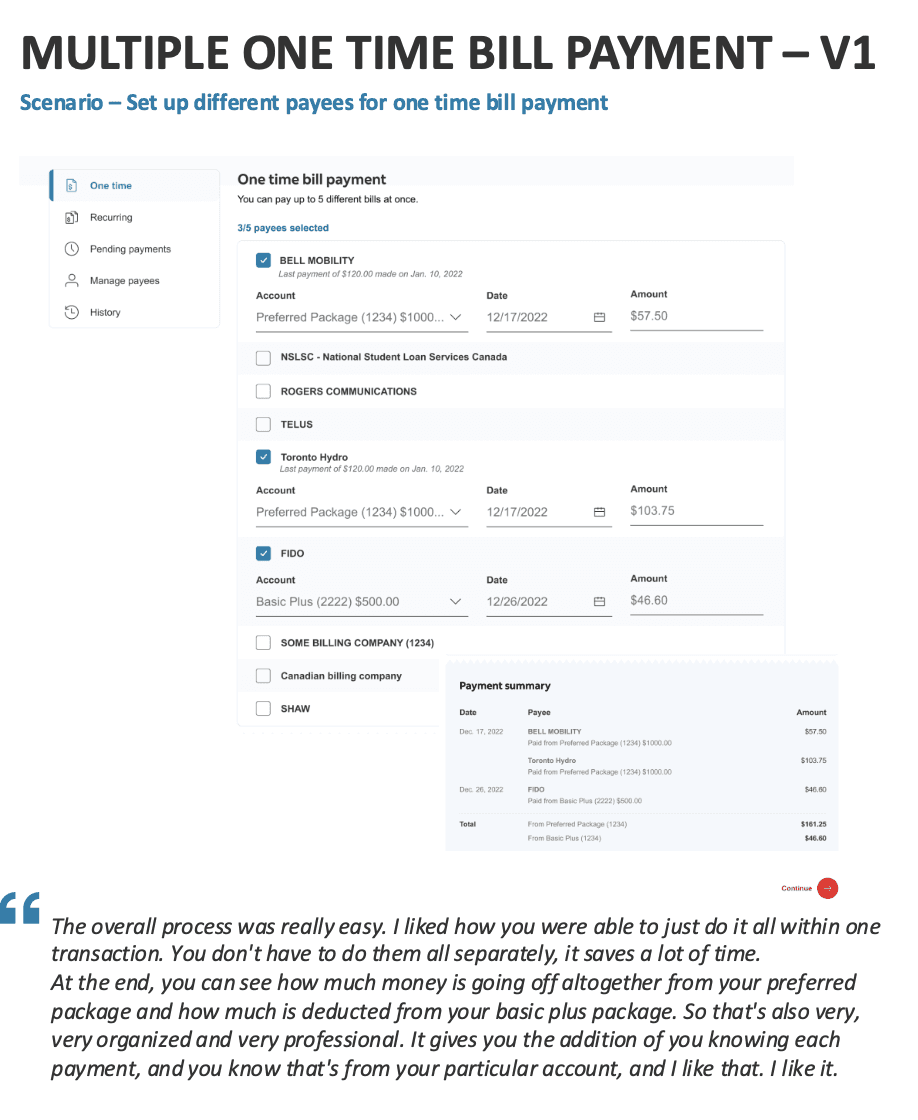
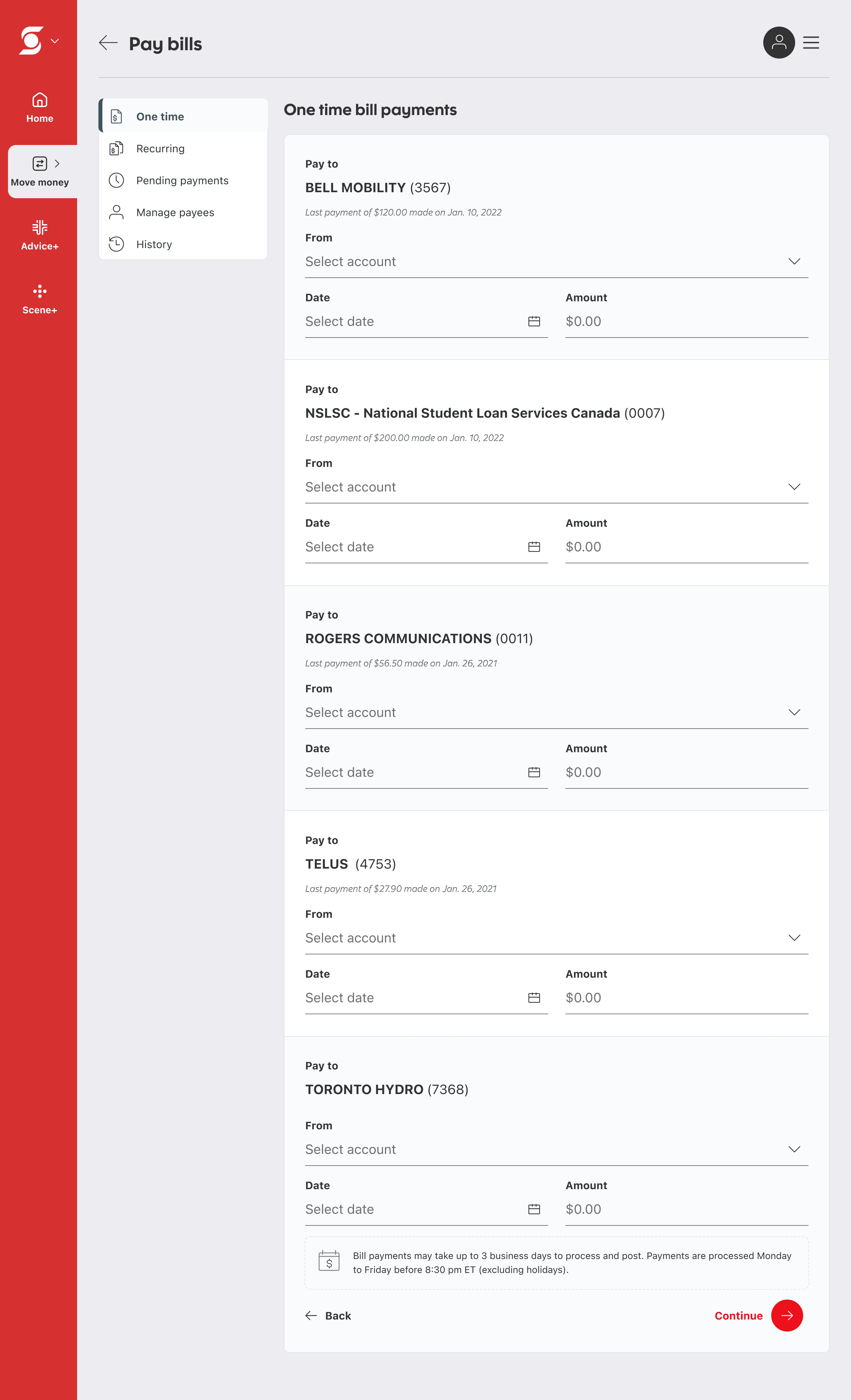
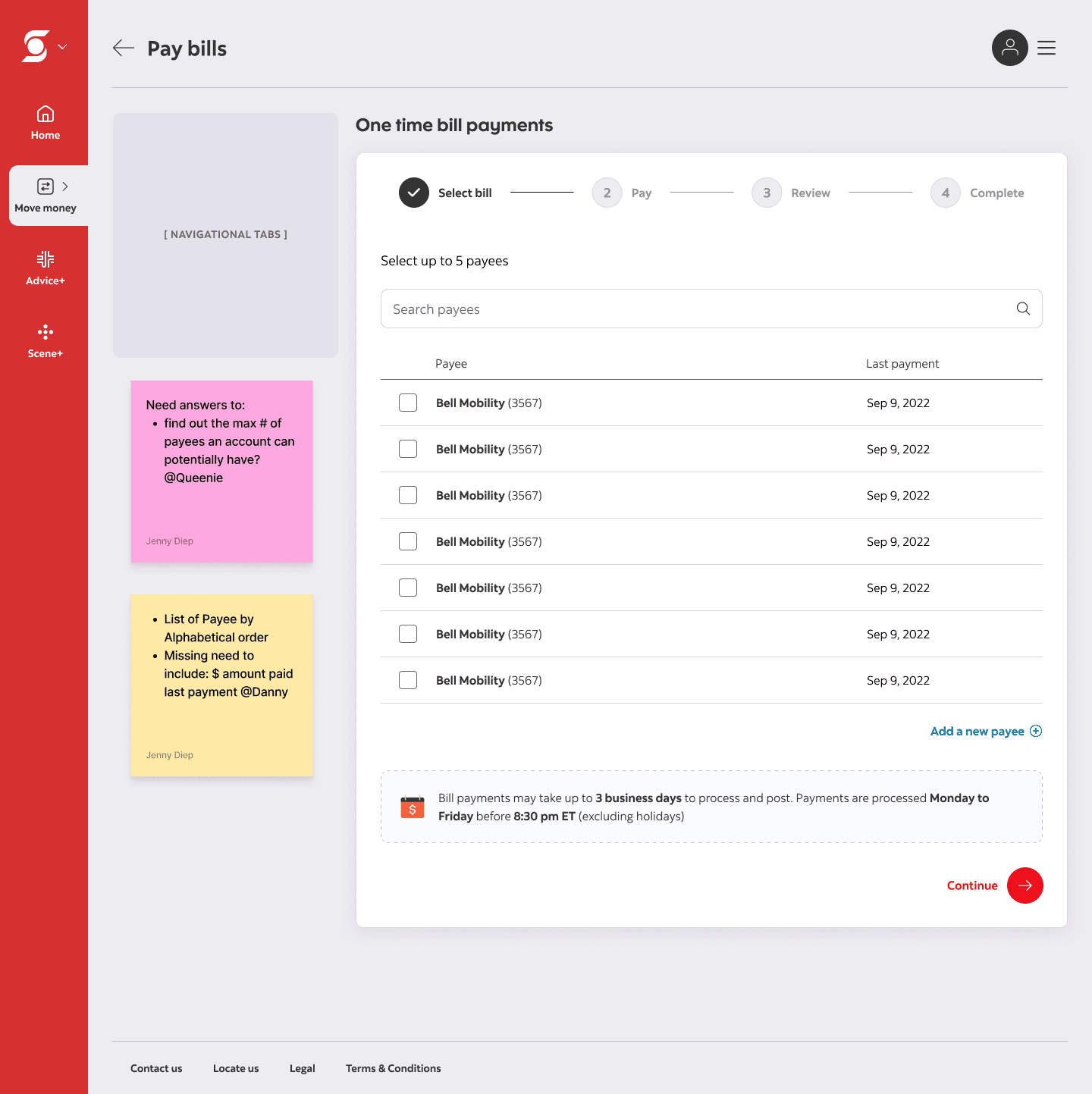
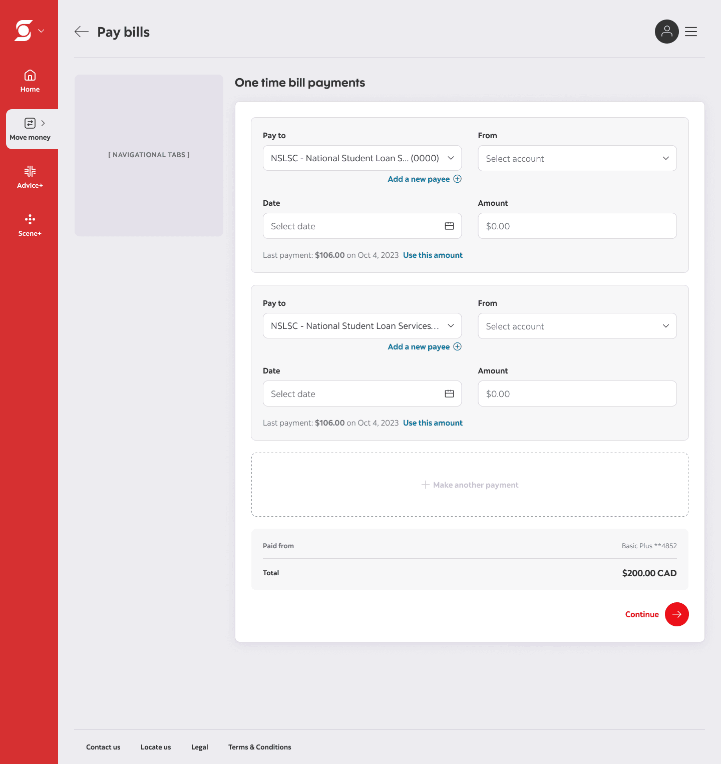
Concept 1: Retained the original pattern by displaying all payees in a list, where entering an amount acts as the selection.
The first redesign
The 50/50 red flag
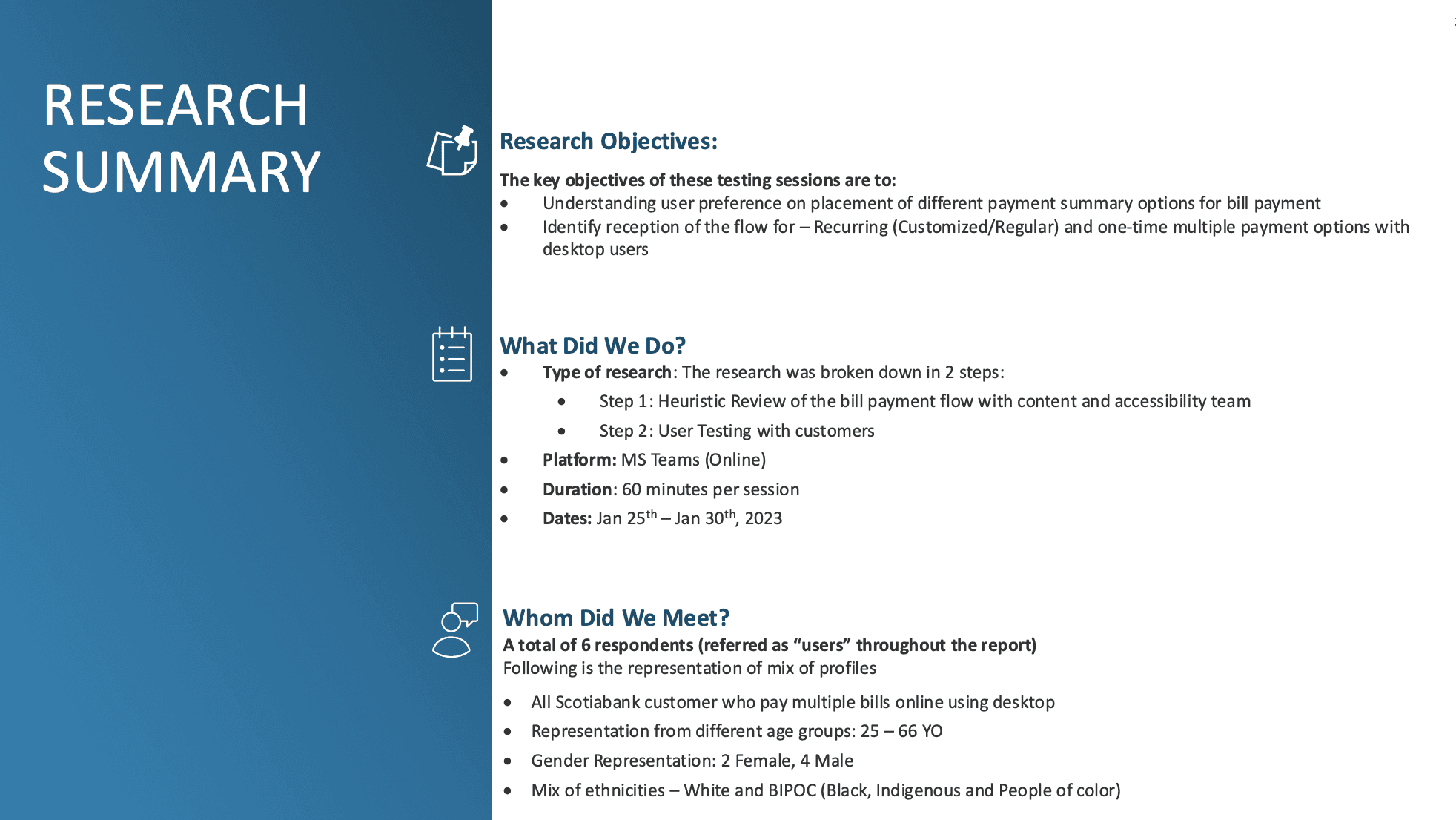
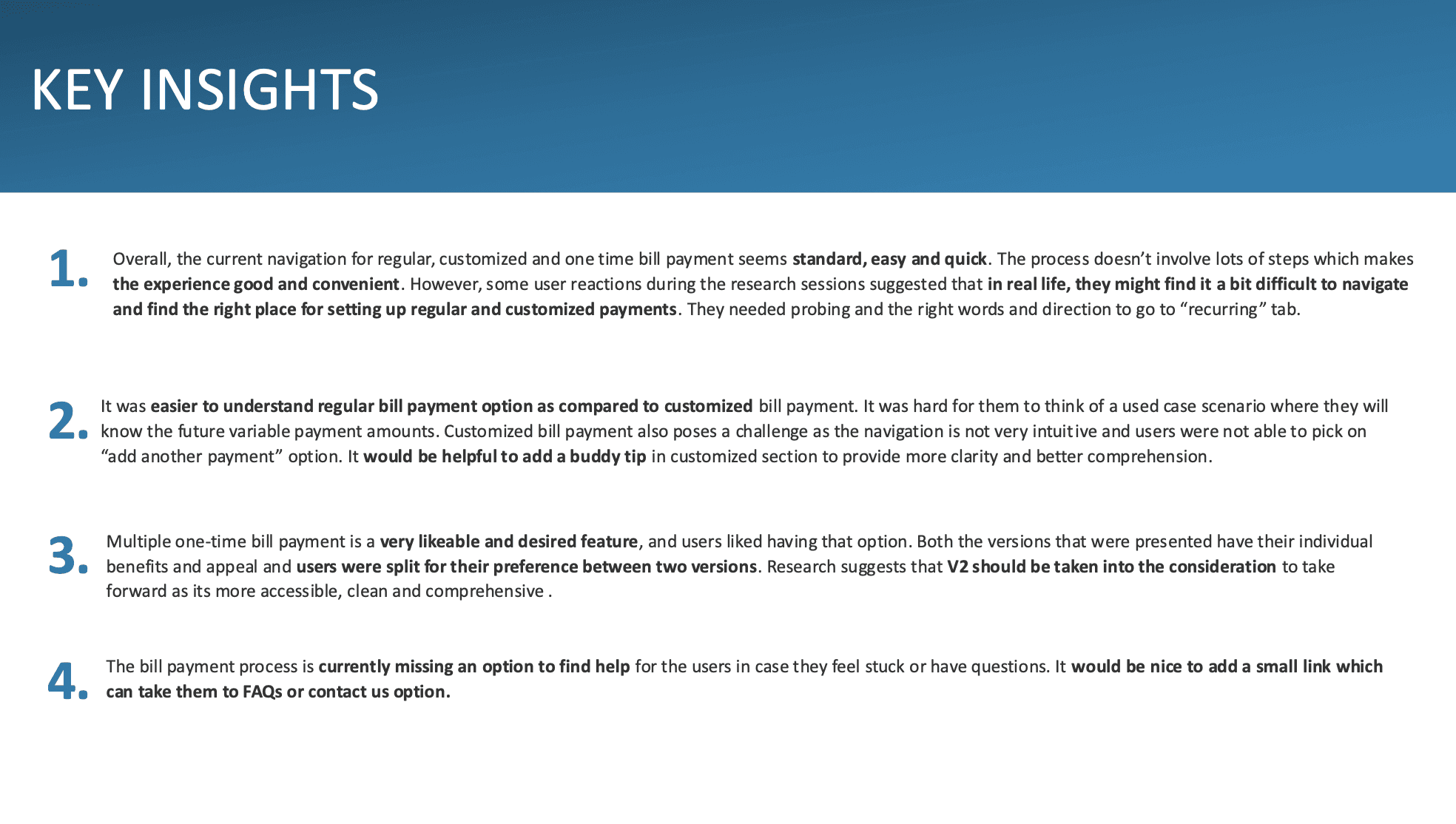
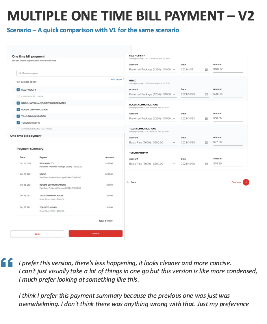
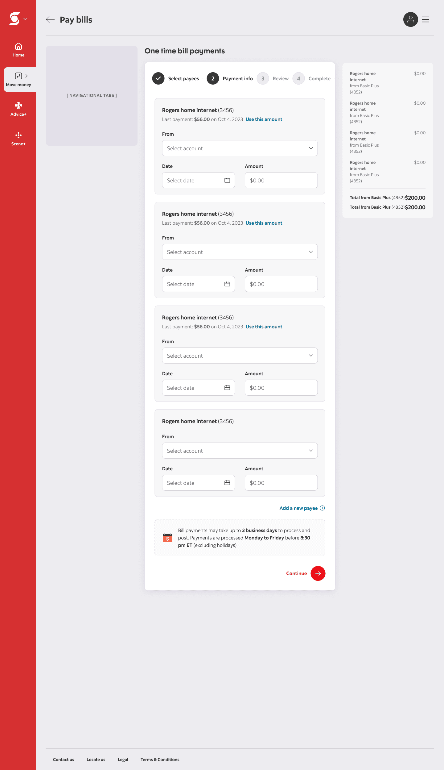
After a few design critiques, both concepts received strong feedback. We moved forward with A/B testing to see how they performed with real customers. The result? An even 50/50 split. As a new designer at the time, I took this as a green light that either direction would work. It wasn't. The split was actually a red flag, signalling to us that each concept was solving a different problem. One concept preserved the existing experience by keeping familiar functionality while improving the UI, while the other concept restructured the flow by breaking the first step into two to reduce upfront complexity.
We weren’t choosing between two solutions to the same problem. We were choosing between two different problems entirely.
The first redesign
The solution customers didn't need
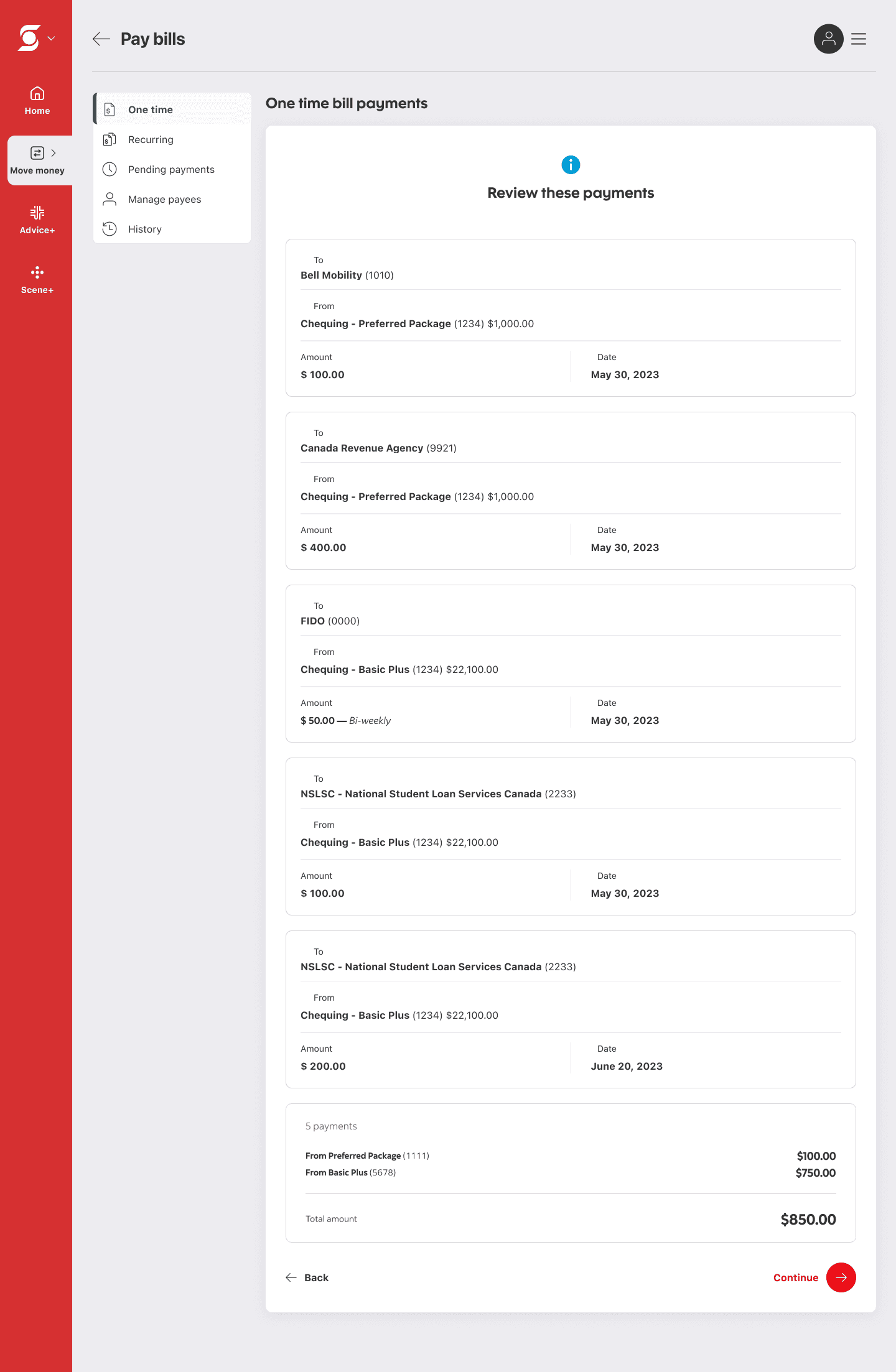
We moved forward with Concept 2 — splitting payee selection and payment details into two steps — based on research recommendations and alignment with competitor patterns. In testing, some customers found the separation clearer and less confusing, suggesting it could help reduce errors, but clarity wasn’t the core issue to begin with.
The first redesign
The result? Not good.
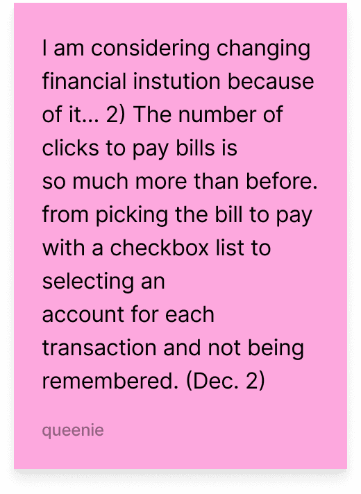
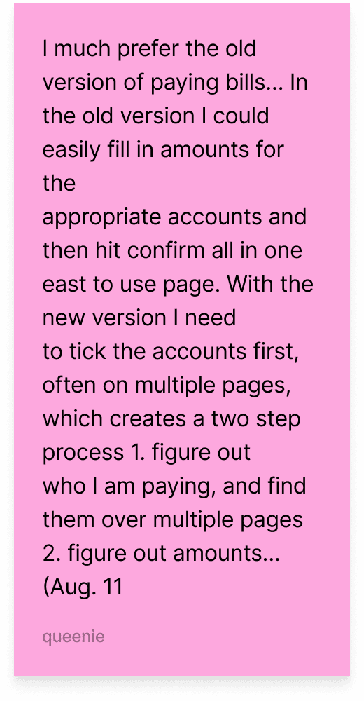
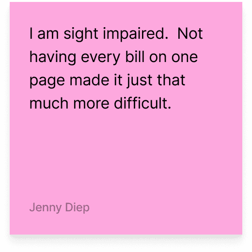
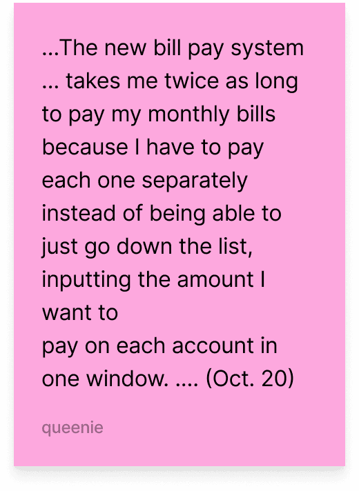
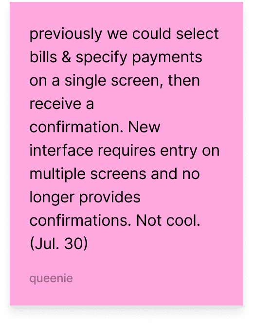
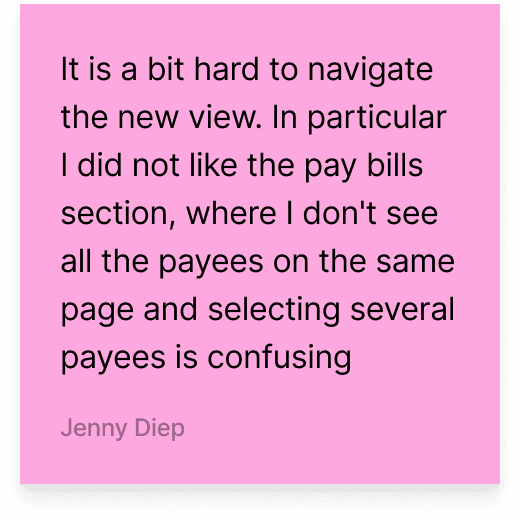
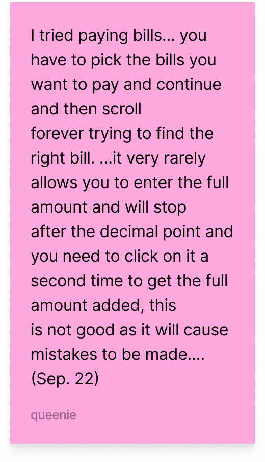
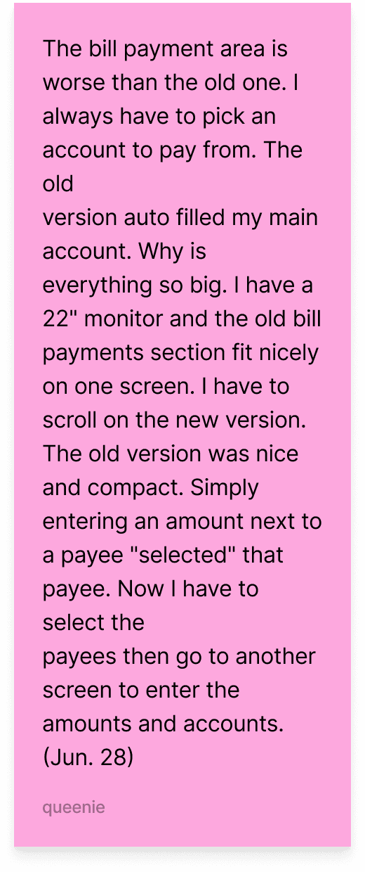
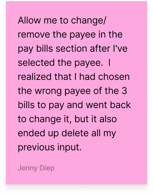
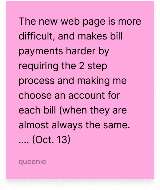
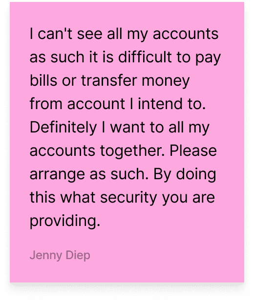
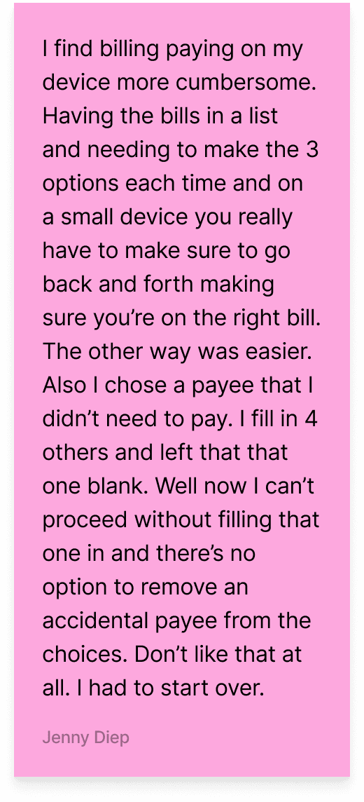
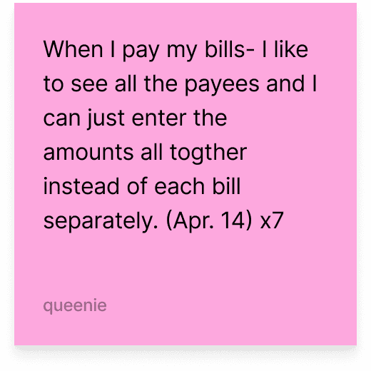
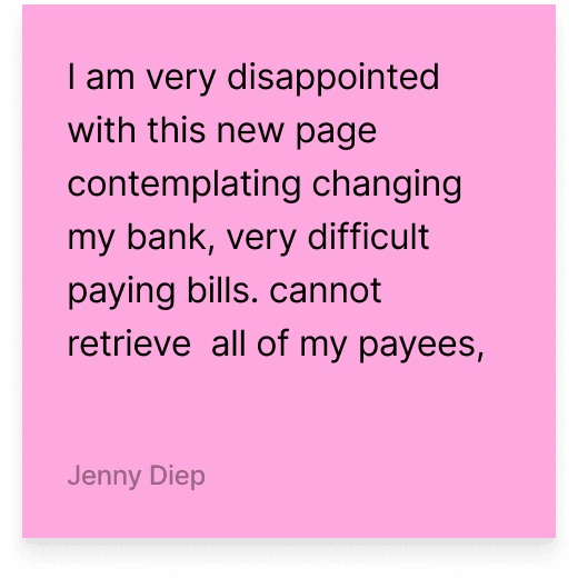
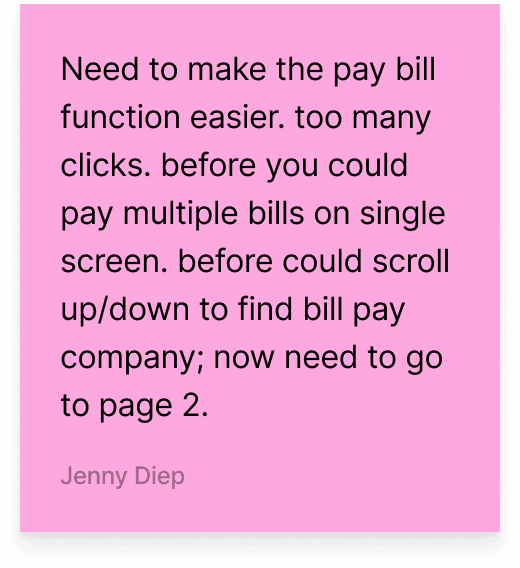
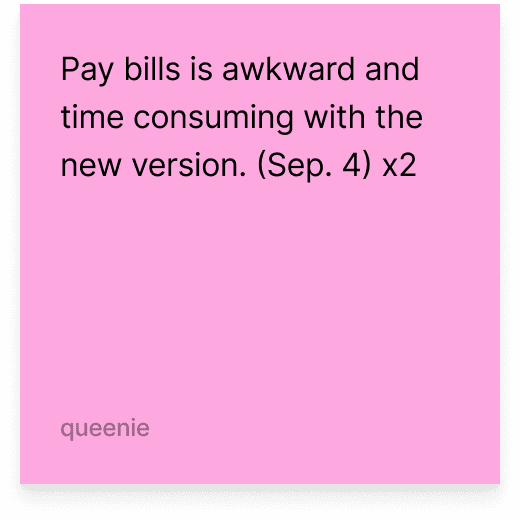
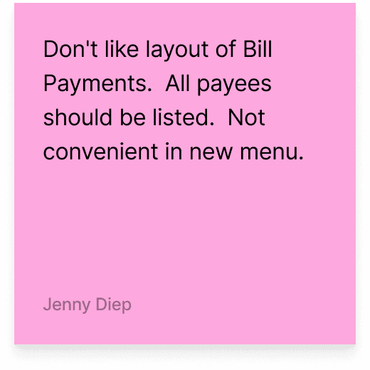
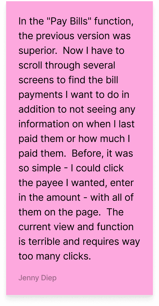
Customers rejected the new design. We had optimized for simplicity when the flow wasn’t inherently complex to them, so breaking it apart added friction instead of reducing it. Customers already had an established mental model around how bill pay worked, and more importantly, they preferred it that way.
the second redesign
Second time's the charm
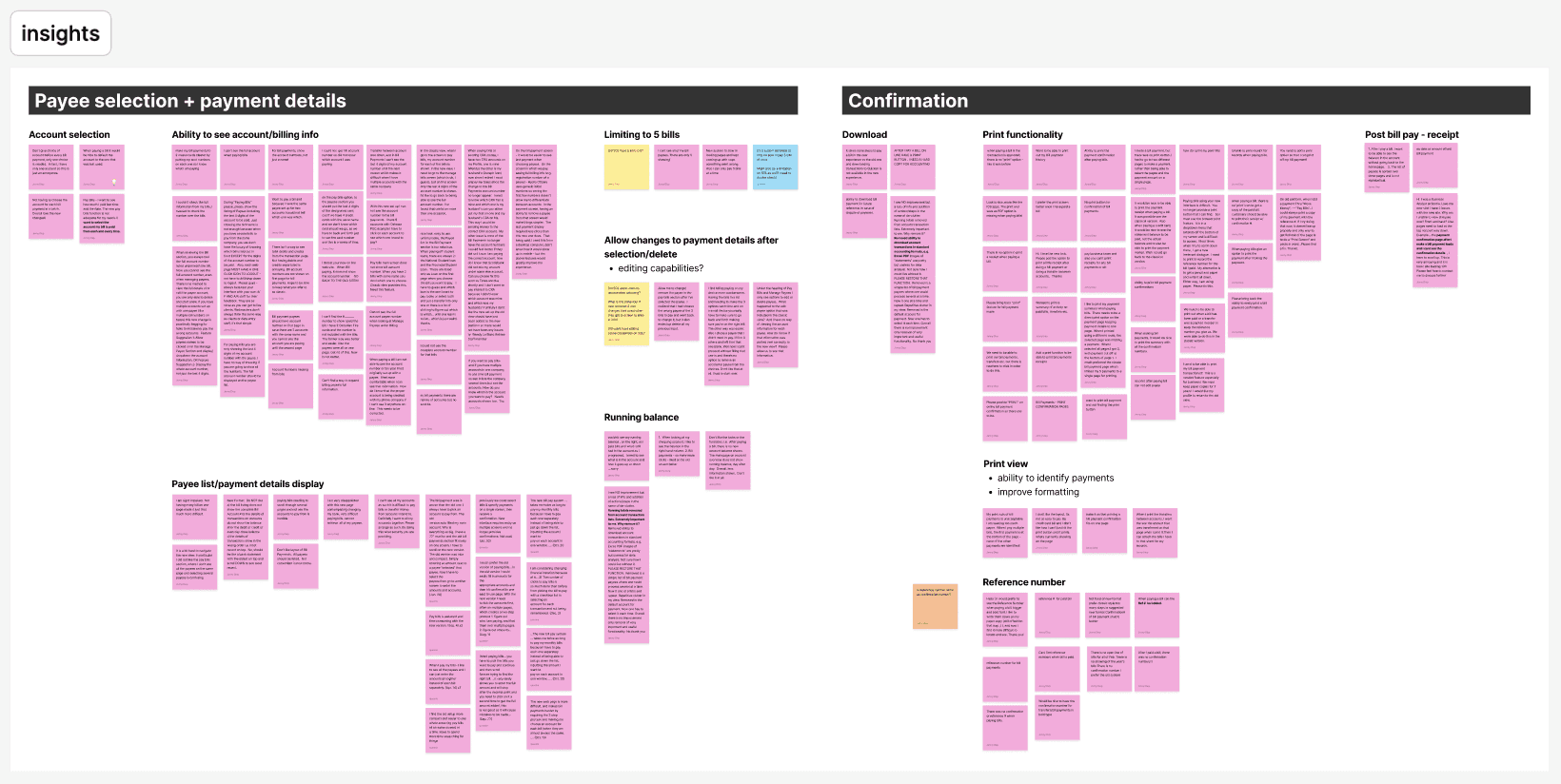
In February 2025, we revisited the bill pay experience as part of the broader Move Money templates initiative, but this time with a clearer understanding of where we went wrong. Instead of jumping straight into solutions, we aligned with product on success metrics and grounded our approach in customer feedback. We created an affinity map to identify the most pressing pain points and prioritize what actually needed fixing.
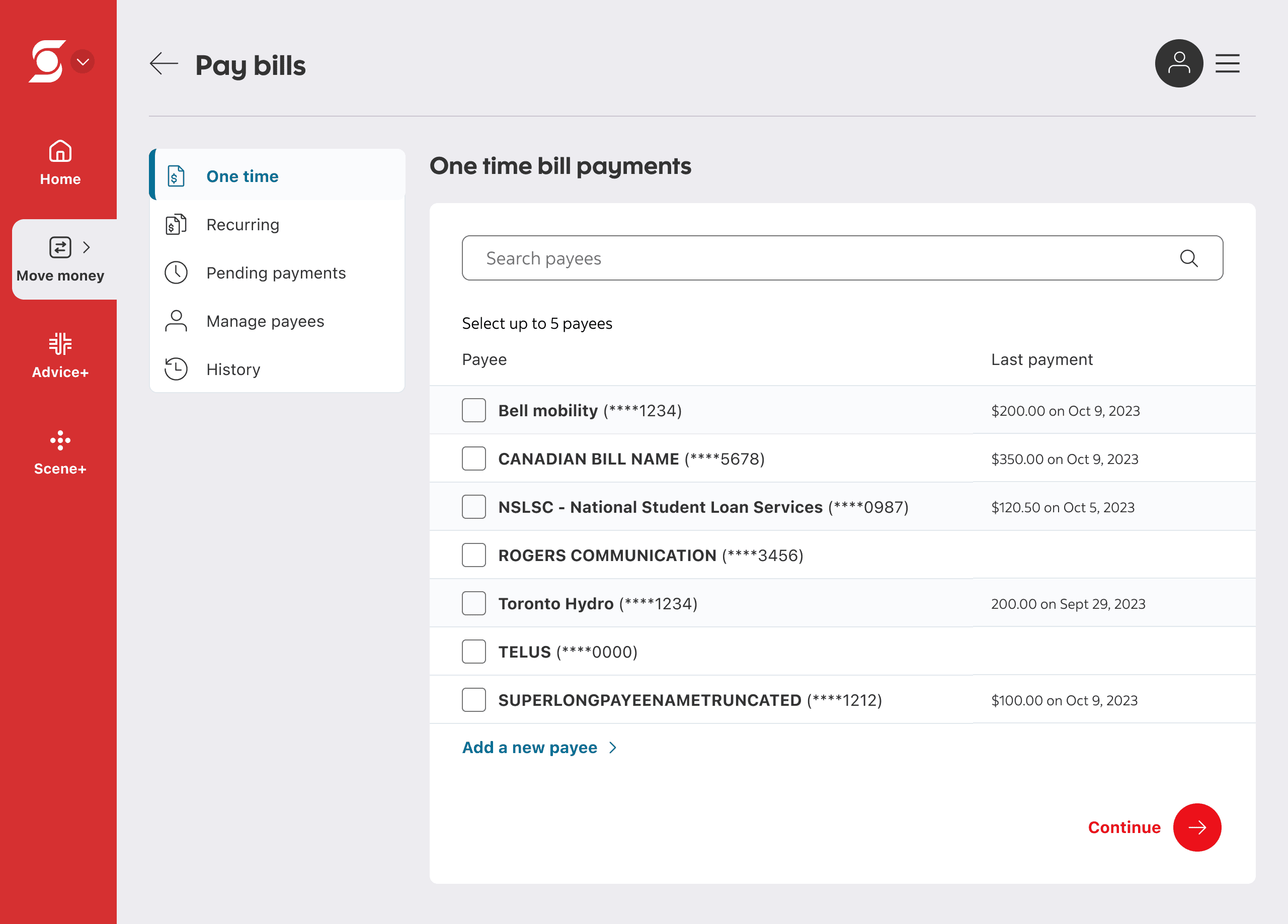
The insights were clear. Most customers struggled with the formatting of the payee selection and payment details page, and called out smaller quality-of-life gaps like seeing full account numbers, referencing the last paid amount, and editing payment details without switching screens.
The second redesign
The good, the bad, and the ugly
Creating a bill pay experience where we…
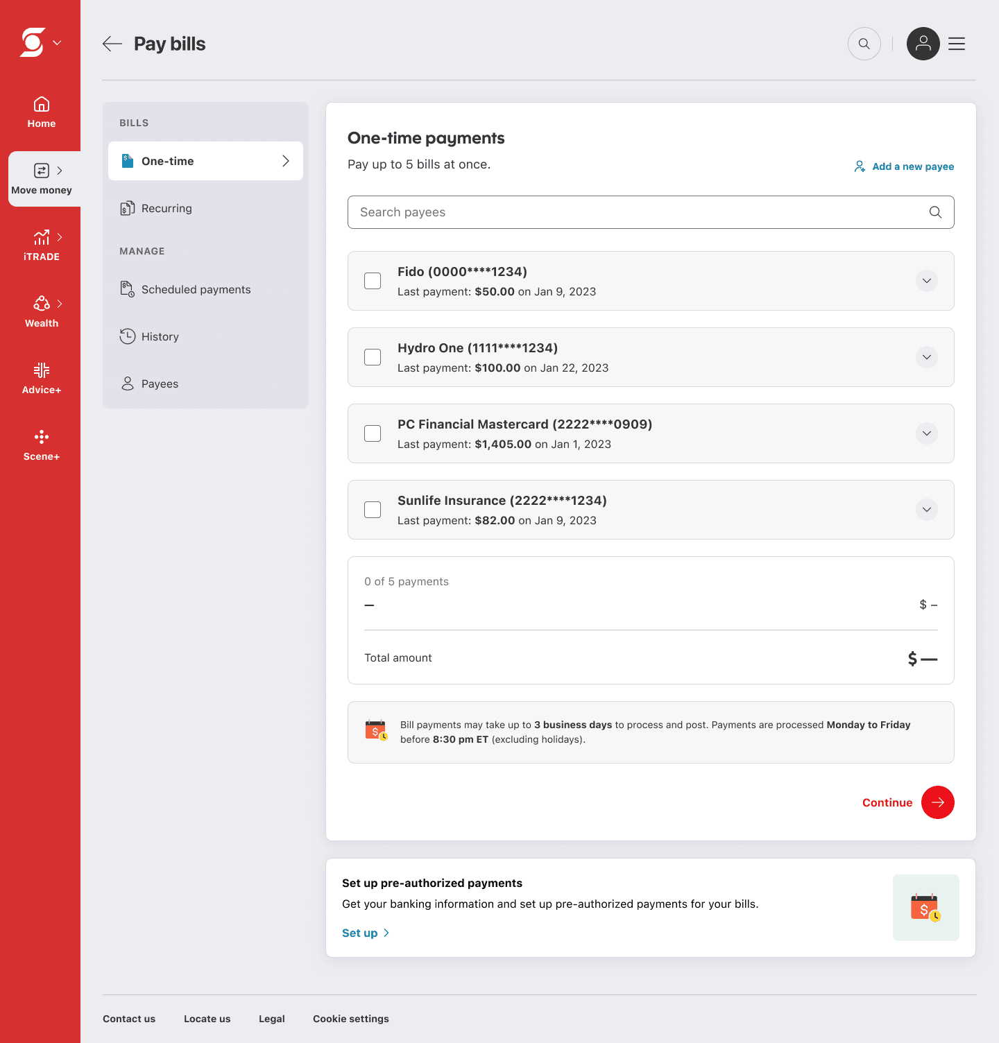
Show the full list of payees
Keep payment inputs on the same page as selection
Surface key details like full account numbers and last paid amounts
Keep the experience simple, modern, and intuitive
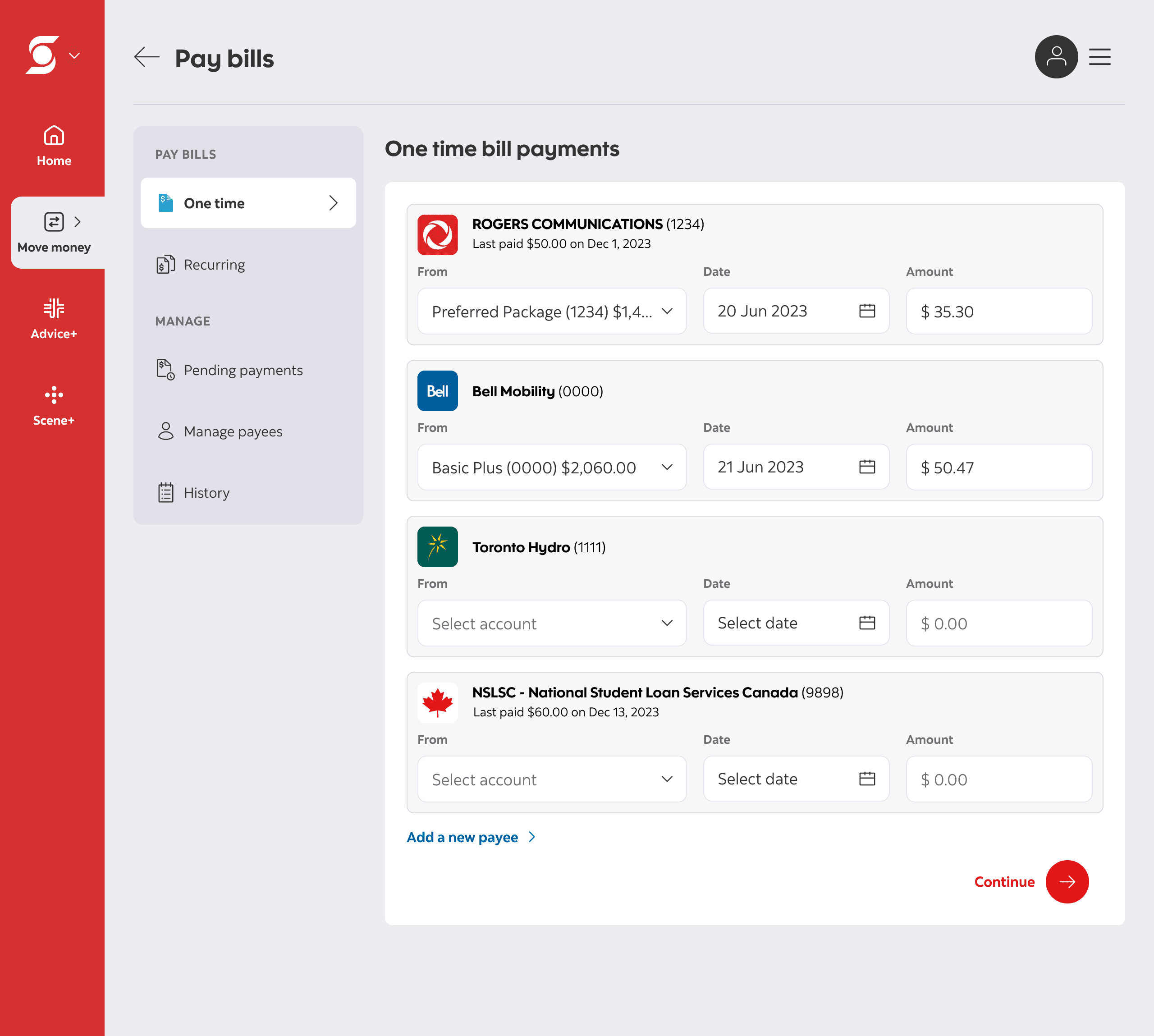
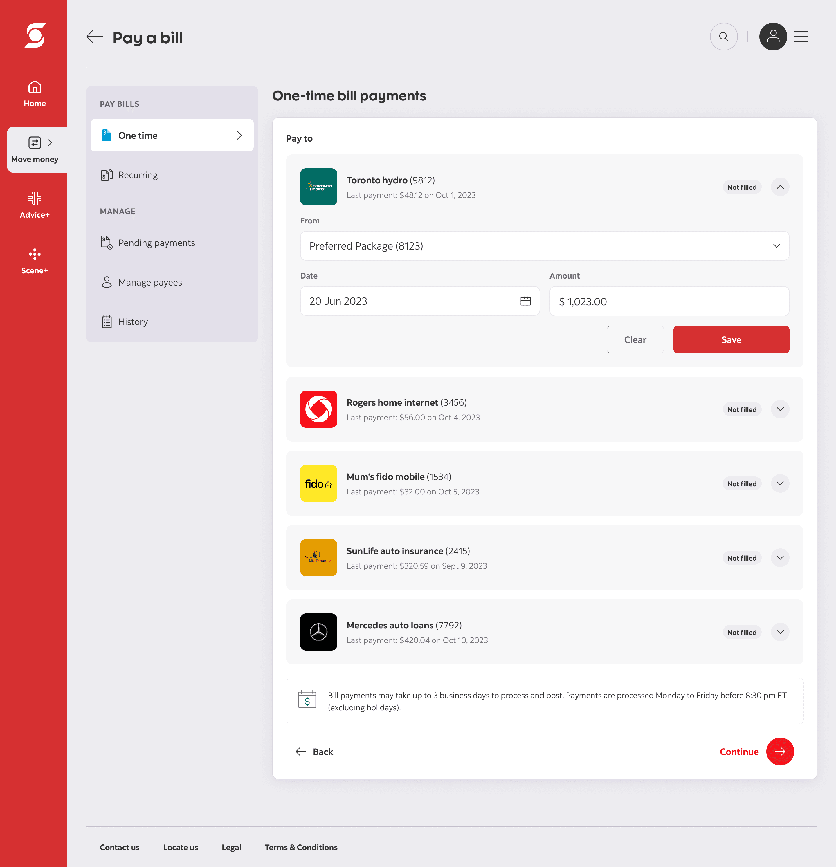
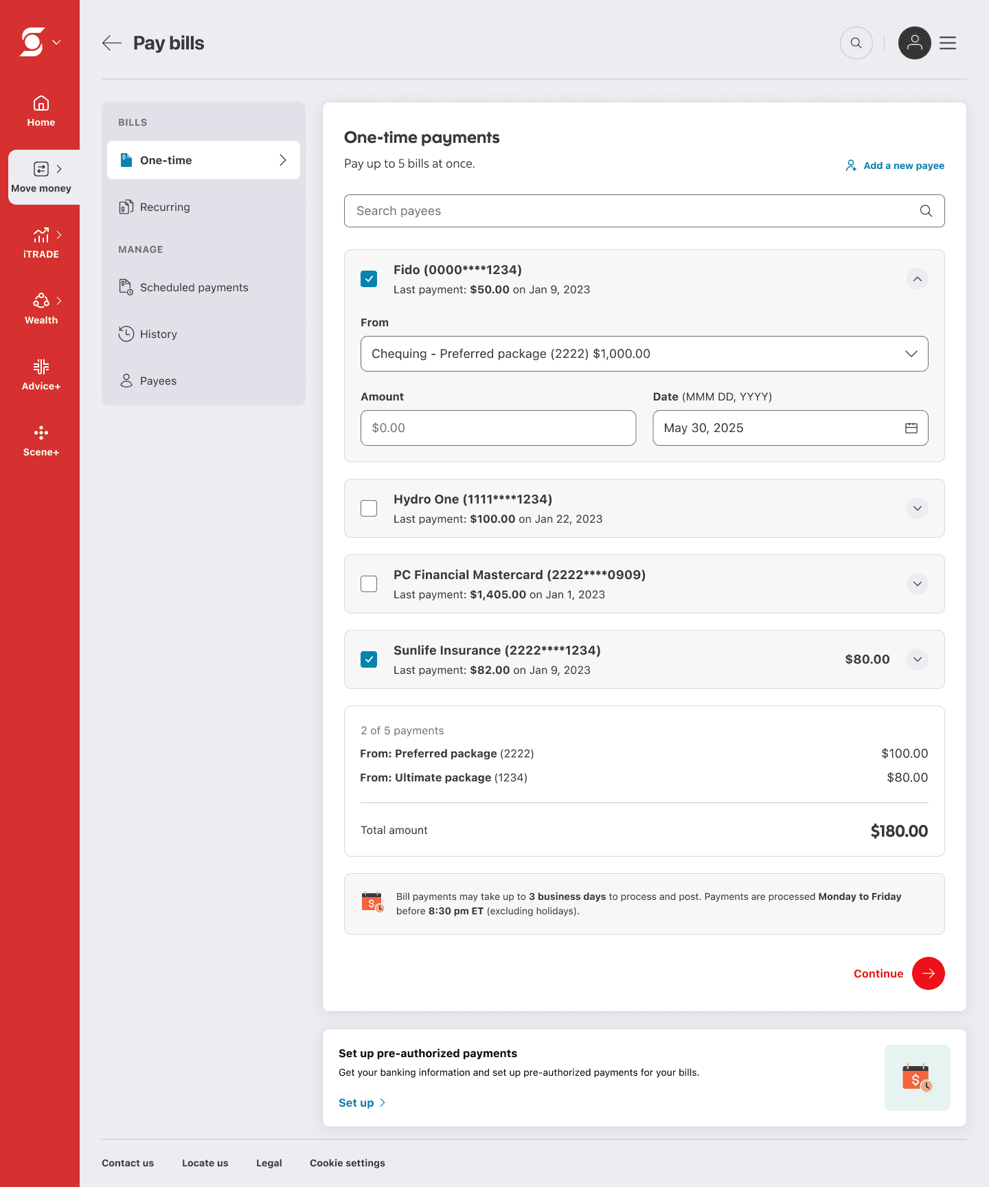
…was a challenge. We ran a design jam with the team to explore solutions. A clear pattern emerged: using expandable sections for each payee —allowing users to enter details inline, then collapse them once complete. To support this, we paired it with a floating payment summary, echoing the original experience. This gave users a constant sense of where their money was going, from which account, and how much, without disrupting the flow.
The second redesign
The final design
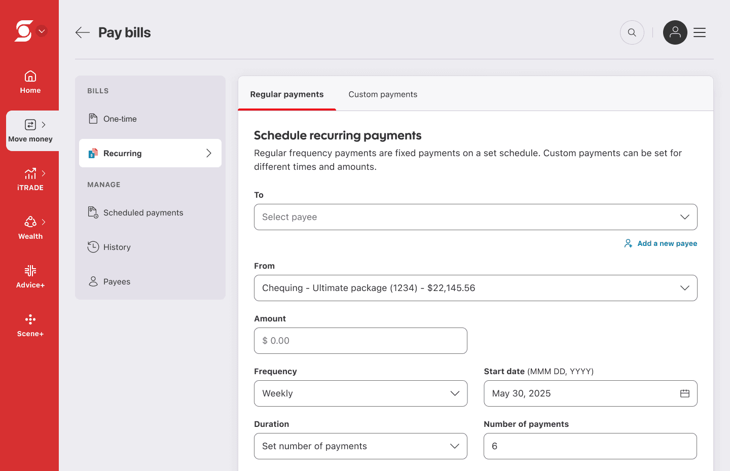
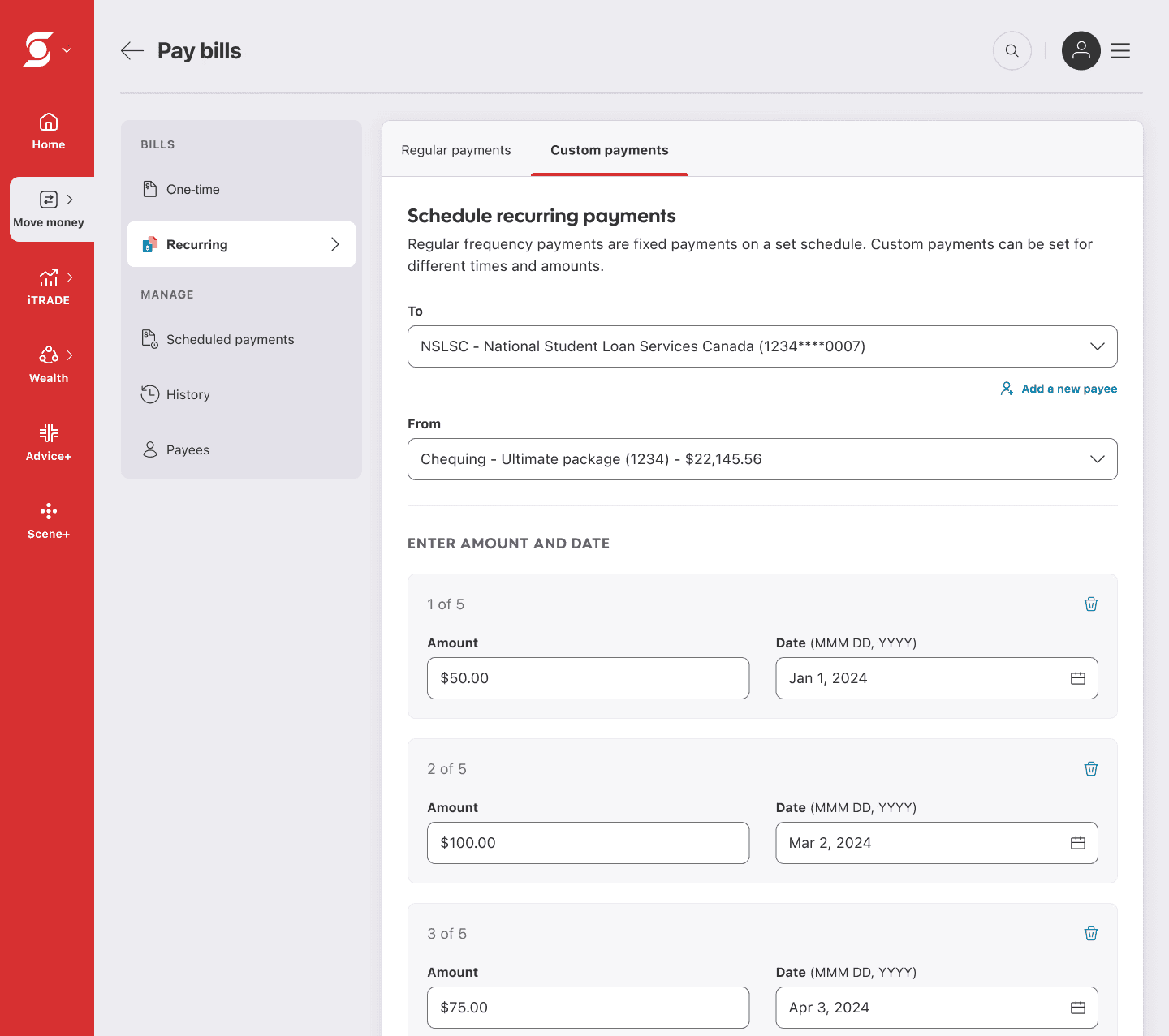
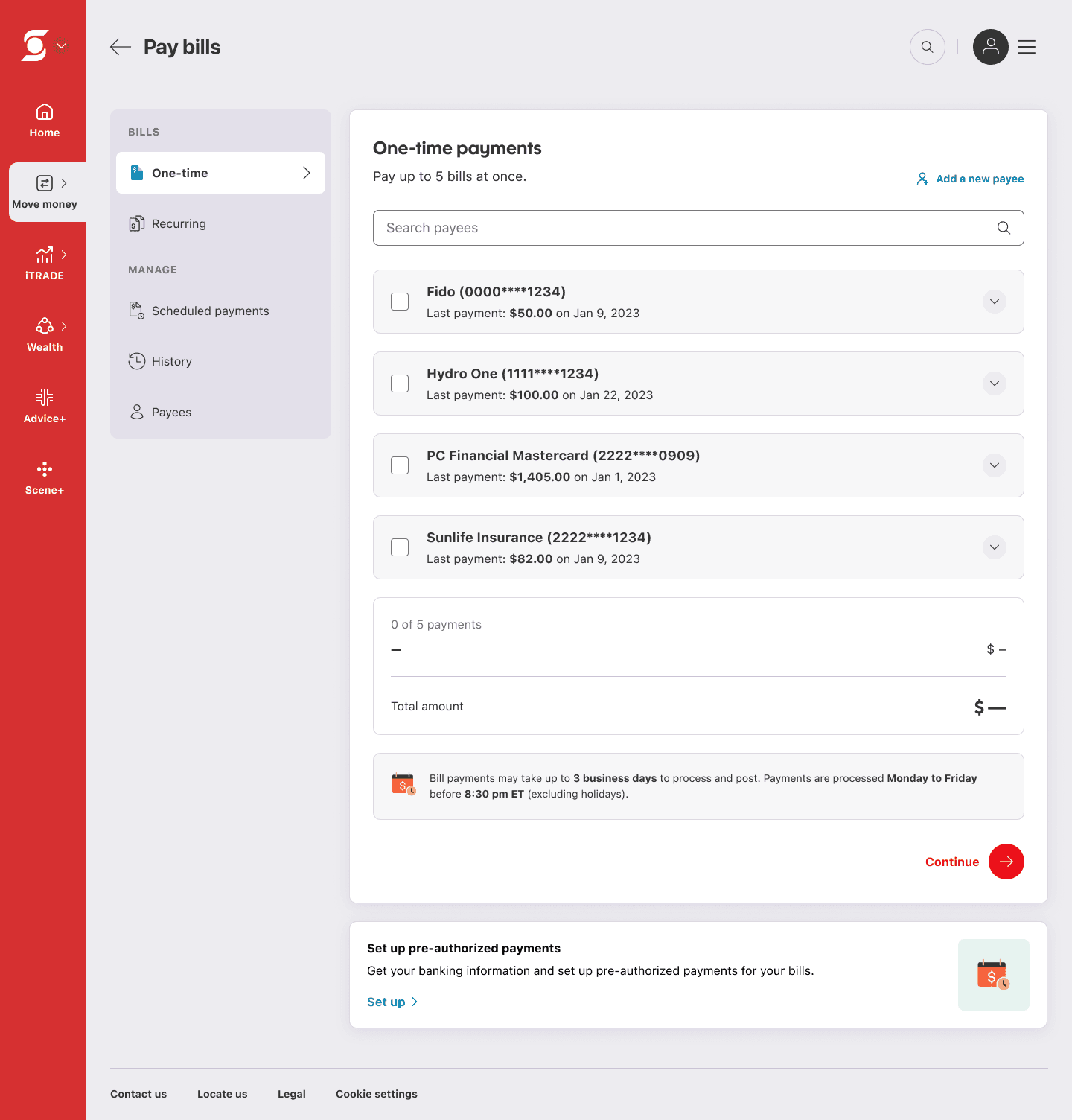
We delivered the new bill pay experience alongside the Move Money templates initiative which required careful balancing of tight timelines, multiple stakeholders, and parallel workstreams.
Payee selection
Customers can view their full list of payees on a single page. Selecting a payee expands it inline to reveal the payment form, allowing users to enter details without leaving the flow. Inputs remain fully editable—users can expand any payee to update or remove their entries at any time.
Payment summary
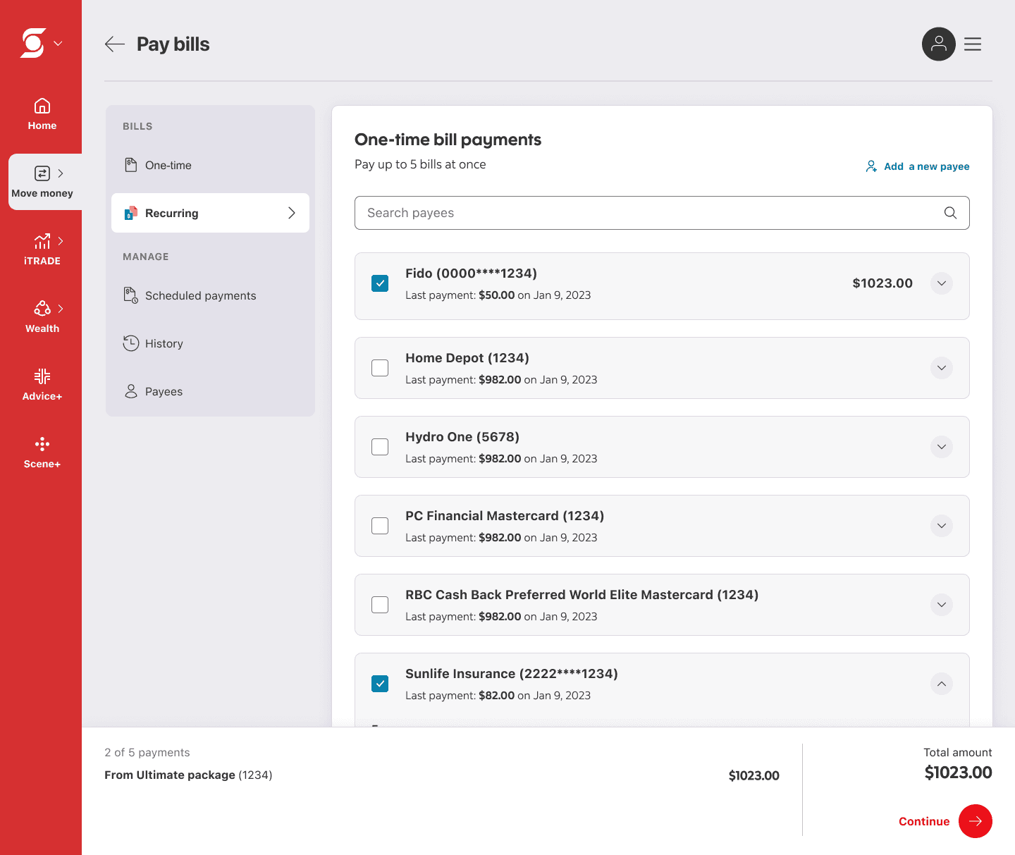
A dynamic payment summary sits at the bottom of the list. When in view, it’s embedded within the page; when scrolled out, it becomes sticky, giving users a constant view of their total and where their money is going.
NPS
7.2
+9.4 pts M/M from -2.2
Task easiness
8.4/10
+0.8 pts M/M from 7.6/10
Task completion
89.8%
+10.6% M/M from 79.2%
Outcome
The redesigned bill pay experience reduced customer complaints, improved satisfaction, and increased task completion rates. All of this was driven by a simpler, more intuitive flow that aligned with existing user expectations.
💬 Customer verbatims
"I really like the way that the bill payments are set up. If I click on a bill I want to pay, it now lets me set up the amount and which account I want it to come from, instead of tediously making me go to another window and put all that info in. Thanks for the update."
"Very user friendly and easy. Very satisfied with web experience. I started using the new system after closing the old one and I love it."
"Thank you for updating the bills page. This is much better than what it was before."
— monthly feedback report, June 2025
Lessons learned
🤔 Don’t blindly follow assumptions: Even when the research seems solid, it’s important not to take any single piece of advice as gospel. I was too quick to accept the results from the initial A/B test without critically evaluating the design against other data points and exploring additional alternatives. Design decisions should be based on multiple facets of input, not just one viewpoint.
🧪 Test beyond first impressions: Early validation isn’t enough. We moved forward without fully stress-testing the experience, and paid for it later. More rigorous, iterative testing would have surfaced issues sooner and saved a full redesign cycle.
👩🏻🏫Solve the right problem: This project reinforced a core lesson: improving an experience starts with correctly identifying the problem. We focused on simplifying a flow that users already understood, instead of addressing what was actually broken.