MOVE MONEY
Unifying Scotiabank's Move Money Experience
PROBLEM OVERVIEW
Money movement features — such as Interac e-Transfer, Bill Pay, and account transfers — drive a large portion of activity on Scotiabank’s online banking platform. Because customers often log in specifically to move money or pay bills, these high-traffic flows are critical to the overall customer experience.
Over time, however, the designs of the money movement flows had become inconsistent due to overlapping updates, evolving requirements, and uneven adoption of the new design system. These inconsistencies created a lot of gaps in the customer experience and lead to confusion for designers working on future feature designs.
MY ROLE
This was a collaborative effort between a Design Lead, Senior Product Designer, and myself. As the SME for our platform’s move money flows, I defined patterns and guidelines across move money features, documented updated flows in Figma, and contributed new guidelines to the platform design system. I also collaborated with the team to refine new components that were contributed back into the system.
OUTCOME
10+
New components
Reduced
dev + design overhead
Team
Product designer (me)
Design lead
Design system team
Accessibility team
Timeline
Aug 2024 - Jan 2025
Read full case study ↓
Context
In 2021, Scotia Digital kicked off a major modernization effort to rebuild its online banking platform and eventually sunset the legacy experience. This became the core focus of my team, and over the next few years we incrementally modernized key areas like account summary, account details, and parts of the money movement experience.
In 2023, a new web design system was introduced, bringing updated navigation, visual styles, and layout patterns. However, previously modernized money movement flows no longer aligned—they sat in an in-between state, mixing legacy patterns, earlier redesigns, and the new system.
As inconsistencies across the platform grew, I worked with a designer from the design system team and our design lead to address the compounding impact on users and internal teams. These gaps led to user confusion, increased drop-off at Move Money review screens, and slower engineering and QA due to unclear patterns. We led an end-to-end redesign of the money movement experience, aligning it with the new design system and creating a scalable, consistent foundation for future work.
INTERNAL AUDIT OF WEB SCREENS
Inconsistencies were everywhere
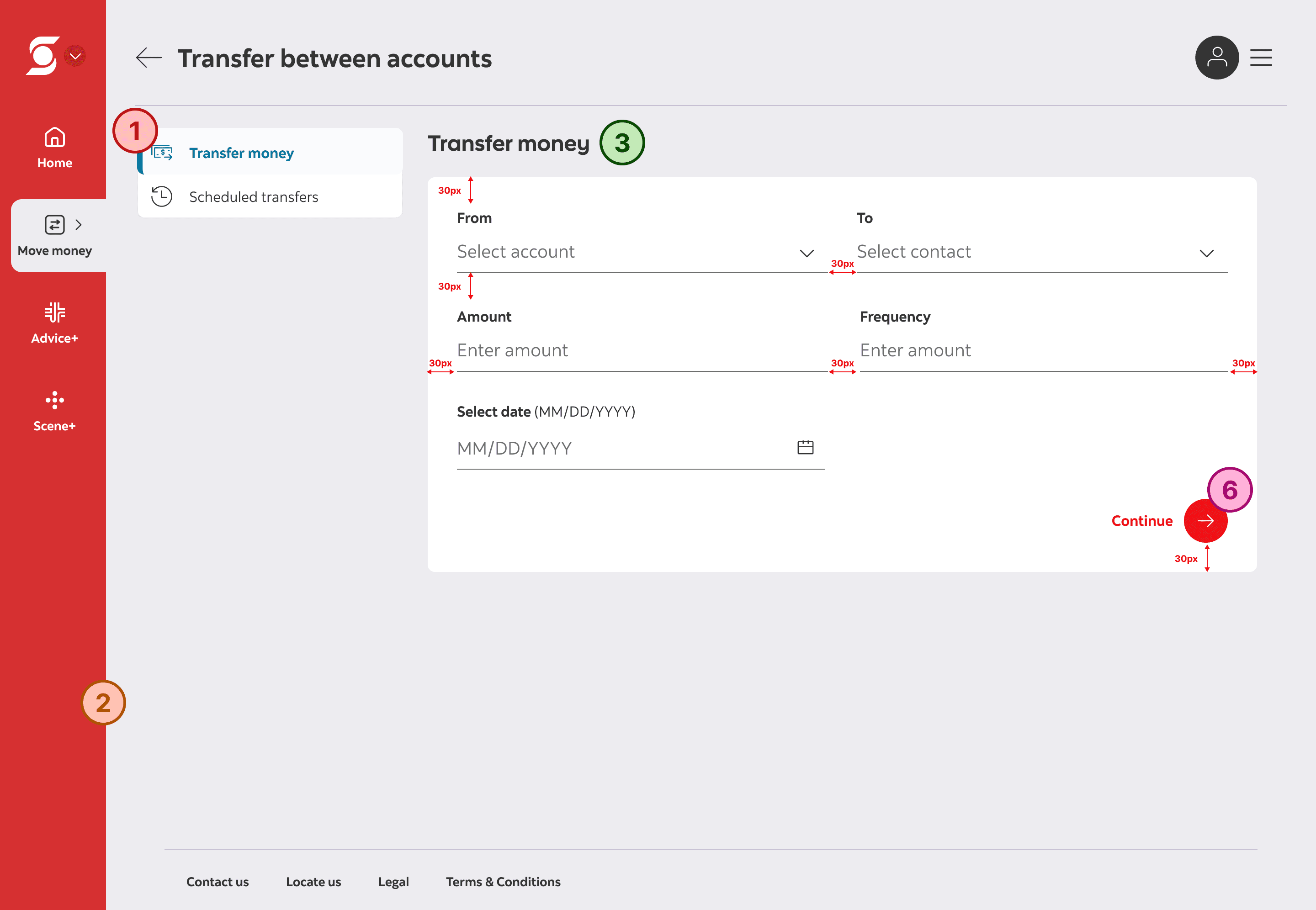
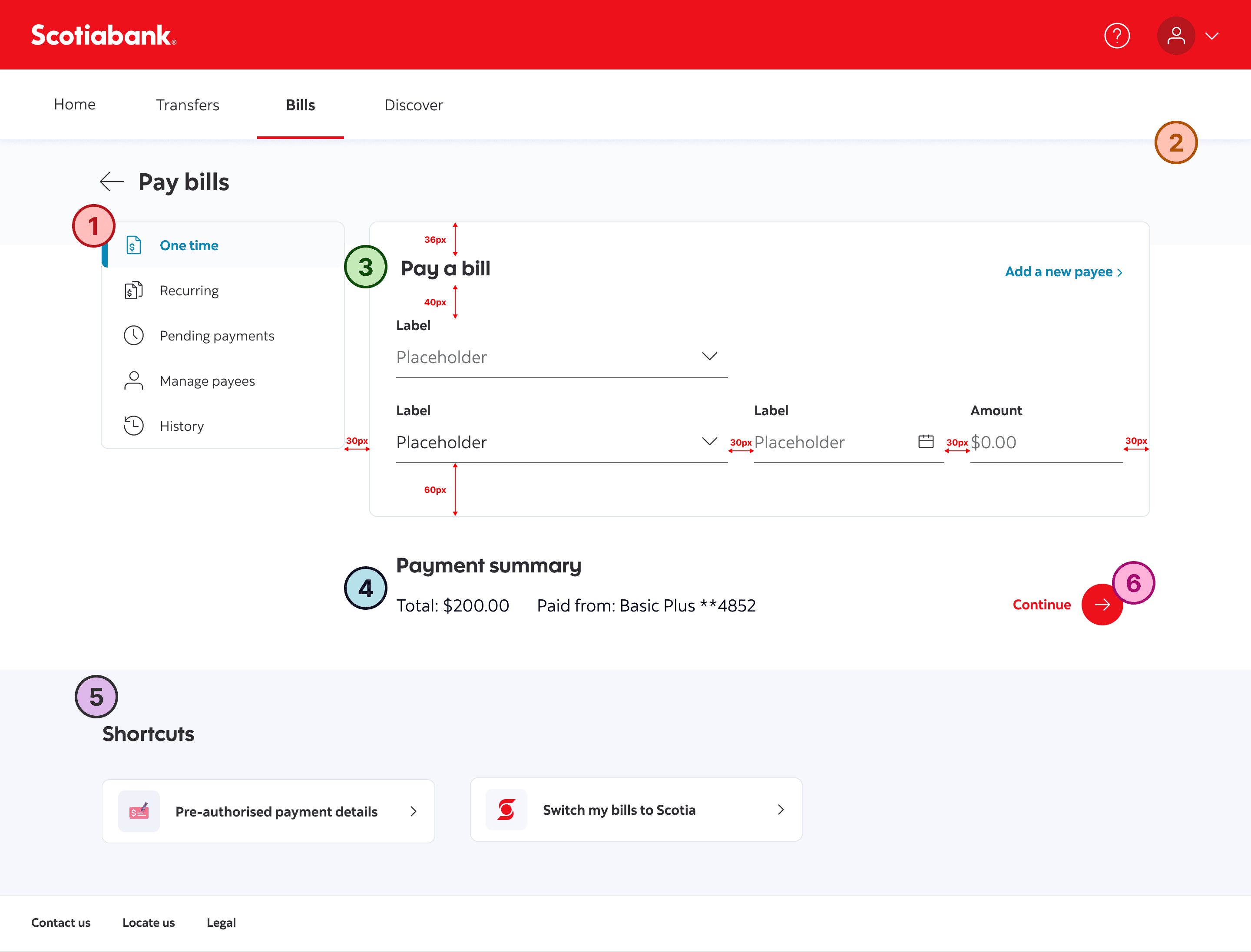
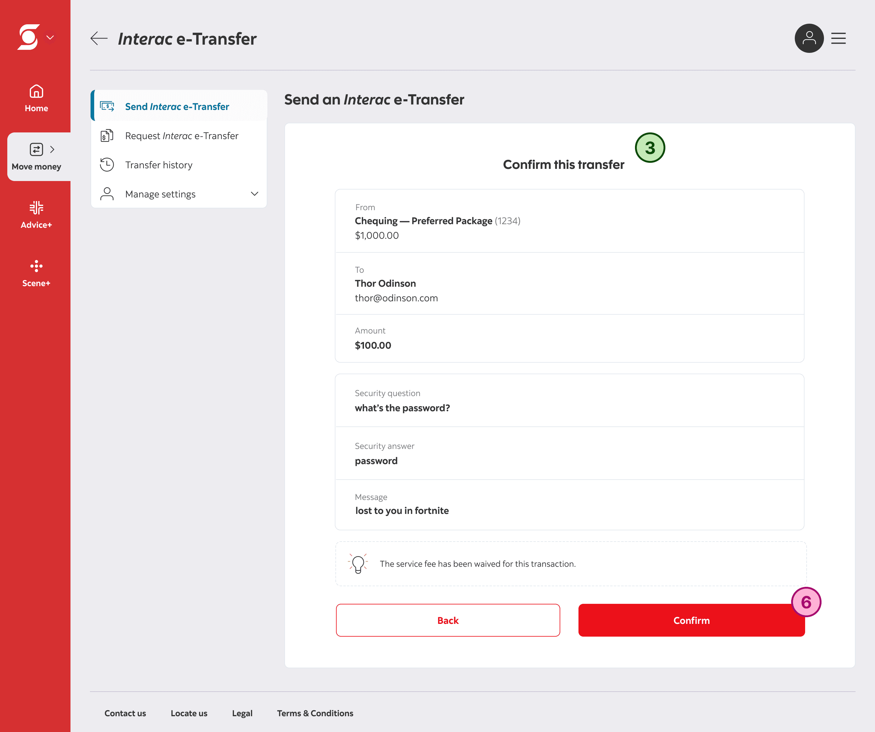
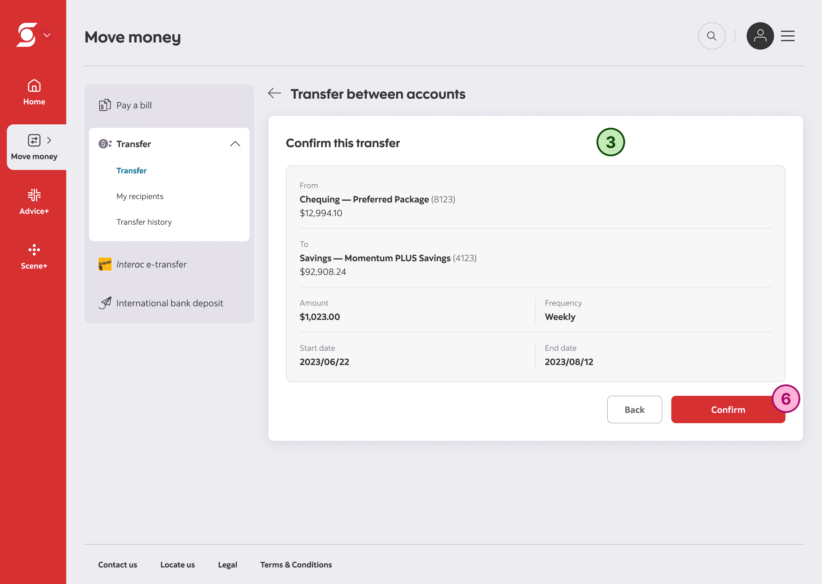
All money movement flows followed the same multi-step structure — input form, review, and confirmation — despite varying input requirements. We used this shared pattern as the starting point for our audit, reviewing each step across all flows to identify inconsistencies. These findings directly informed the rulesets we defined and the components we created.
Input forms
Review pages
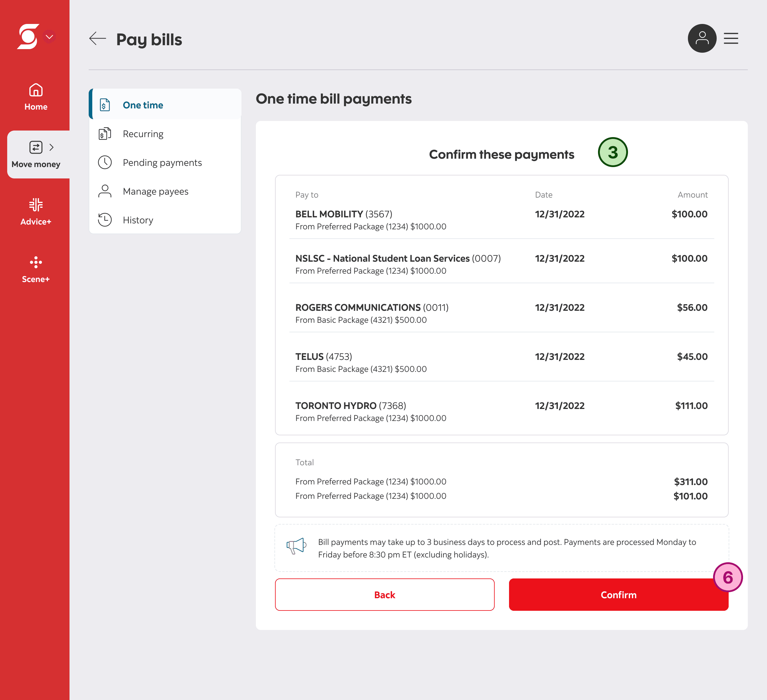
Confirmation pages
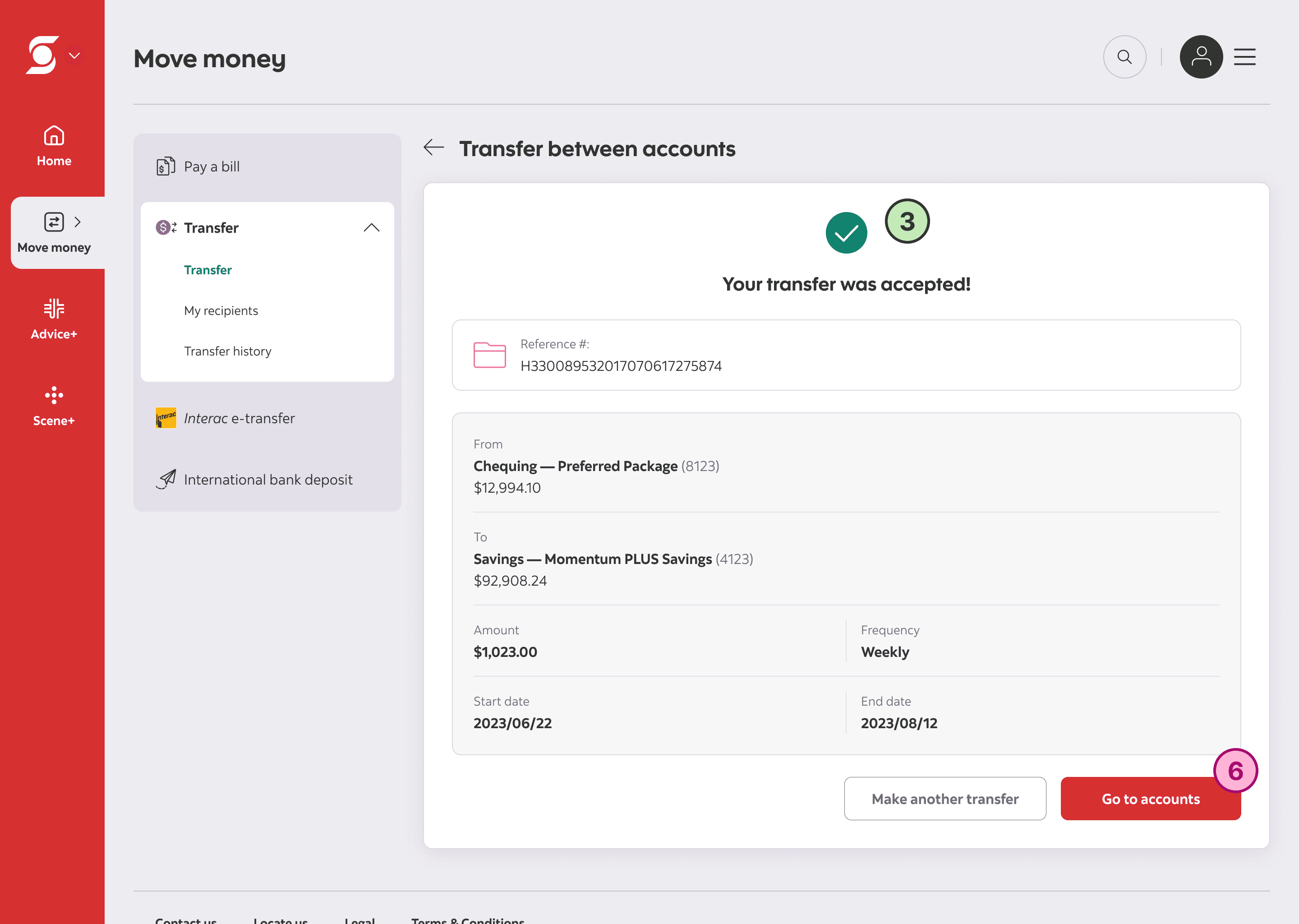
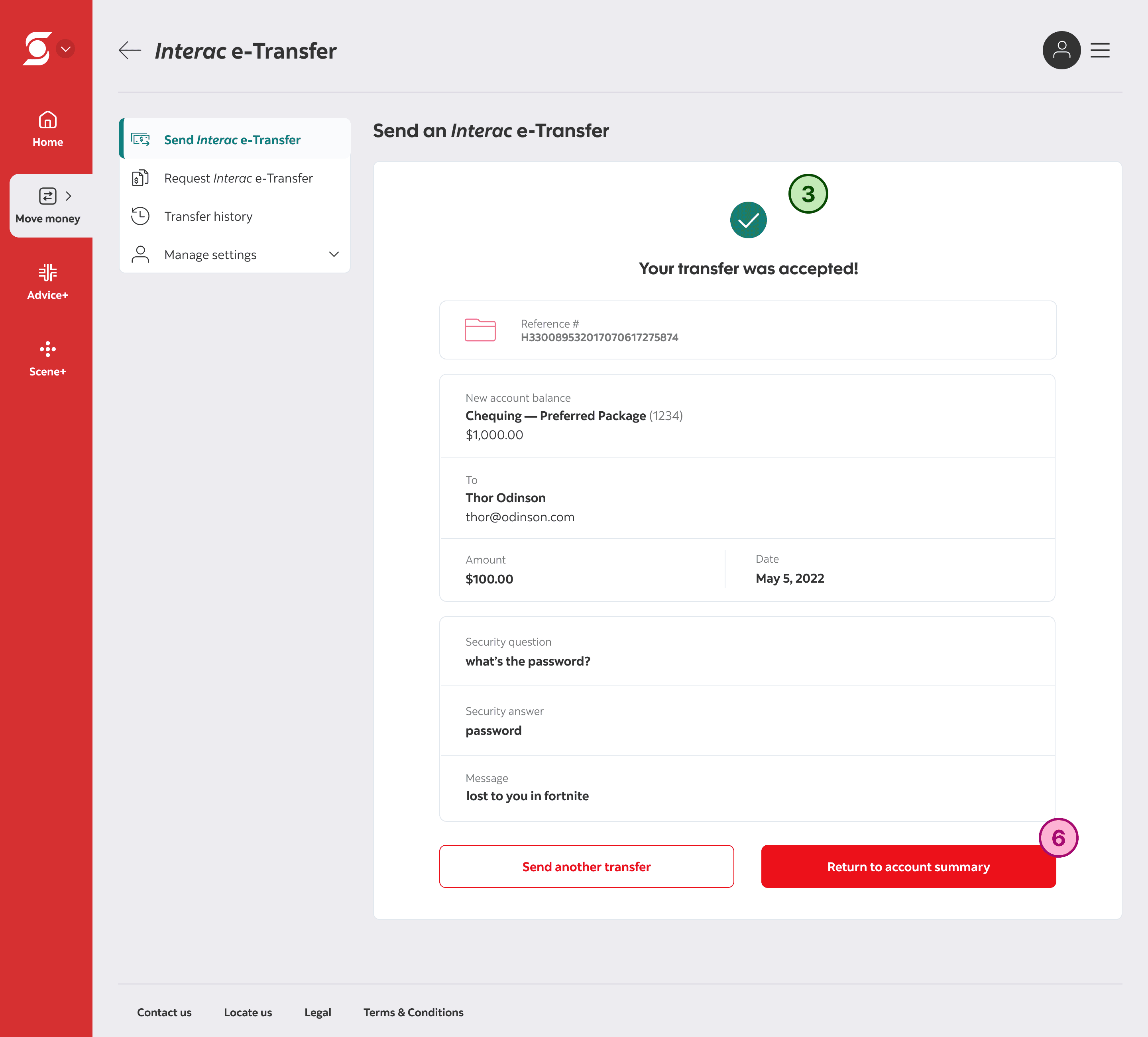
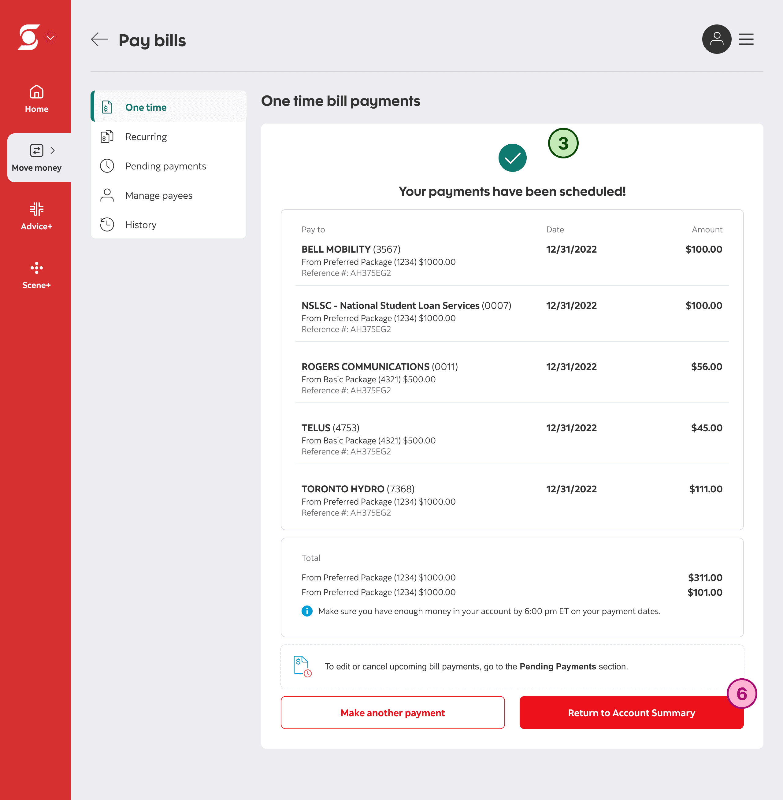
Key problem areas:

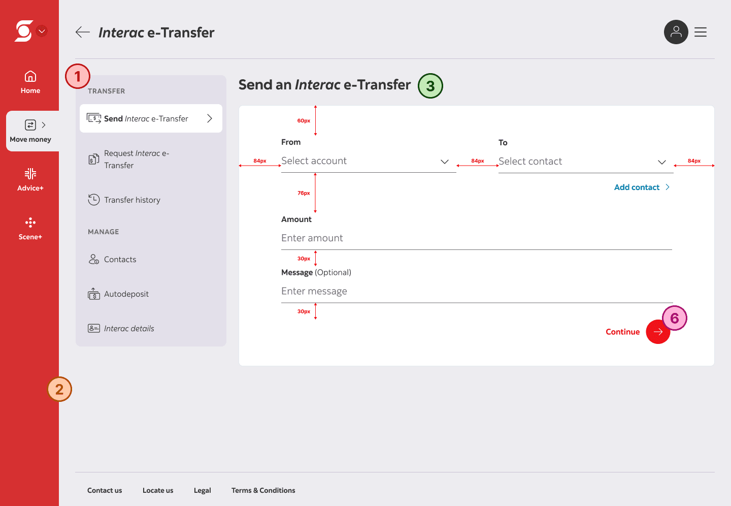
Sub-navigation bar – Inconsistent styling and information architecture across flows

Branding and global navigation – Partial adoption of the new sidebar, with some flows still using legacy headers and logo treatments

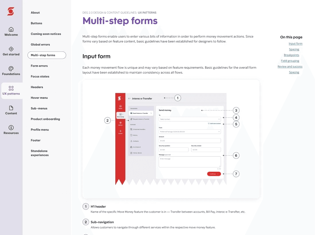
Input form layout – Inconsistent title placement and hierarchy, with uneven spacing (margins and padding) between input fields across flows

Payment summary pattern – Relied on ad hoc, floating copy instead of a reusable component (critical for bill pay)

Shortcuts pattern – existed only in bill pay despite potential usefulness across other flows

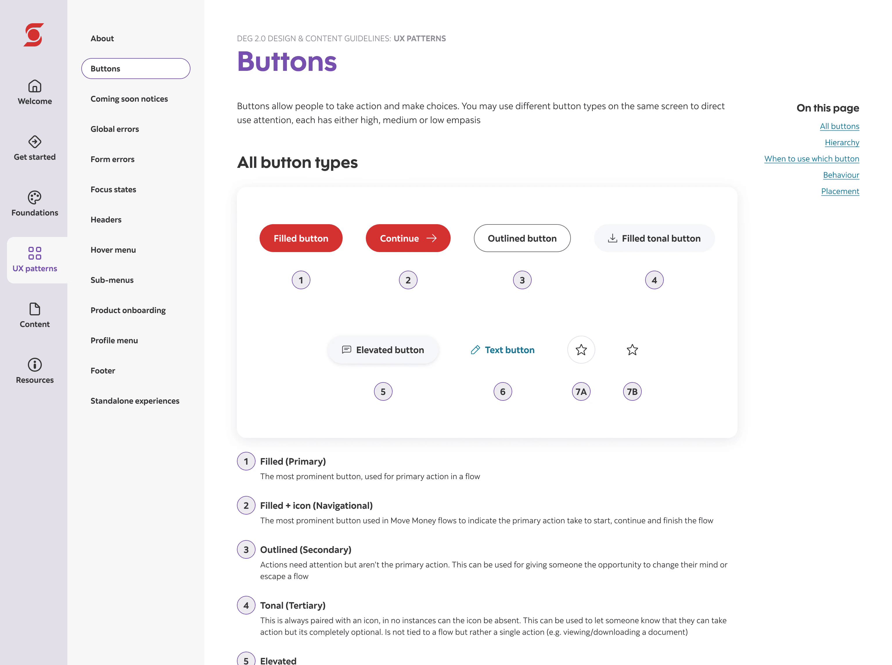
Buttons – No guidelines have been established for consistent sizing and styling across the steps of the multi-step flow.
Solutions:
Sub-navigation bar – Run card sorting activity to identify proper grouping for menu items. Create new sub-navigation component with interchangebale menu items for different flows. Use outlined and filled variations of icons for unselected and selected states.
Branding and global navigation – Apply the new global sidebar and Scotiabank logo across all money movement flows
Input form layout – Establish new input form layout guidelines, following new design system grid system for even spacing between input fields
Payment summary pattern – Create new payment summary component for bill pay
Shortcuts pattern – Relocate shortcut items into sub-navigation to sunset this pattern that only exists in the bill pay space
Buttons – Develop new button components and establish clear rulesets for consistent styling and sizing across the interface
internal audit of mobile screens
They're sisters, not twins
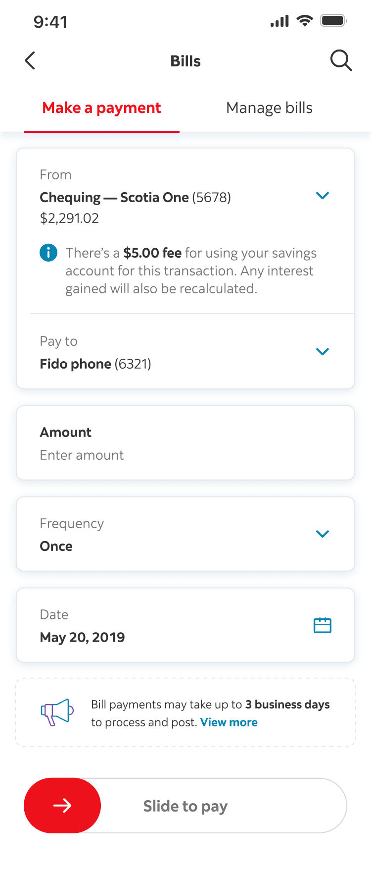
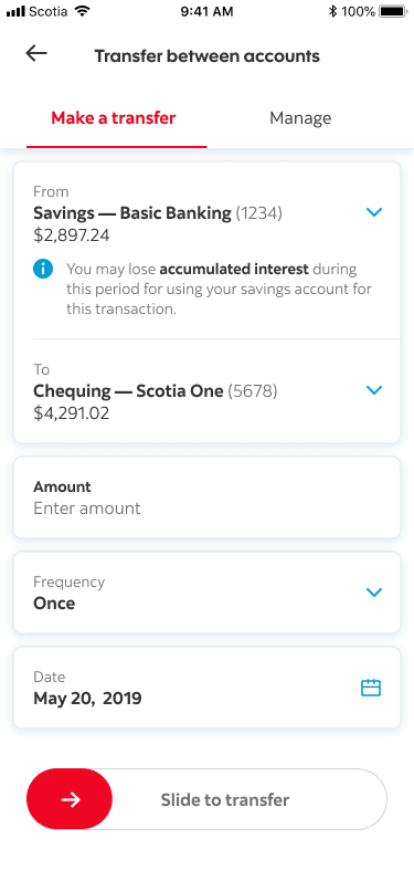
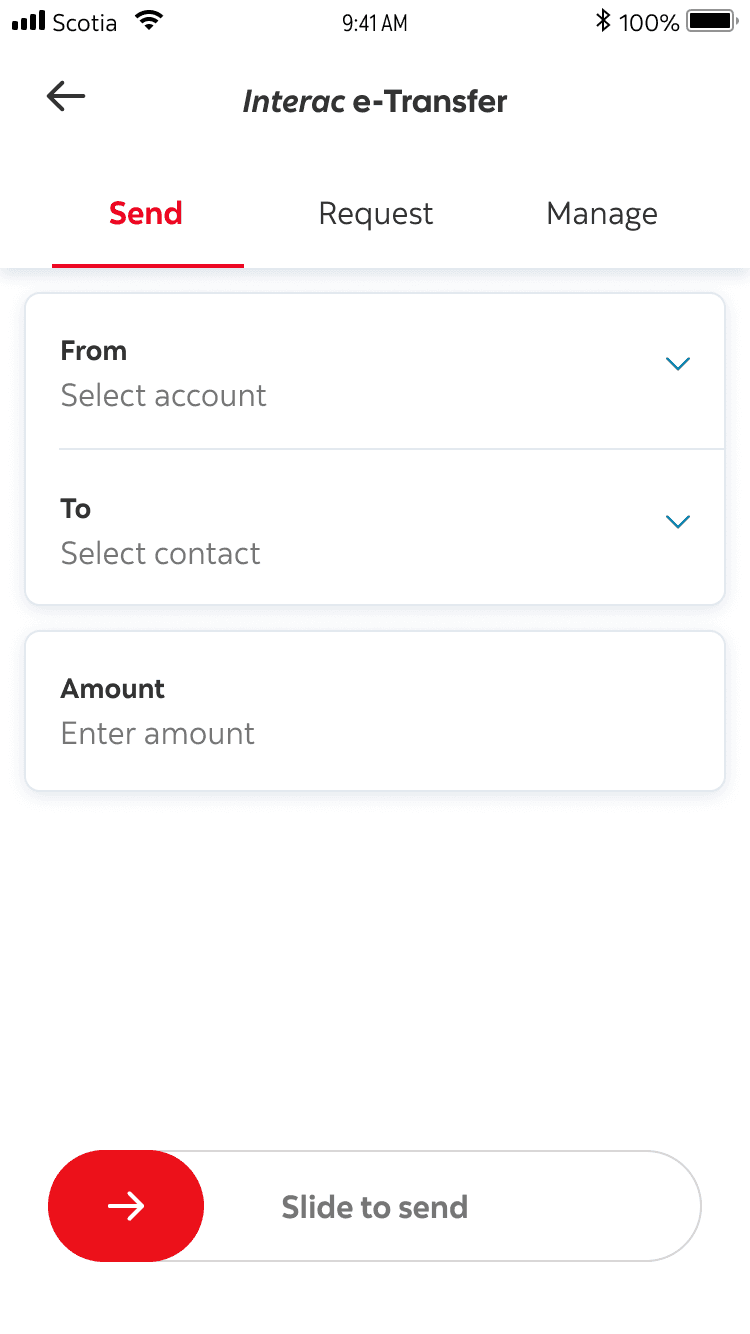
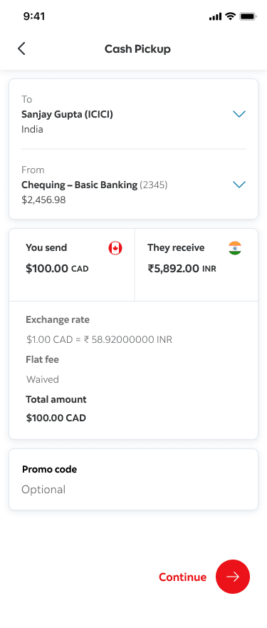
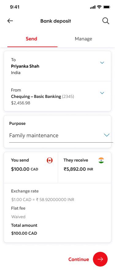
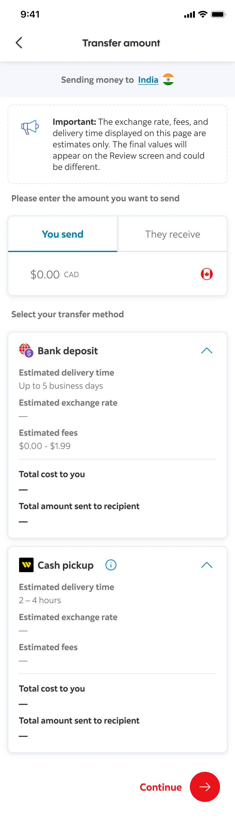
We also reviewed how the Scotia mobile app handles these features in comparison to the web platform. While each platform serves different user needs (web for more complex, power-user tasks and mobile for quick, on-the-go interactions), both still need to maintain consistency in Scotiabank’s overall language and experience.
It’s important to note that the new design system applied only to web, while the mobile app continued to use a separate, established system — creating natural divergence between the two platforms.
IDEATION
So. many. iterations.
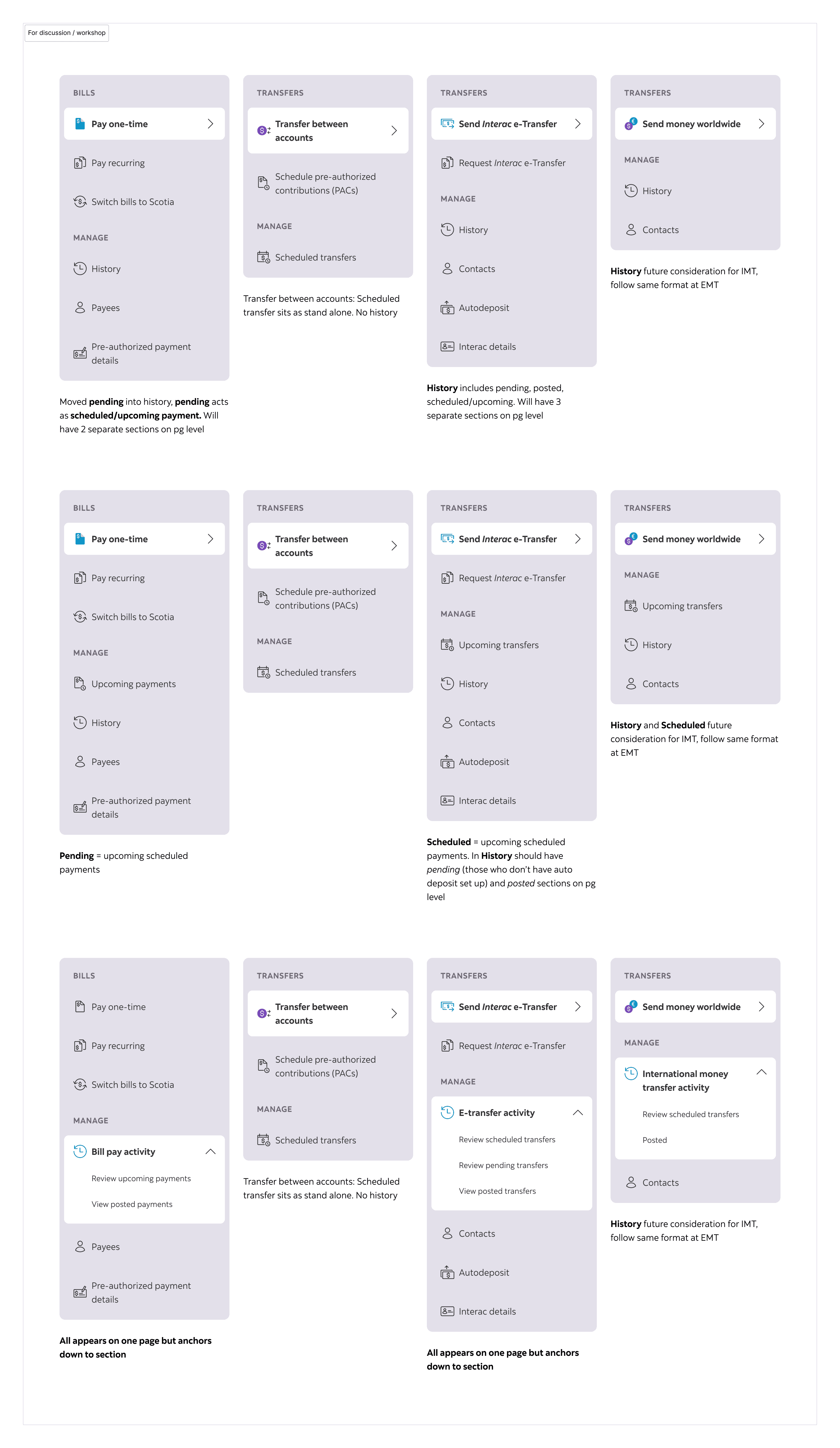
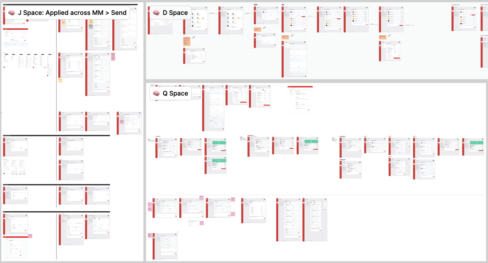
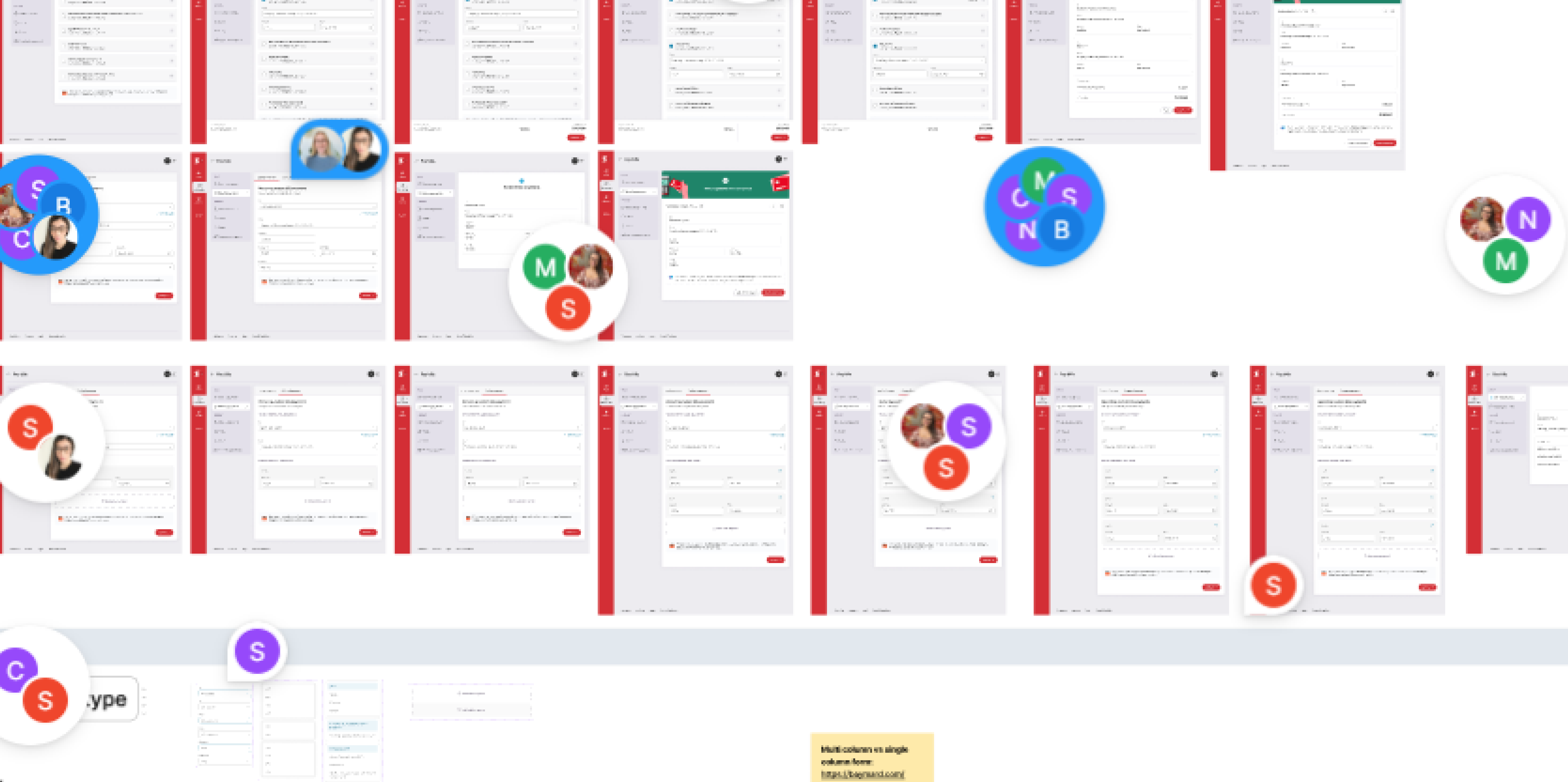
We facilitated multiple design jam sessions to explore key areas of the product, including component styling, sub-navigation patterns, and page layouts for data entry, review, and confirmation flows.
ALIGNMENT
We win as a team
We engaged Scotia’s broader design community to stress test our proposed components and page templates, ensuring they could scale across a variety of use cases. Designers were encouraged to leave comments or reach out directly to surface missing states, edge cases, behavioural nuances, and scalability concerns within their own work.
The final product
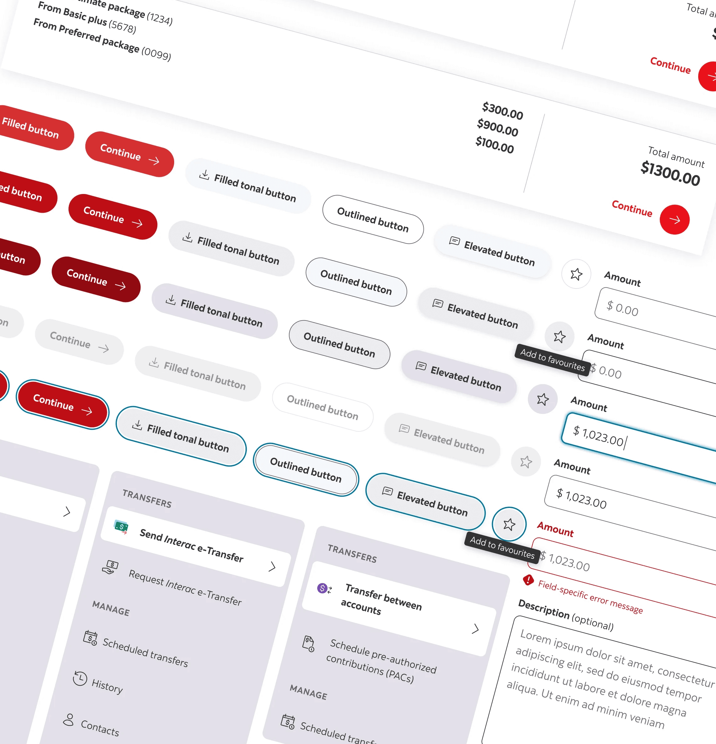
New components
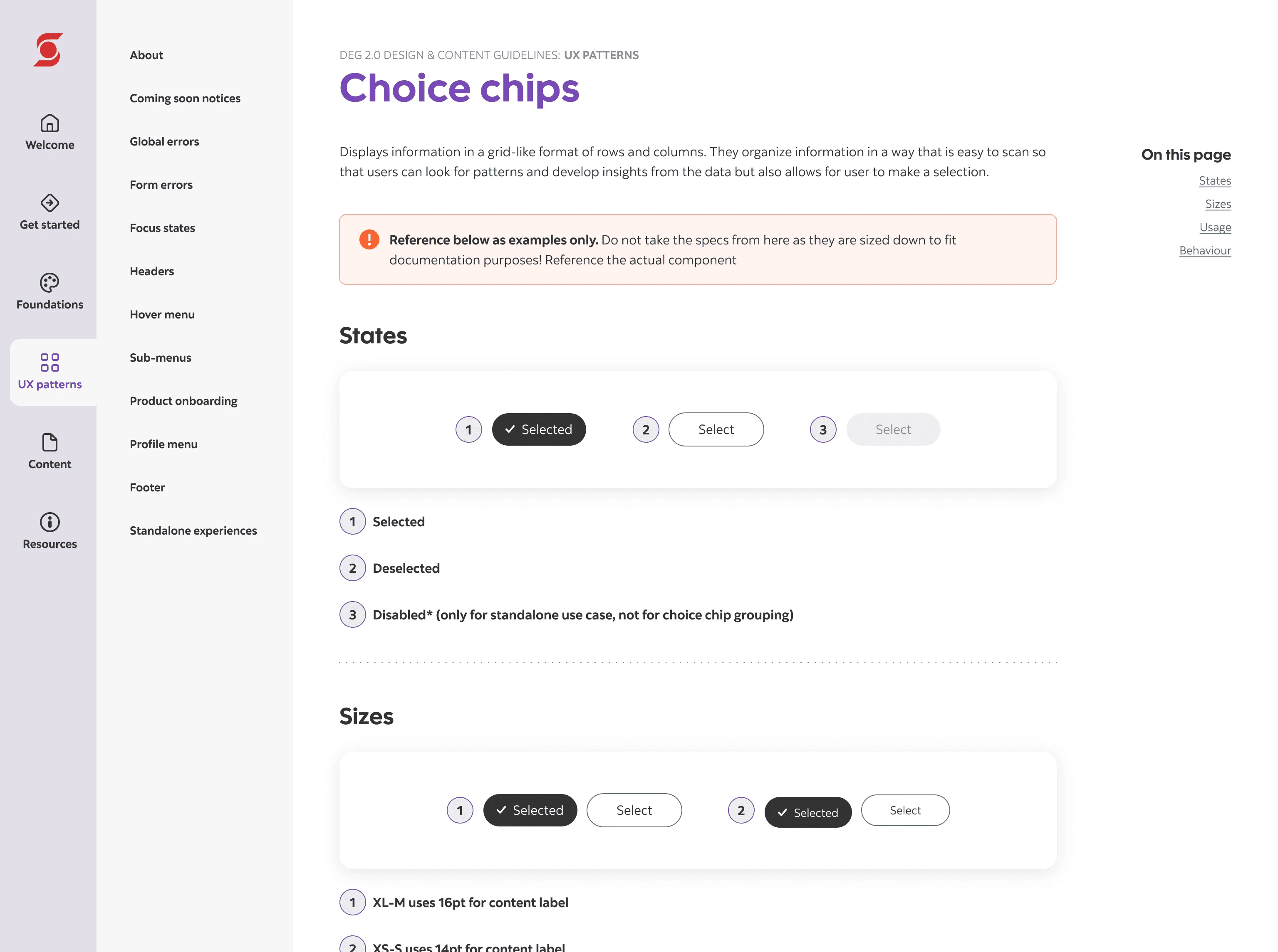
Introduced 10+ new components and updated existing ones in the design library to support diverse money movement use cases, aligning with Scotiabank’s branding and design system.
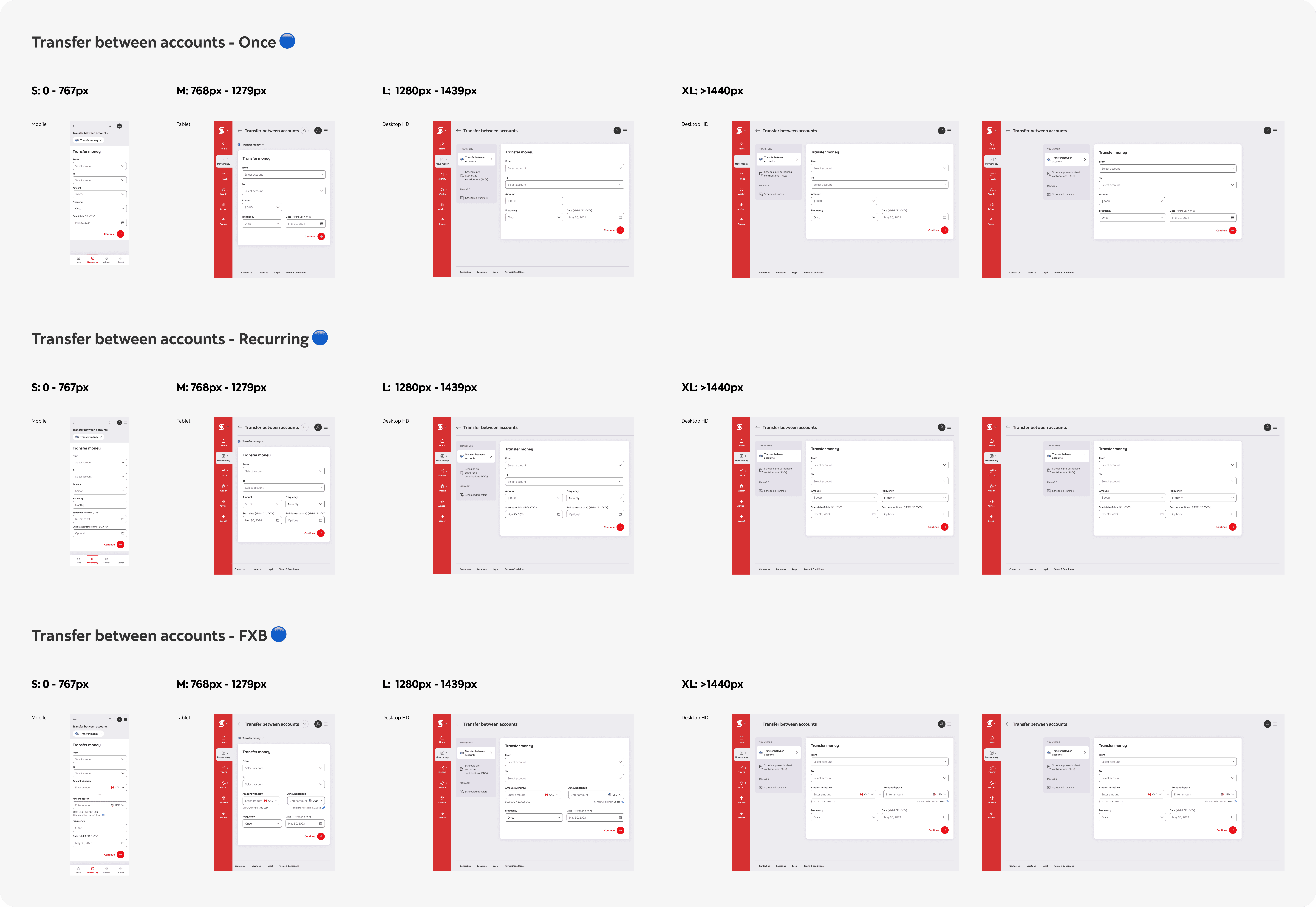
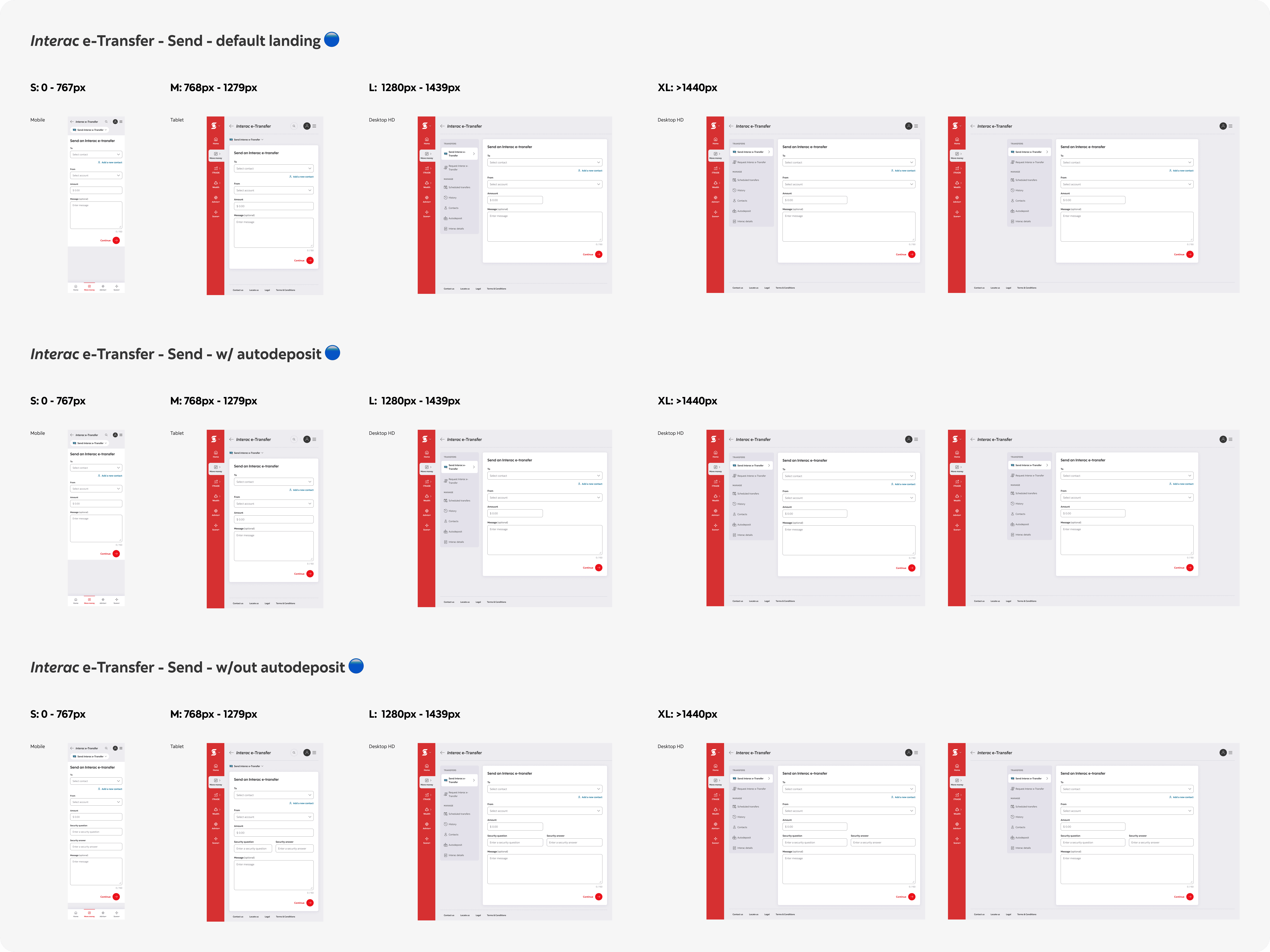
Updated flows
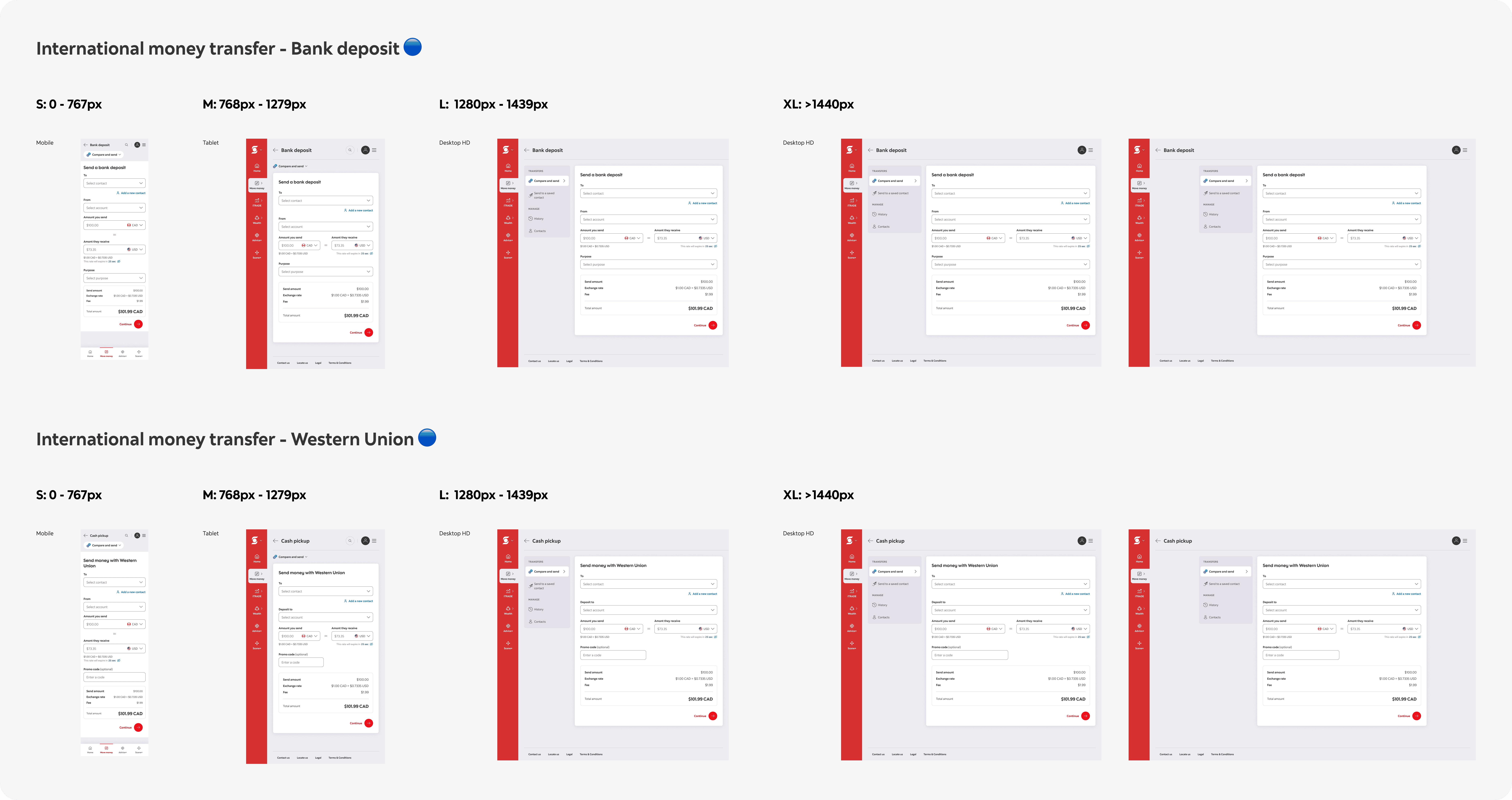
Refreshed all screens across Transfer Between Accounts, Interac e-Transfer, Bill Pay, International Money Transfer, and Balance Transfer using new components and refined patterns (development in progress), creating a more cohesive and consistent experience across the online banking platform.
Comprehensive design guidelines
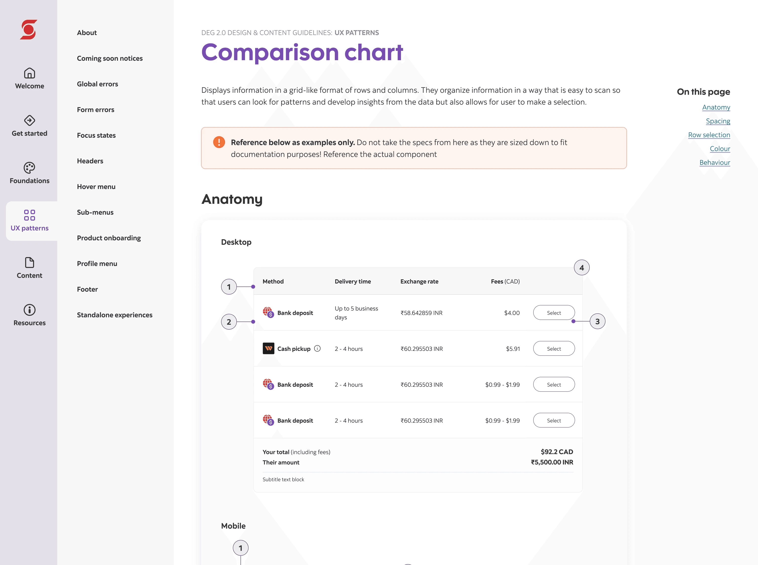
Prior to this work, designers relied on legacy money movement flows as references for new features. While effective early in the modernization effort, this approach wasn’t scalable. We addressed this by documenting comprehensive rulesets and contributing new pages to the web style guide — reducing design and development overhead while improving scalability.
Lessons learned
⏱️ Time management without deadlines is tricky: It helped to define next steps proactively and maintain constant communication with my partners and manager to ensure the work was moving along.
🔨 Break it down: This was a complex project with many possible directions. Breaking the work down into components and page-level patterns made it easier to define clear guidelines which allowed us created a more scalable system that could support a wide range of flows.
🗣️ Be the voice of the customer: This project wasn't requested by the business. My design lead and I identified the problem and pushed to address it. Driving alignment on the need for change and our proposed solutions was challenging, but it resulted in meaningful improvements to the customer experience.