BALANCE TRANSFERS
Improving balance transfer clarity across business, legal, and customer needs
OVERVIEW
Balance transfers allow customers to move debt from another financial institution onto their Scotiabank credit card or line of credit to consolidate balances or take advantage of promotional low interest rates.
Although balance transfer campaigns brought in millions in transferred balances each month, the experience on the legacy platform was difficult to find, unavailable on mobile, and lacked clarity around promotional rates and important terms. This caused low promotion response rates, created hesitation, and reduced customer confidence during the flow.
MY ROLE
I was the sole designer on this project, partnering closely with product, copy, legal, and business teams to redesign the experience to improve discoverability, simplify the transfer flow, and help customers make more informed financial decisions while balancing business goals and legal requirements.
Team
Product designer (me)
Content writer
Legal team
Product manager
Timeline
Nov 2023 - Feb 2024
impact
Improved feature discoverability
Reduced friction
Increased customer clarity
Scalable cross-platform framework
CONTEXT
Understanding balance transfers
Customers with debt spread across multiple credit cards or lines of credit often use balance transfers to consolidate what they owe into a single account with a lower interest rate or a promotional interest rate. This makes their debt easier to manage, track, and pay down over time, giving them temporary relief from high interest charges and helps them focus on reducing their debt without accumulating additional financial pressure.
An opportunity for clarity
Balance transfers involve promotional rates, repayment conditions, and account-specific terms that customers need to clearly understand before moving debt.
While this information existed within the terms and conditions, much of it was buried in dense legal copy that customers were unlikely to read or fully understand. This creates an opportunity to surface important information more clearly throughout the experience while balancing customer clarity, legal requirements, and the original business goals.
Problem discovery
Identifying the friction points
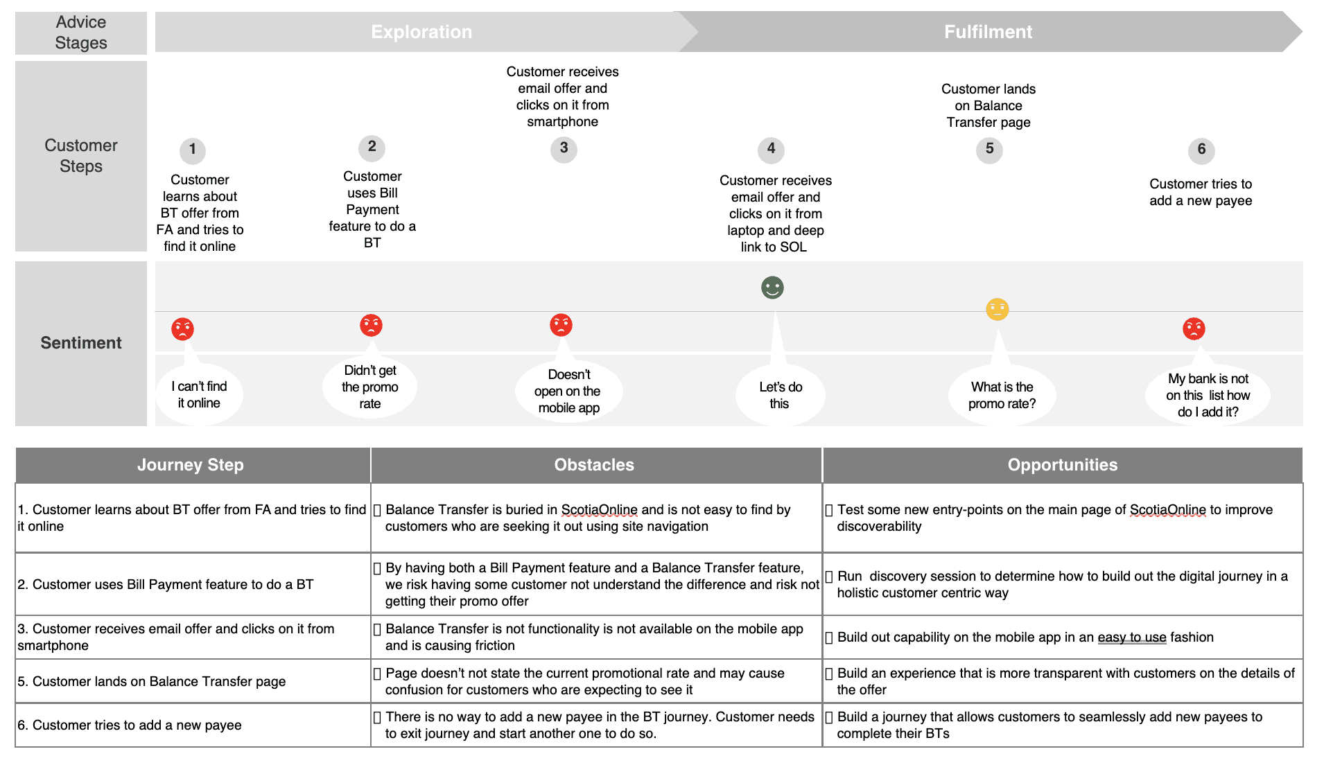
The product team initially approached the project with the business goal of increasing usage of balance transfers and improving response rates on promotional offers. However, after reviewing analytics and existing flows, it became clear that the problem extended beyond discoverability alone. Through journey mapping and flow audits, we identified three key areas of friction.
Problem discovery
Poor discoverability
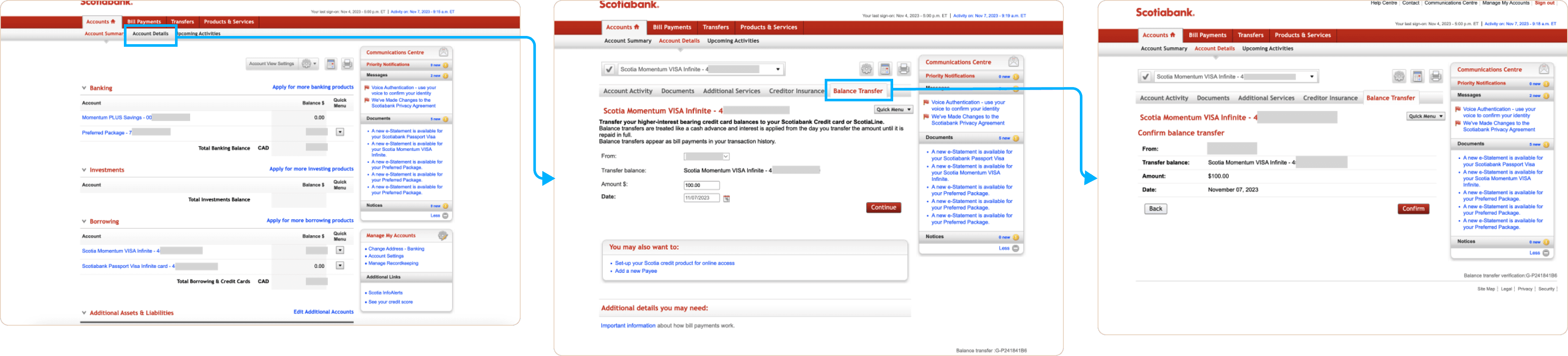
Balance transfers were buried within account details settings, making the feature difficult to find unless customers already knew where to look. The feature was also unavailable on mobile, limiting visibility across key customer touchpoints. This created a disconnect between promotional campaigns driving awareness and the actual product experience needed to complete the task.
PROBLEM DISCOVERY
Broken mental model
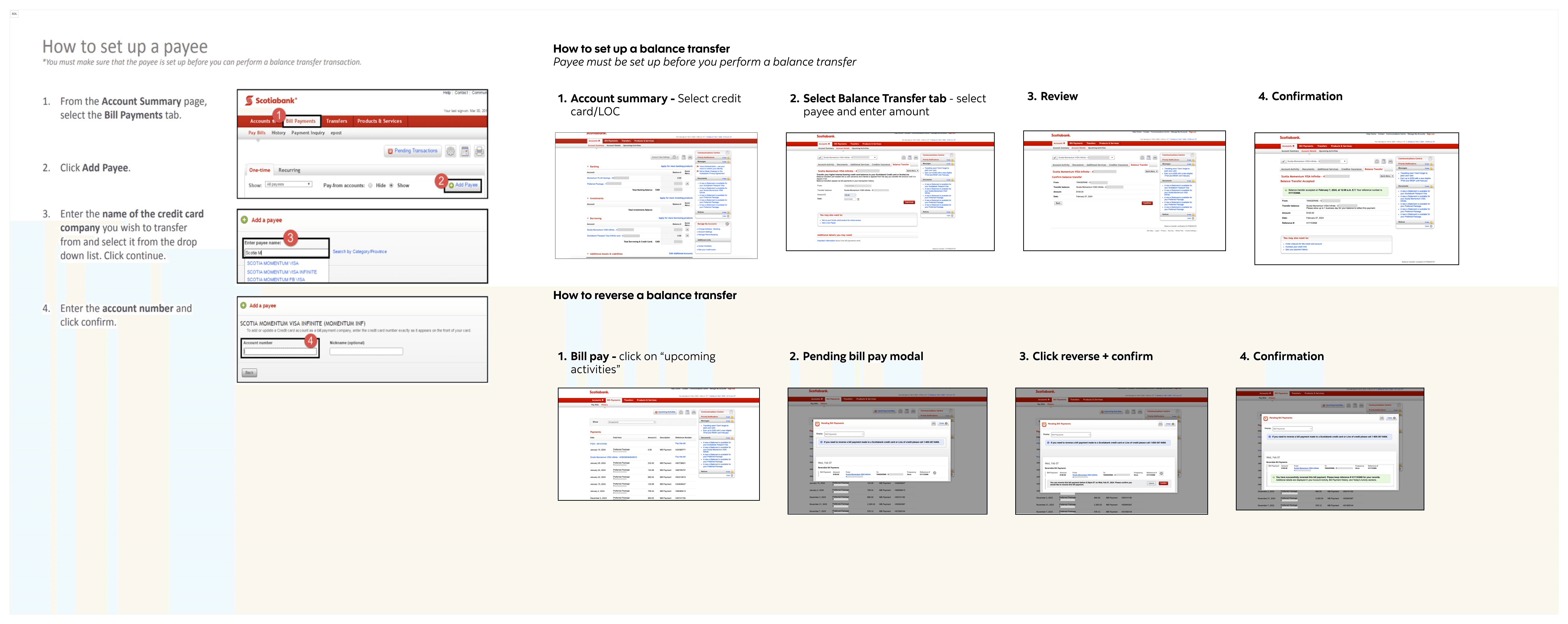
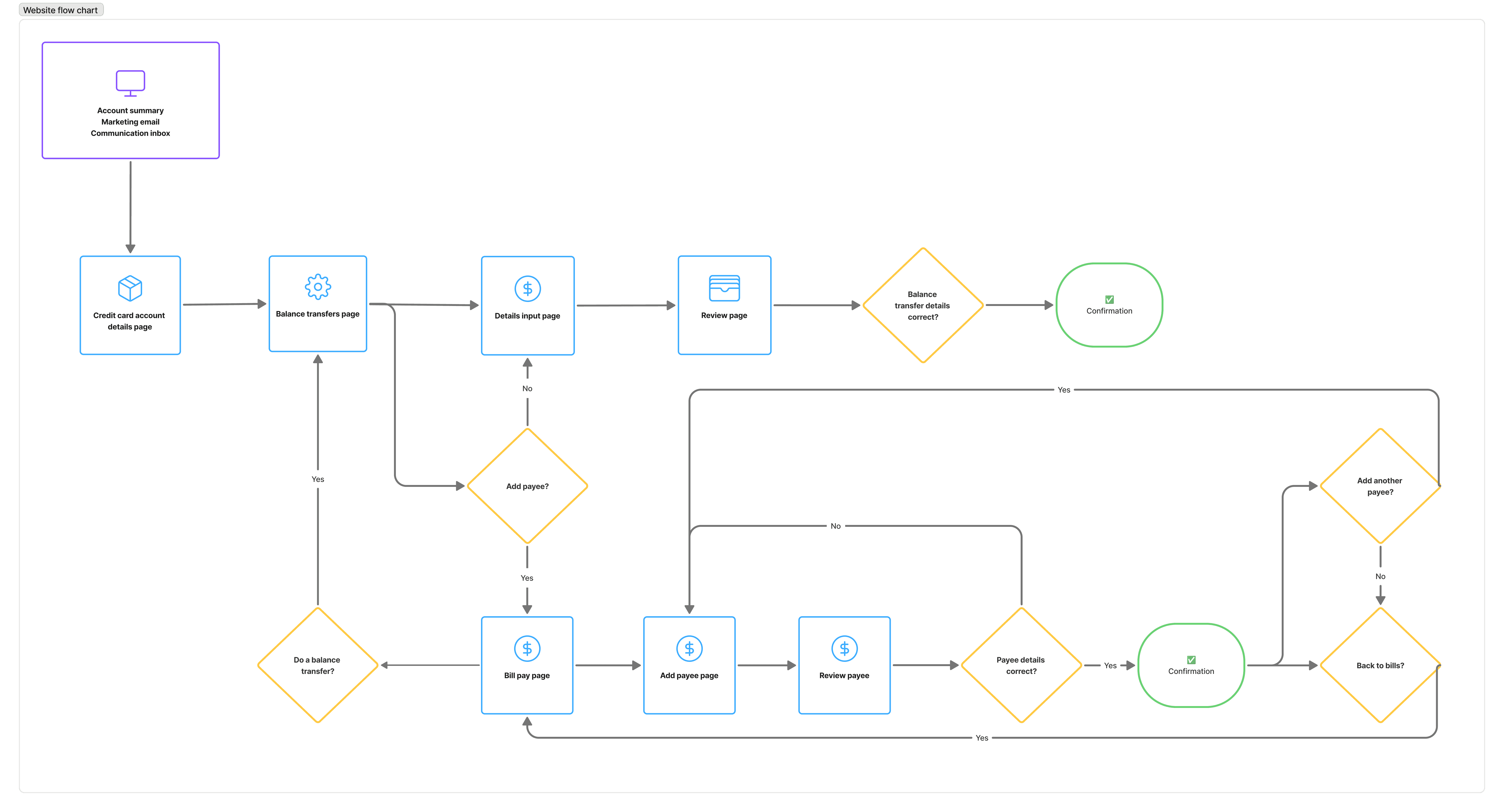
Balance transfers was its own separate feature, but key tasks within the experience required customers to navigate to the Bill Pay feature to complete them.
For example, if customers needed to add a new external credit account as a payee or reverse a balance transfer, they had to leave the flow, navigate to Bill Pay, complete the task there, then manually return to Balance Transfers to continue.
On top of that, after completing these actions, customers were redirected to the Bill Pay landing page instead of back to Balance Transfers, creating confusion around whether they were still completing the same process.
PROBLEM DISCOVERY
Lack of clarity during a high-risk financial task
Customers were often unsure whether promotional rates had been applied, what terms applied to the transfer, or what financial implications came with moving debt between accounts.
Much of this information existed within dense legal copy, making it difficult to digest at critical decision-making moments. This created hesitation and reduced confidence during the flow.
PROBLEM STATEMENT
HMW improve the discoverability and clarity of the balance transfer experience to increase usage while helping customers make informed decisions?
IDEATION
Finding a home for Balance transfers
Although the feature followed the same input → review → confirmation pattern as other money movement experiences, it wasn’t considered a high-frequency task like bill payments or account transfers, so it didn’t naturally fit within the Move Money space. As a result, the challenge was less about creating new UI and more about determining where balance transfers should live within the existing information architecture.
IDEATION
Legal requirements vs. business needs vs. customer advocacy
The real challenge was determining how much information customers needed throughout the experience to make informed financial decisions without creating unnecessary friction. Through multiple rounds of iteration and collaboration with product, business, and legal partners, we focused on three key content challenges:
Making promotional rates clear
Customers were often unsure whether a promotional balance transfer rate had been successfully applied. We explored ways to make promotional rates more visible and reassuring throughout the flow while maintaining consistency with existing patterns.Surfacing important information contextually
Many important balance transfer conditions existed within lengthy terms and conditions that customers were unlikely to read. The challenge was determining which information should be surfaced directly within the experience to improve clarity without overwhelming customers, including how proactively we should surface financial guidance like credit limit warnings.Designing for different financial strategies
One of the most nuanced discussions centered around automatic payment settings. The business wanted to encourage customers with “pay in full” automatic payments to switch the setting to "pay the minimum" in order to maintain their promotional balance transfer rate. However, this raised questions around customer intent and financial responsibility. Some customers may want to aggressively pay down debt as quickly as possible, while others may intentionally use balance transfers as part of a broader financial strategy. Rather than pushing customers toward a single financial behavior, we aligned on a more neutral approach focused on informing customers of the implications of their payment settings so they could make decisions based on their own financial goals.
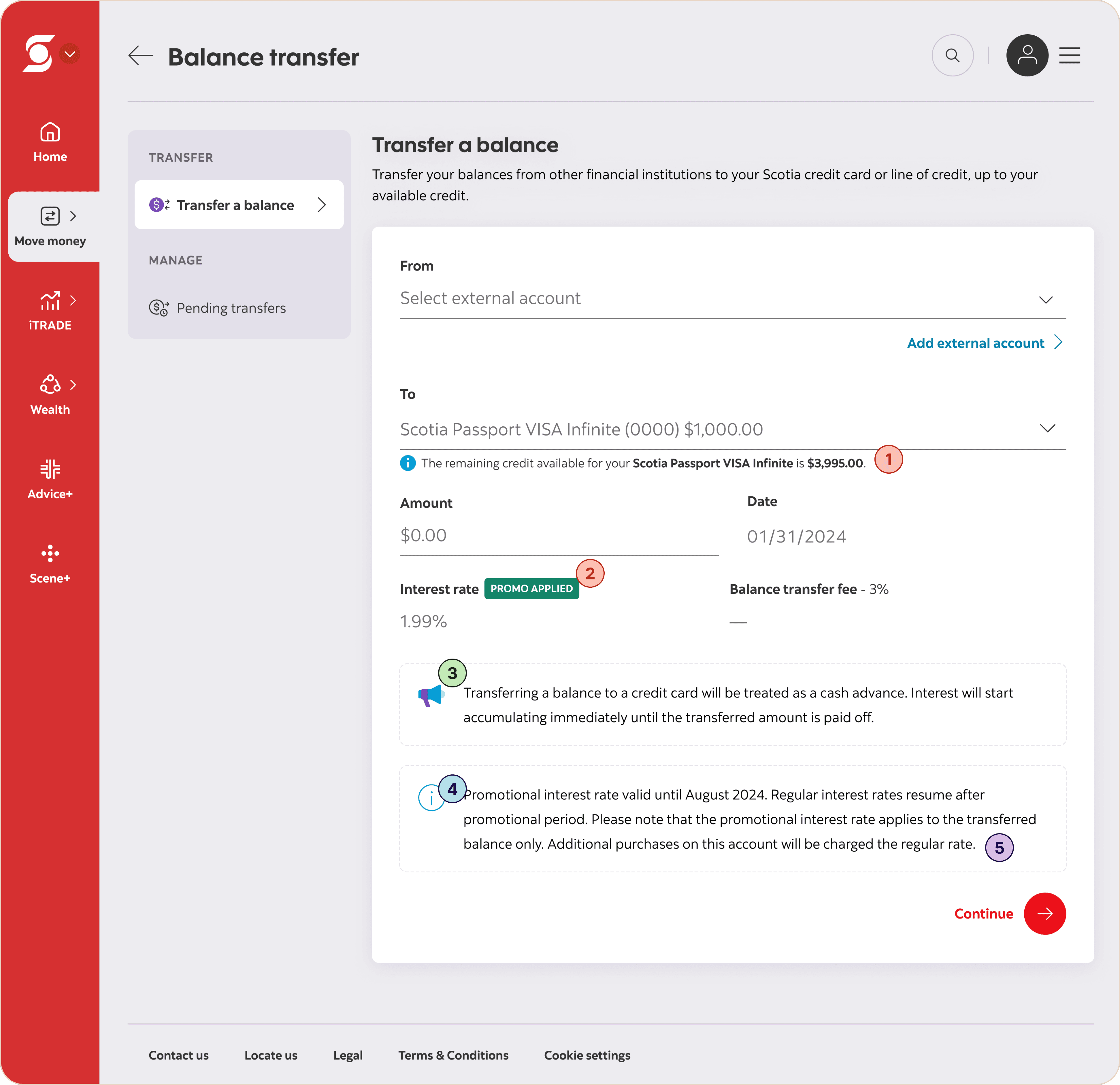
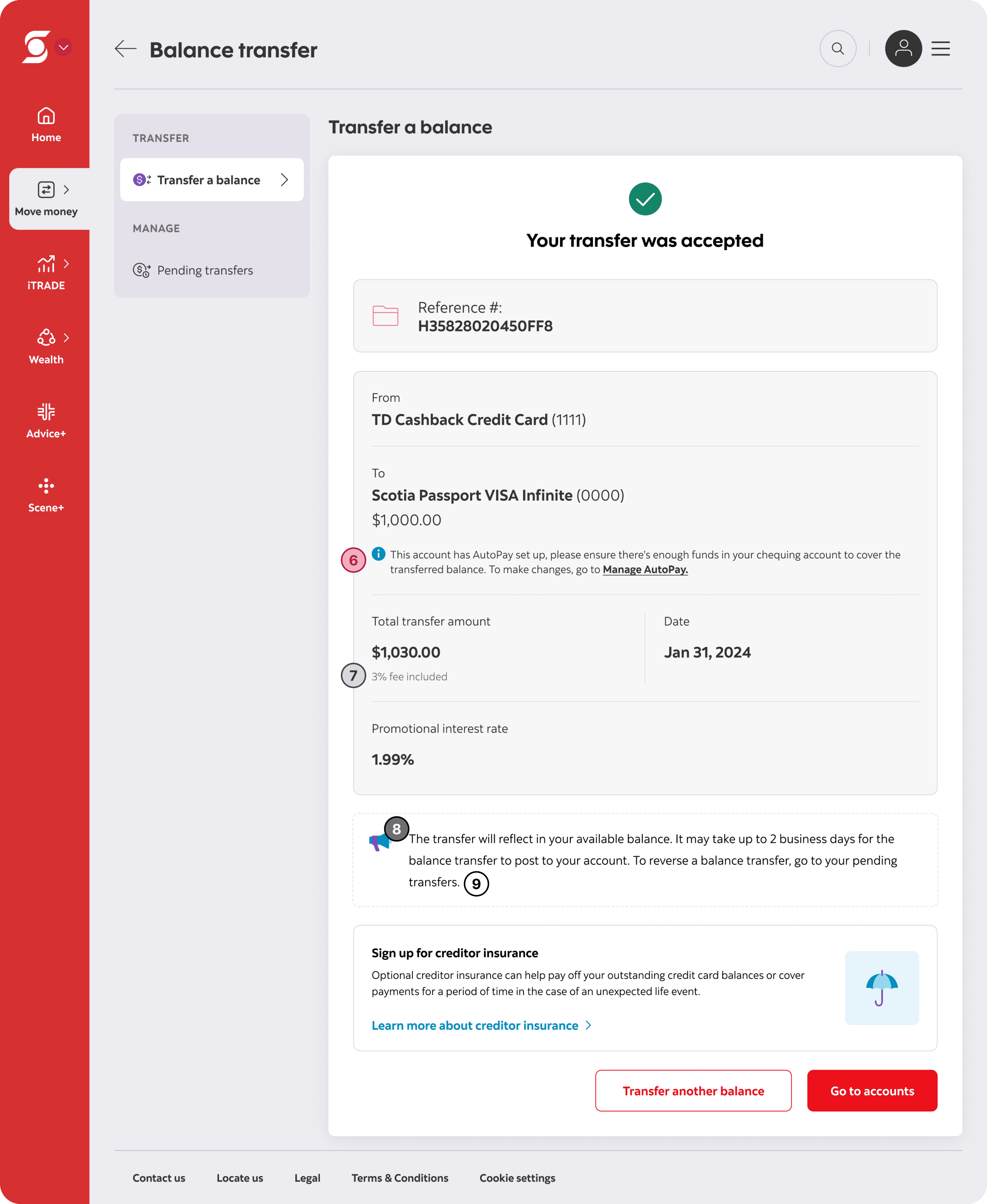
Example iteration we explored that had too much content to be digestible:

Remaining balance informing customer of how much room they have left to transfer over a balance before touching their credit limit

Promotion badge indicating the promotional amount has been applied

Cash advance buddy tip notifying customers that interest starts accumulating right away until the transferred amount is paid off

Promotion buddy tip telling customers the end date of the promotion

Promotion buddy tip telling customers that the promotional interest rate applies to the transferred balance only and any purchases made on the same account will be charged the regular rate

Info tip on confirmation screen telling customers their account has automatic payments turned on and to ensure enough funds are in their account to covered the transferred balance

Transfer fee under total transfer amount

Buddy tip telling customers their transfer will reflect in their available balance and will post in up to 2 business days

Buddy tip giving reversal instructions
IDEATION
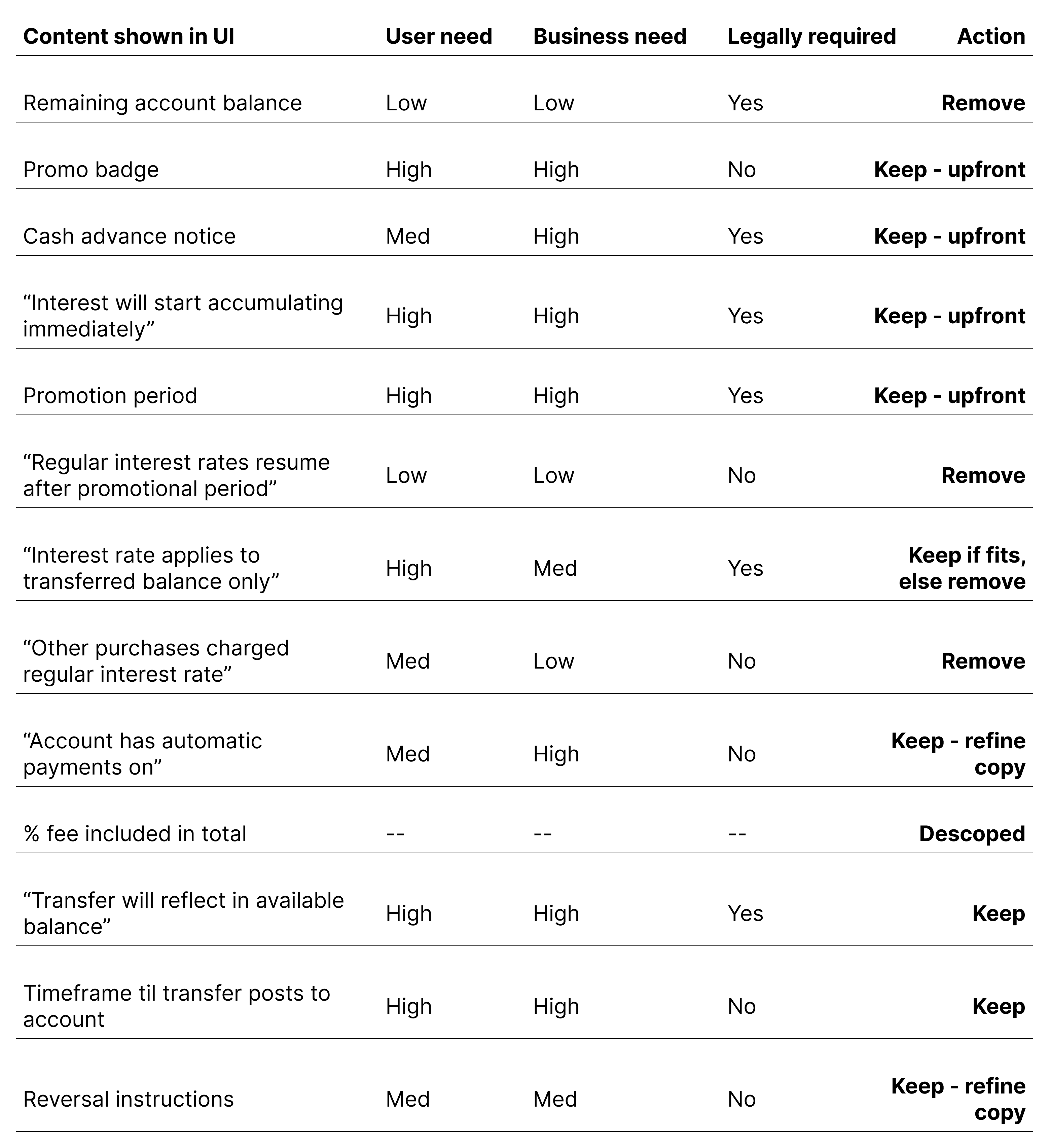
Workshopping the content
I first conducted an independent content prioritization exercise to evaluate which information customers truly needed upfront, what could be progressively disclosed, and what could be simplified or removed altogether. I then reviewed and refined the framework alongside the product manager and business stakeholders to ensure the final experience balanced customer clarity, legal requirements, and business goals without overwhelming users during a sensitive financial task.
final designs
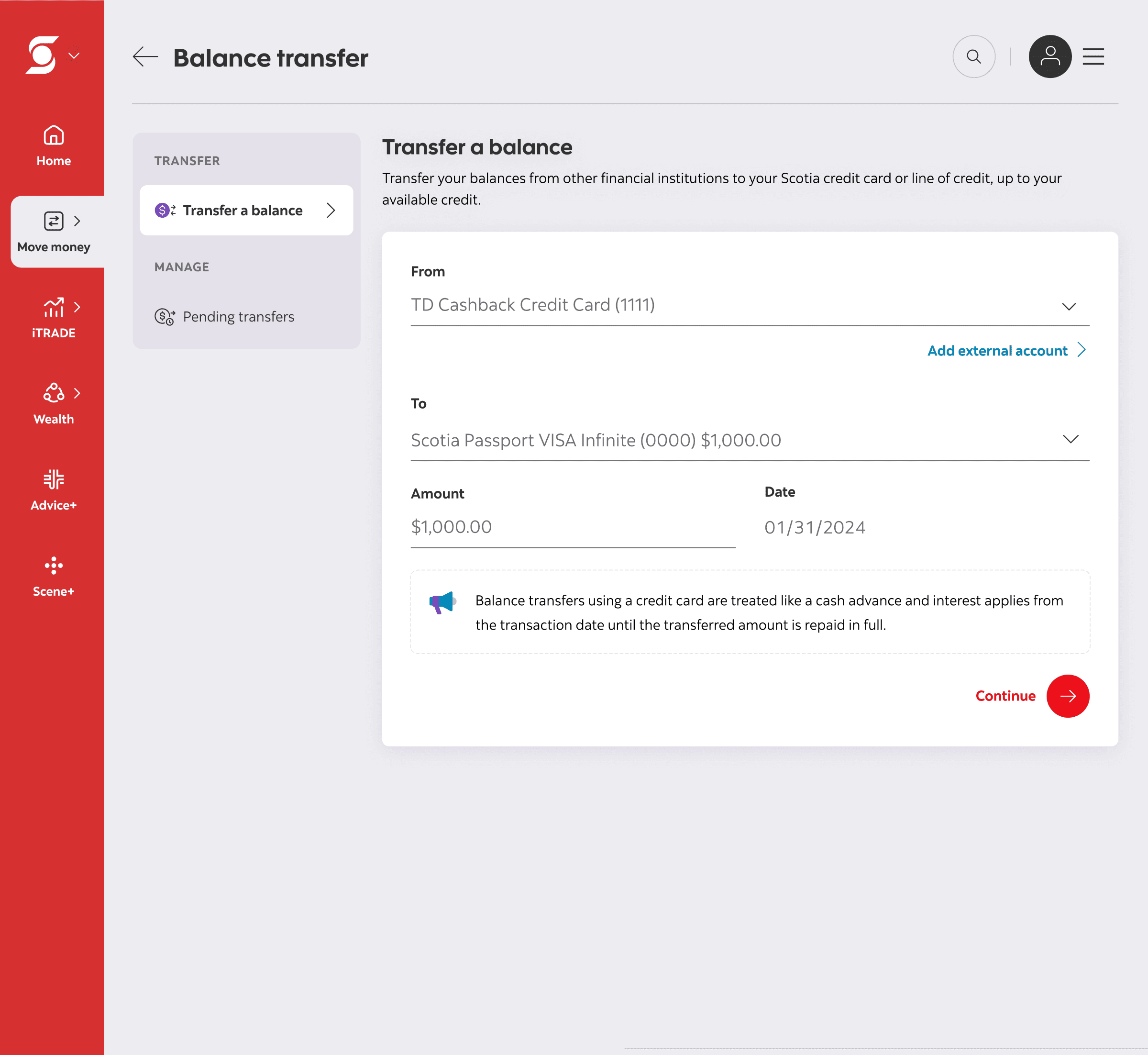
The final designs
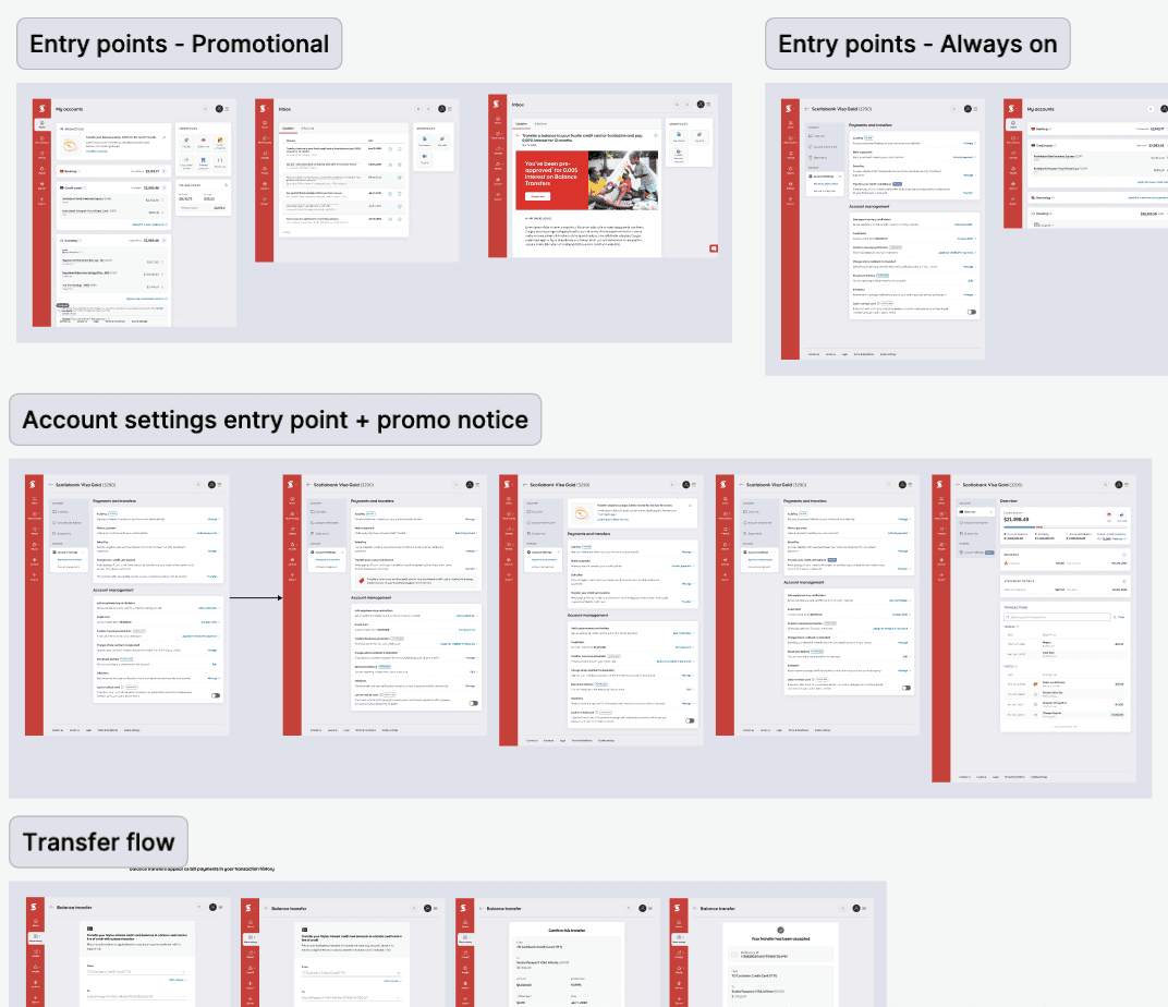
Improved discoverability through multiple entry points
To make balance transfers easier to find, I introduced new entry points across both mobile and web while still respecting existing customer mental models.
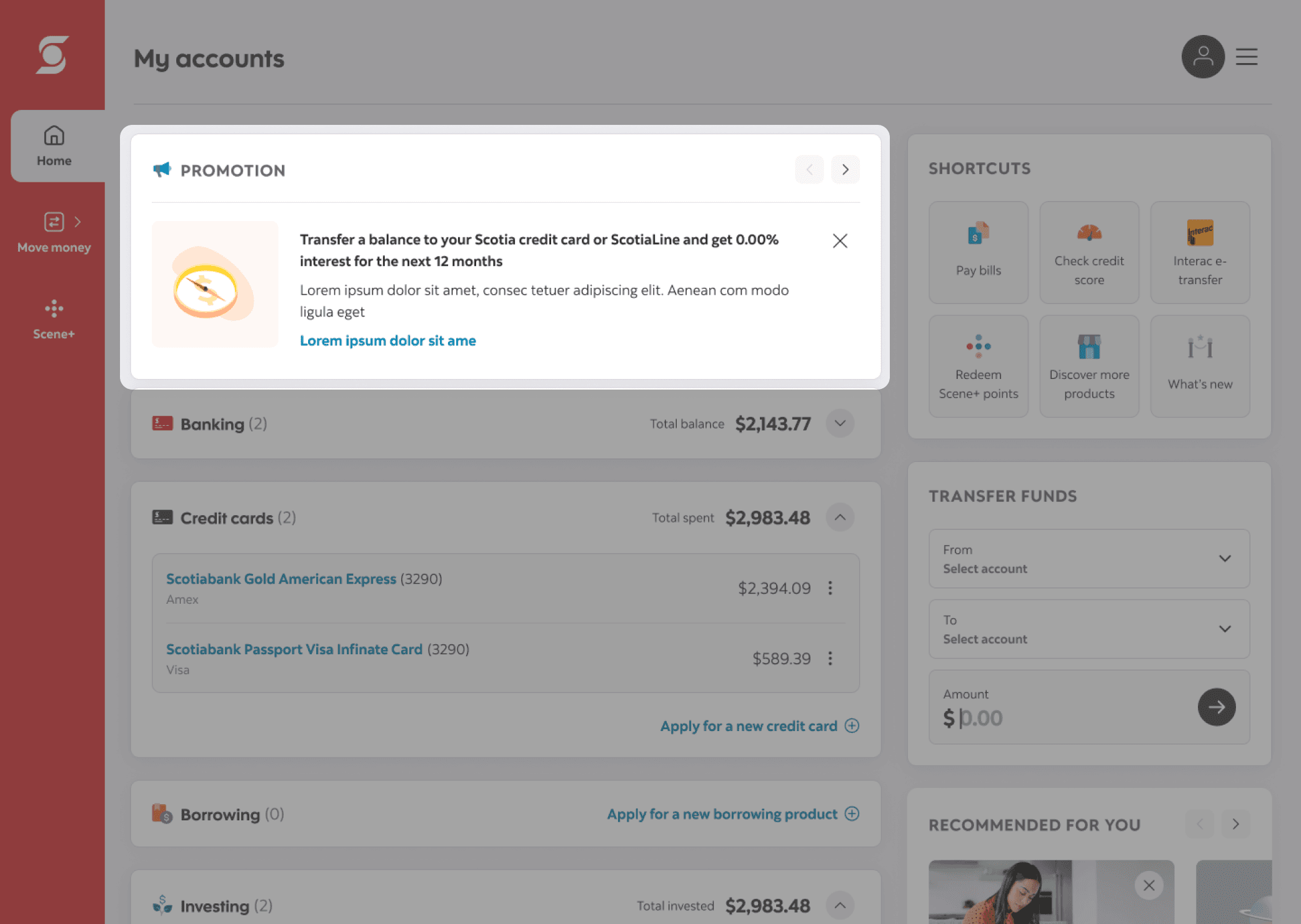
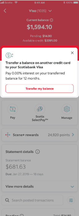
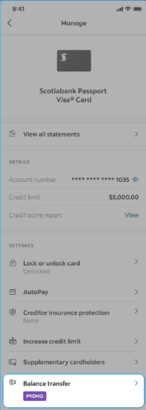
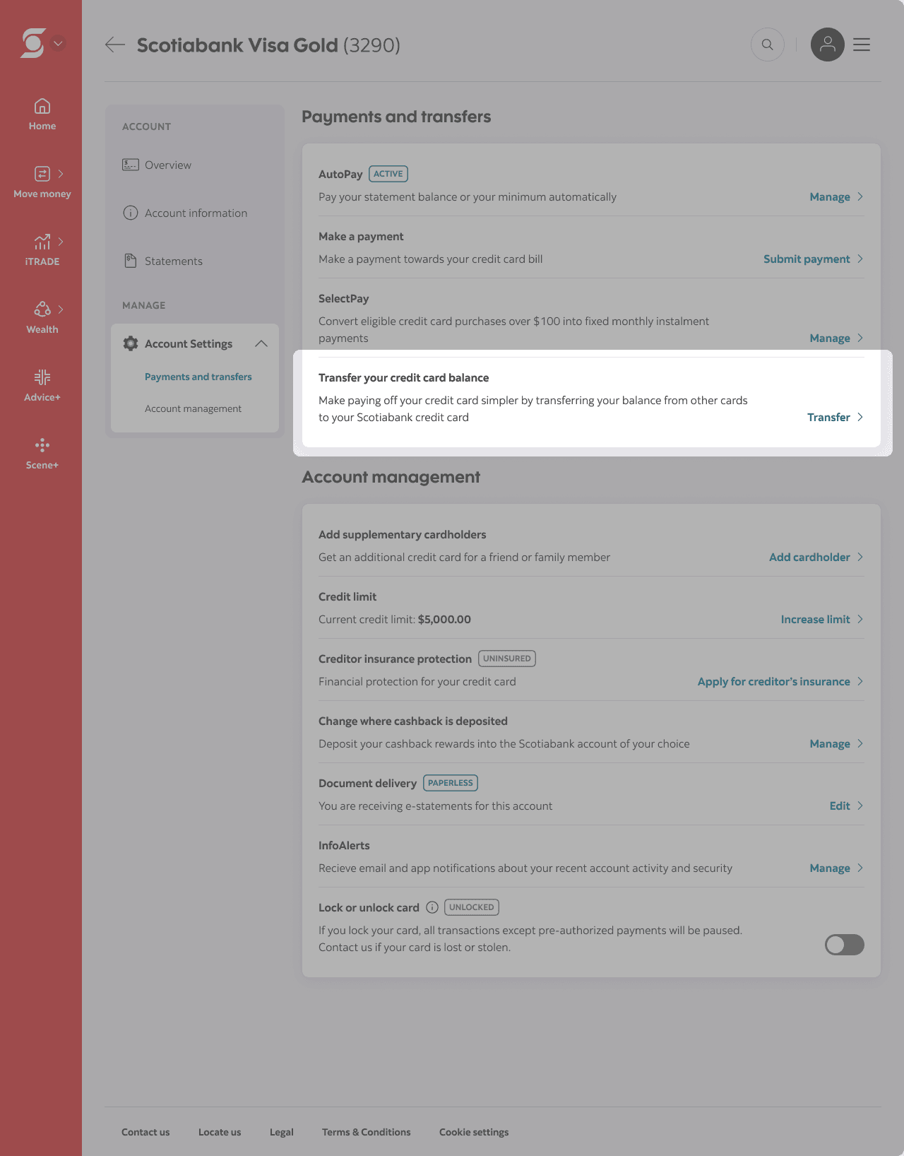
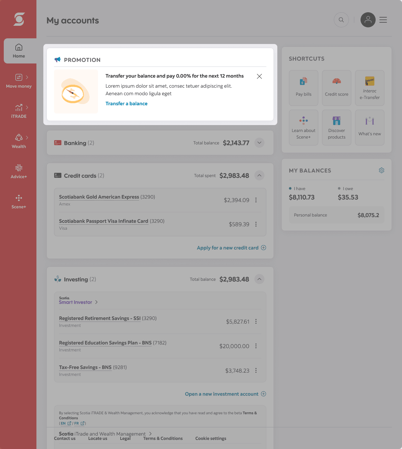
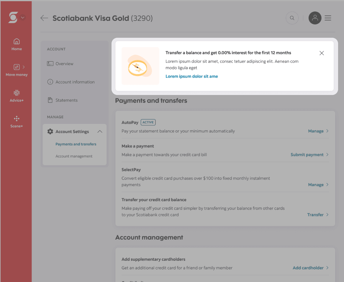
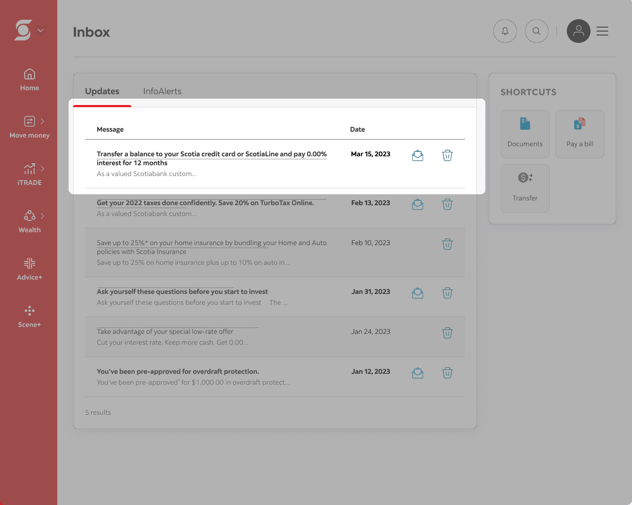
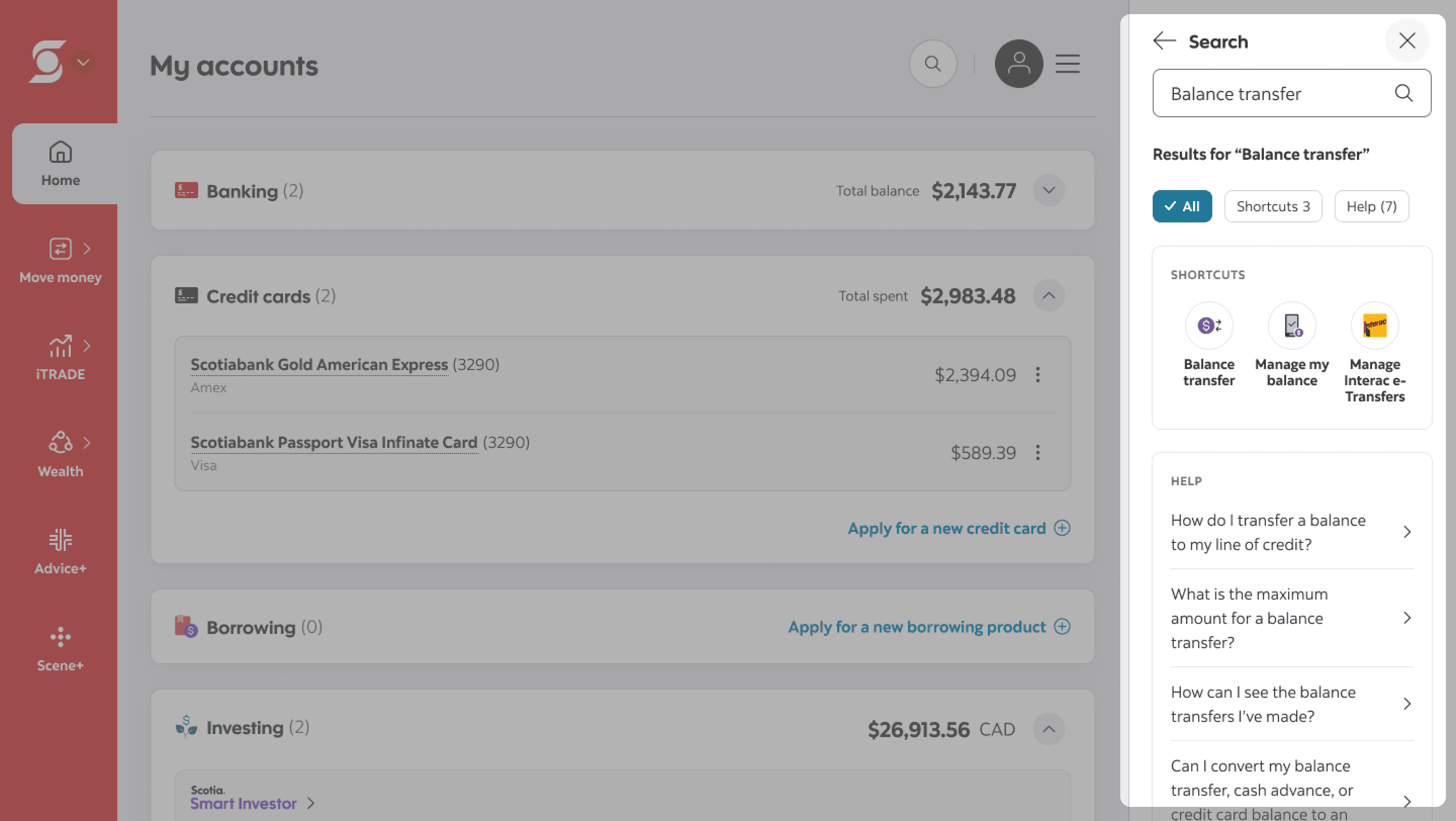
On mobile, entry points were added to the account summary and account details screens. On web, the existing account settings entry point was maintained since many customers were already familiar with accessing the feature there. I also expanded the existing promotional treatment used in the inbox and account summary experiences by surfacing promotional balance transfer messaging directly within the account settings page to encourage action at key decision-making moments. Finally, I added support within the universal search experience, allowing customers to quickly find the balance transfer flow and related help content from anywhere within the platform.
Simplifying the flow and refining the content
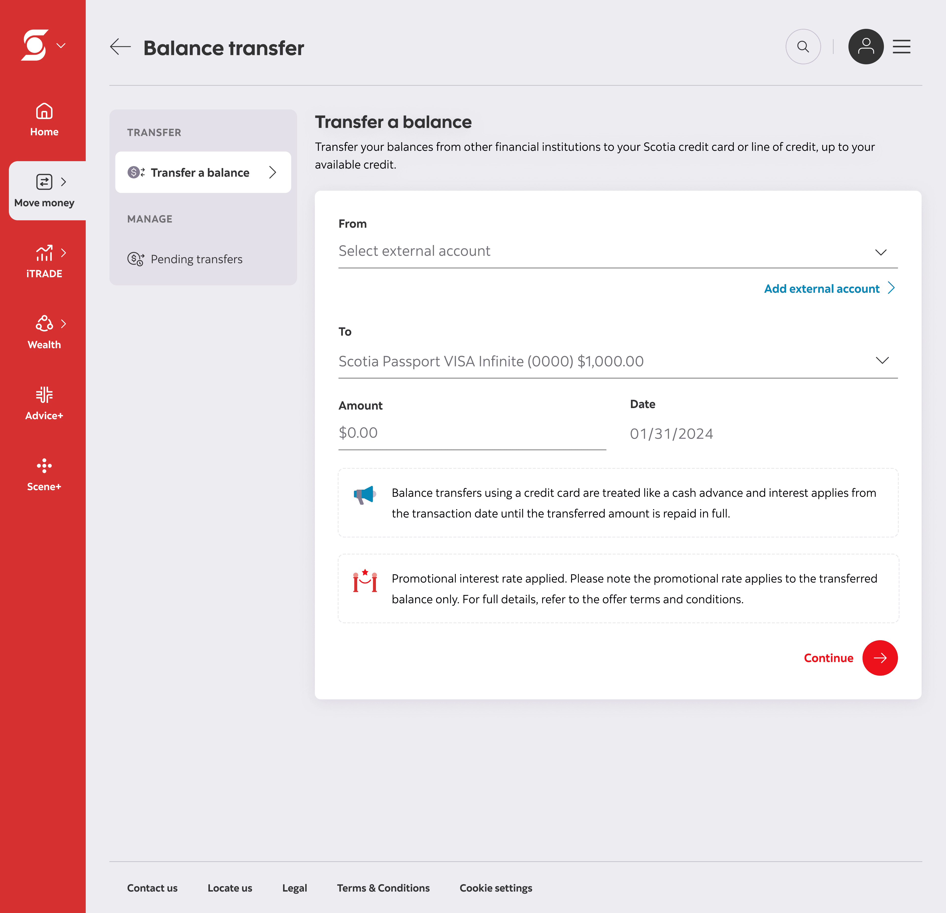
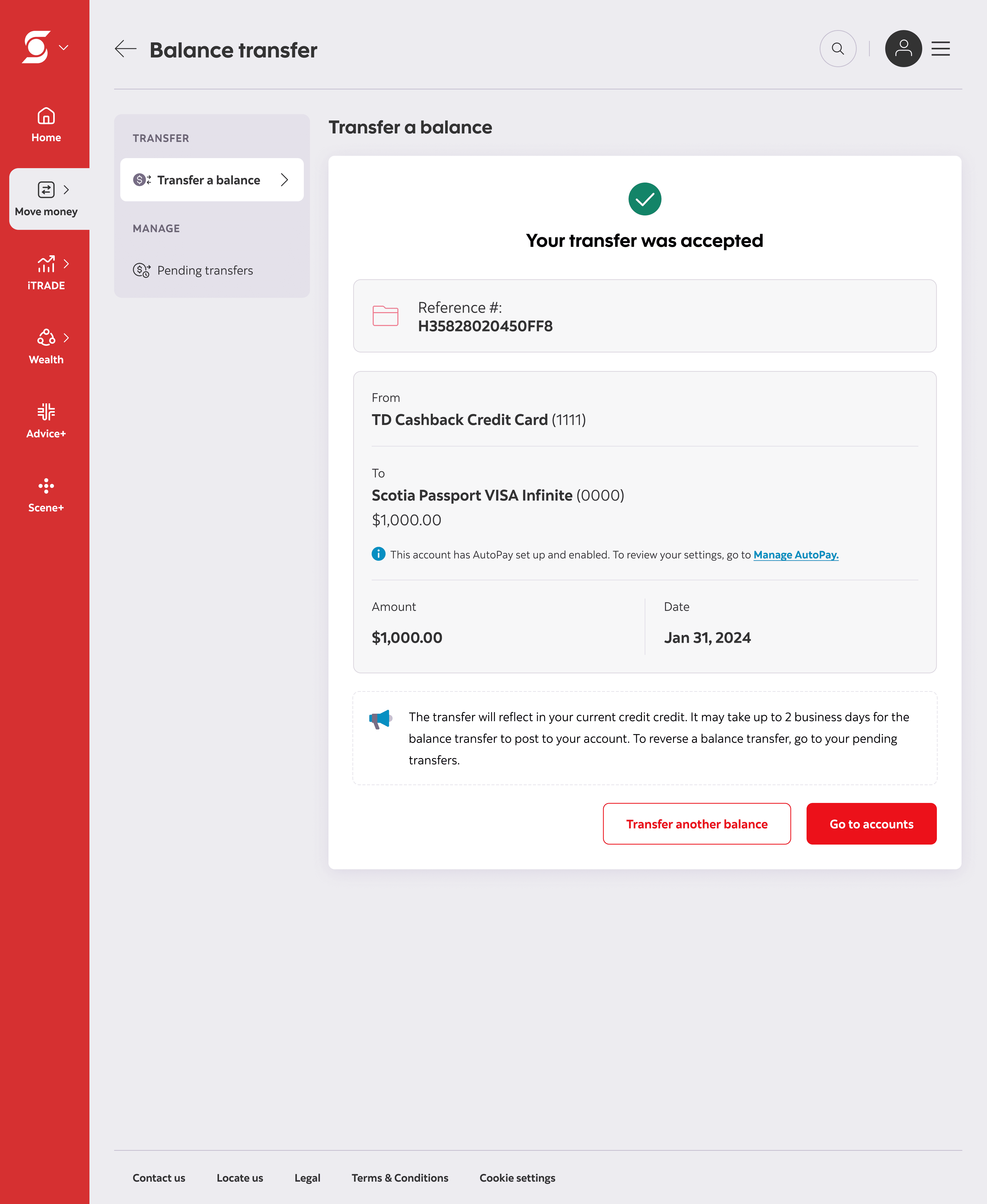
The updated experience reused components from Scotiabank’s refreshed design system to maintain consistency with other money movement flows.
One of the largest usability improvements was embedding the “Add a new payee” task directly within the balance transfer experience, eliminating the need for customers to leave the flow and navigate through Bill Pay. I also collaborated closely with the copywriter to refine and consolidate important financial information throughout the experience. Together, we worked to surface key details contextually within the flow while keeping the interface digestible and linking out to full terms and conditions where appropriate.
Outcome
Although the project was temporarily paused due to shifting business priorities, the proposed experience established a clearer and more scalable framework for balance transfers across web and mobile platforms by:
improving discoverability through multiple contextual entry points
reducing friction by embedding adjacent tasks directly within the experience
increasing customer clarity around promotional rates and repayment conditions
balancing customer advocacy with legal and business requirements
The project is currently expected to move into development in 2026–2027.
Lessons learned
⚖️ As designers, we strive to meet business needs while advocating for the end user: This project taught me how to navigate the delicate tension between business goals, legal requirements, and customer protection, using collaboration and careful copywriting to convey the right message that satisfies all parties.
✍🏼 Designing for clarity builds trust: Our job is all about creating a safe, confidence-boosting experience by presenting complex information clearly, without overwhelming the user.
🤝 Lean on your team: As the sole designer on this project, I often hit dead ends and faced uncertainty in the project direction. By leaning on and seeking feedback from my product manager and fellow designers, I gained confidence in my decisions and ensured the experience was right for our customers.